Good Design Moment - Anhalt Building Addition

In a city draped with Hardie Panel details, it's nice to see a building where the owners chose to go with something longer lasting and easier to look at. Public47 did a great job restoring historic apartment building in addition to building a more modern portion. The dark brick is a particular nice element. 

IMG_0575.jpg

Read more on Public47's website.


Location Address: 201 16th Ave E, Seattle, WA 98112 (Technically 1600 E John Street)

Good Design Moment - Dakar Apartments

A gem of Seattle's Summit Avenue is the fantastic Dakar Apartment Building. Built in 1963, this mid century modern building has a great detail of diamond like forms layered on the facade. These forms break up the modern facade into an interesting mid century feel. One would assume the diamond material would be some form of concrete, typical of this style, but a closer inspection demonstrates the shapes are actually wood. darkarfacade

dakardetail

IMG_4925 One could loosely compare this facade to the theory that Alvar Aalto designed in a regional variation of modernism. As Aalto didn't follow the rigid rules of modernism for a more regional design, the Dakar Apartment Building doesn't use typical materials of mid century modern for a more regional material, wood.

Bad Design Moment - McCarran's Terminal 3 Parking Garage

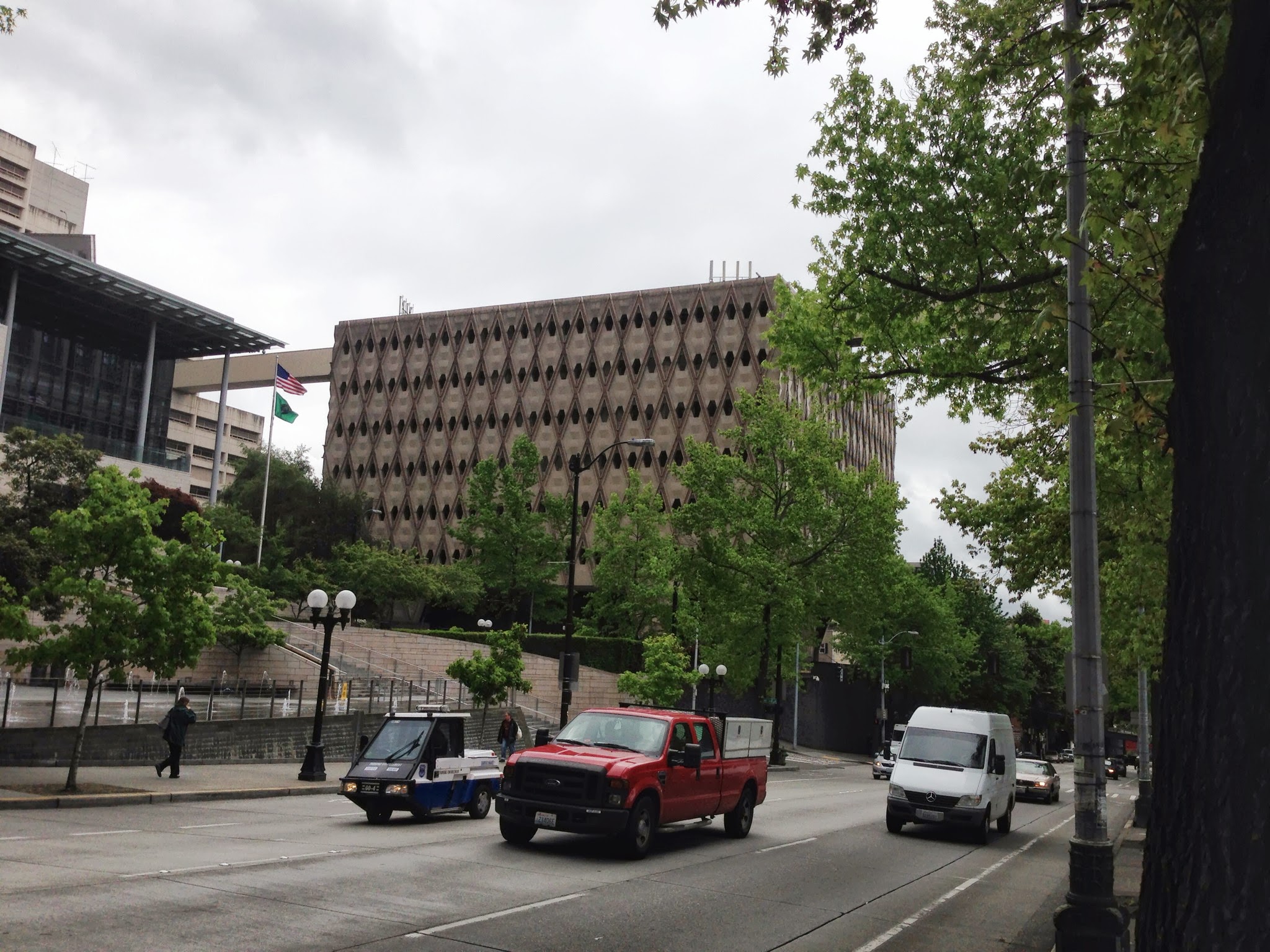
I have written about this in a previous post, but I think Terminal 3's parking garage deserves an official Bad Design Moment post. This is largely due to my sadness regarding the design reoccurring on a recent, unexpected, trip there. 
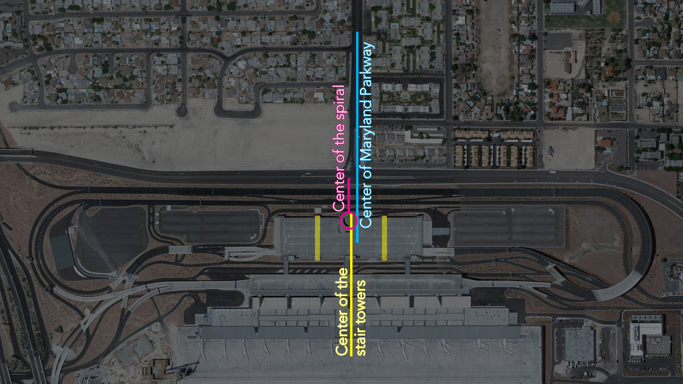
McCarran Airport's new terminal 3 is efficient, but the overall design is mediocre, certainly compared to the original terminal 1 building. The worst part of the new terminal building is the location of the parking garage's spiral ramp that is unsymmetrical within itself as well as missing a perfect opportunity to align with Maryland Parkway. It would have been an easy gesture to simply move the spiral, or the whole structure, to make the spiral align with Maryland Parkway or at the very least center it between the two stair towers. The parking garage s is a real beast and sad considering Vegas has some really well designed parking garages (including the one very near at terminal 1).

McCarran's Terminal 3 Parking Garage

  Below is a simple diagram illustrating the parking garage's many centers.

Terminal 3 Centers

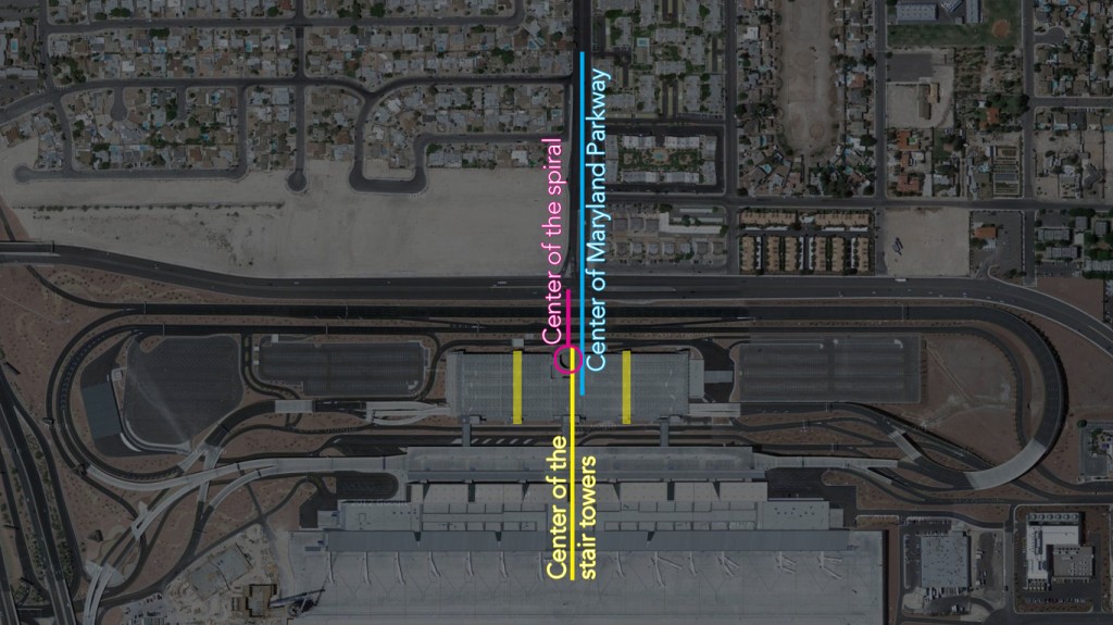
  Location: Russell Rd and Maryland Pkwy, Las Vegas, NV

Good Design Moment - Awning of UK's Chemistry-Physics Building

Awning of UK's Chemistry-Physics Building Post war modern architecture is more common in the western United States, but even the University of Kentucky managed to have a building or two with this style (impressive given the campus' largely conservative design). An interesting part of this architectural style is how little pieces of "decoration" started to erode the previous Modern Style. The awning of the Chemistry-Physics Building shows us a simple design can add an interesting moment to an otherwise plain or Modern facade.

Location Address: 505 Rose St, Lexington, KY 40506

Bad Design Moment - Ballard Hotel

Hotel Ballard 
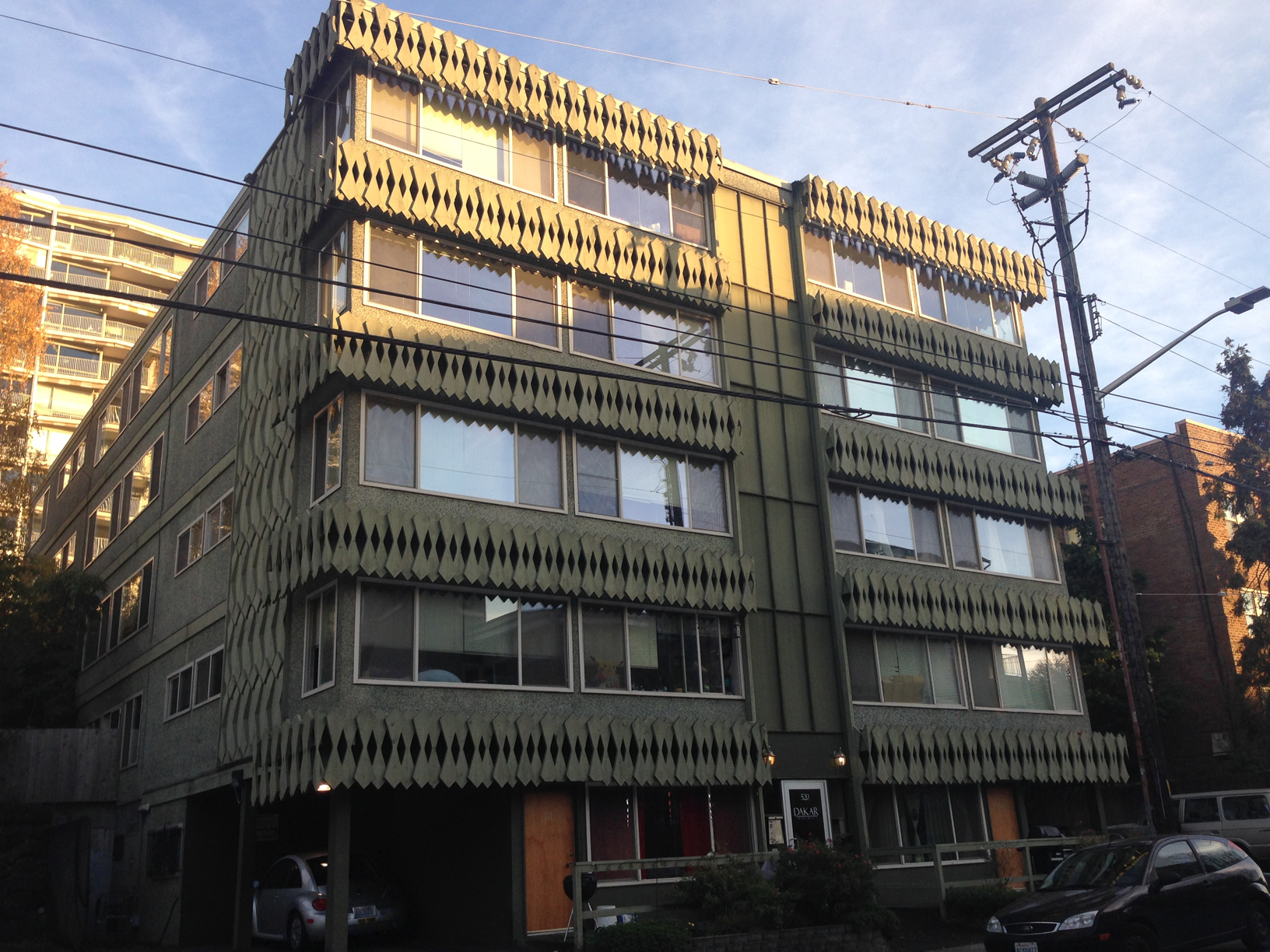
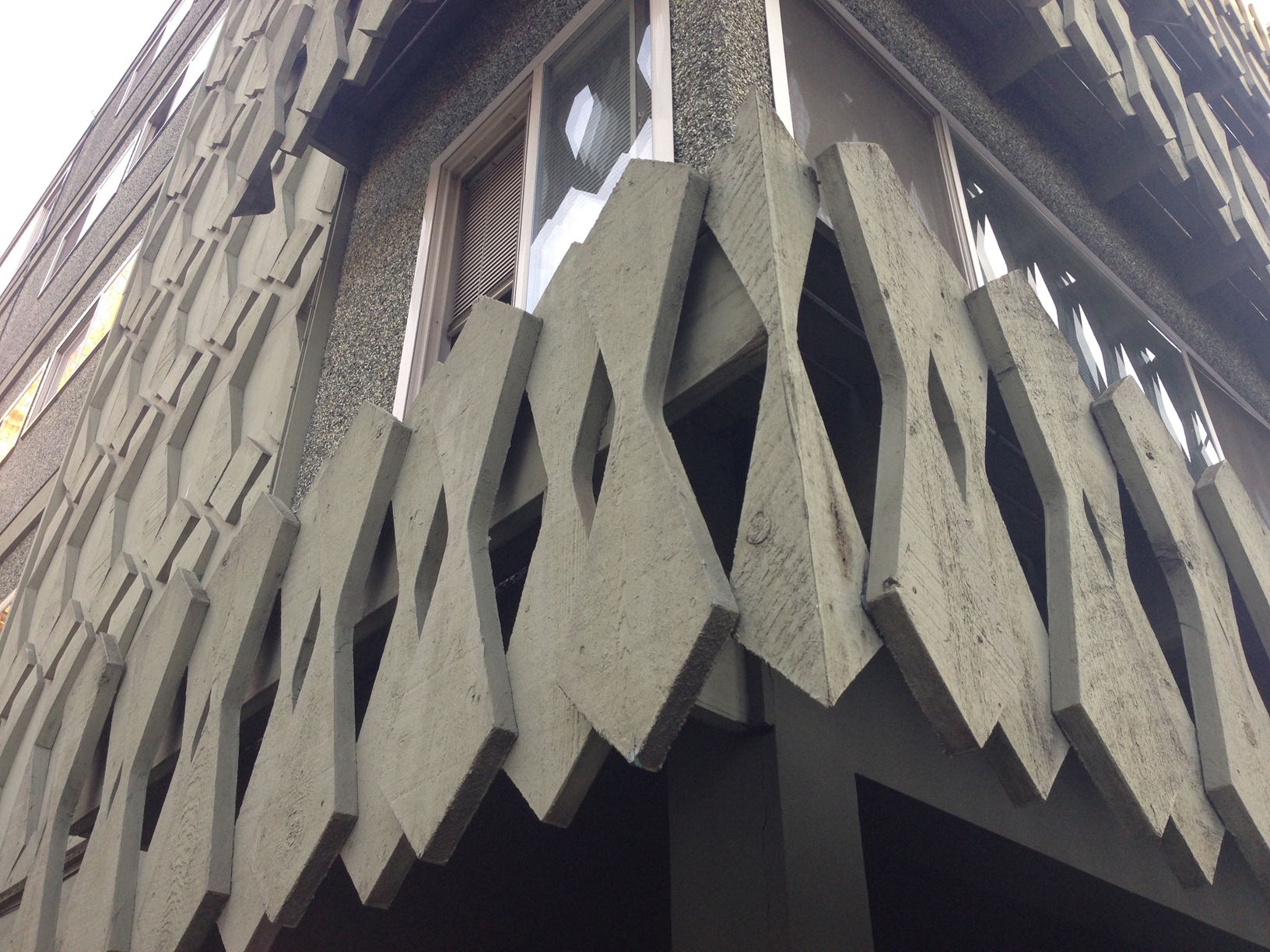
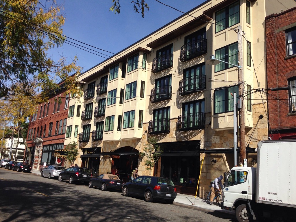
Ballard Avenue's row of old brick and stone buildings have been one upped by the beautifully designed facade of the Ballard Hotel. The designers pulled out all the stops to shows Seattlites the finest detailed faux Tuscan stucco that easily rivals the finest tract developments of Las Vegas, (maybe even surpasses the Lake Las Vegas Hotel- a fine stealing of Florence's own Ponte Vecchio). This building will live on as a testament to true architecture.

Location: 5216 Ballard Avenue Northwest, Seattle, WA 98107

Bad Design Moment - The Holiday on John Street

I am surprised at what is passed off for exterior siding these days. There is what looks like an apartment (perhaps the micro living kind) on John Street in Seattle that has a bad facade of blue painted metal panels. The uncoordinated mix of metal panel textures and narrow windows only makes the facade more insulting than painted it all blue. A decent window detail, a few continuous lines, or leaving the metal gray could improve this facade ten fold. IMG_2610

Shipping containers or trailers stacked on top of each other would be more interesting and true to what this building is.

For the record, the clock on the side is ok.

Located at 1001 East John Street, Seattle, WA

Good Design Moment - Sieg Hall

So I wrote earlier that I would post another project relating to the King County Administrative Building in Seattle. I was interested in the architect Roland G. Pray to see what other work he may have done and found the only website with anything besides an obituary on the guy. I took a moment to Google a few buildings in the list and found Sieg Hall, a building I photographed a month earlier on the University of Washington Campus. It's a pretty good one on a Beautiful Campus. We can see a geometric compositions similar to the King County Administration Building. Good Job Roland G. Pray.

Seig Hall - University of Washington


Source: University of Washington Digital Collections


Source: University of Washington Digital Collections


While I think the building is great, the general public and users finds it dated and bad. Which may be partially true of its construction and maintenance as visually described on the sarcastically entitled webpage Beautiful Sieg Hall -- "The Pride of UW"

Good Design Moment - Kansas City International Airport

The Kansas City airport designed by Kivett and Myers was a nice surprise a few weeks ago. Designed as an "Airport of the Future", it has many cool features that, much like TWA Terminal in New York, features an impractical design for modern air travel but is too good to demolish. Much like JFK it looks like the future prospects of this airport are limited with a new terminal being planned. Kansas City International Airport

It's great to see the road names around the airport terminal indicating the big ambitions that both TWA and Kansas City had for this airport.

Source: Google Maps

Good Design Moment - King County Administrative Building

On my first day of work in Seattle, I took note of the King County Administrative Building on my way to Pioneer Square. I snapped a shot of the building and dug it up today for this post. A quick Google search led me to a Wikipedia article describing the building as "ugly" and the architect Roland G Pray. I am not surprised by the lack of attraction to this building- it's likely the same people who think slapping a stucco pilaster on a tract home as a beautiful design. If we take a moment to actually look at the building it's very interesting. It was built in 1971 and represents this point in time well. It's tectonic exterior facade is fantastic with a simple layering of structural elements (that seem to have held up pretty well). I was surprised that the natural light was decent inside given the relatively small window openings. My only general critique is the entry and how the building does not address the street, which was likely impossible for the architect to with with past zoning regulations anyhow (I'm sure the "ugly" naysayers described above will blame the architect anyway).  Comparing this building with the Seattle Public Library seems easy with it's playful and geometric exterior and other obvious themes. Perhaps I should write about this in a future post.   King County Administration Building   King County Administration Building

  Stay tuned for more relating Good Design Moments relating to this project.

Bad Design Moment - New Drop Ceiling of Washington Metro Stations

A few months ago, a replacement drop ceiling was going in at Metro Center. I was surprised to see the new framework installed 2 inches lower than the previous ceiling and hoped this was a unique situation. Instead the lowered ceiling has become the new normal and makes for funny situations with existing elements. The ceiling now pops out from vents, escalators, and the curved bottom corners of the platforms above. The elegant curved concrete runs right into the new vertical frame! At Farragut North, I inspected the half completed ceiling for obstacles and could not find any obvious reason for a lower ceiling. I predict saving money was the root reason for this change, but it comes at the cost of aesthetics. It's unfortunate the Metro stations keep drifting away from Harry Weese's original design. New Dropped Ceiling - Installed at Gallery Place

New Dropped Ceiling - Framing at Farragut North

Good Design Moment - Franciscan Monastery

Source: Danvera at en.wikipedia 
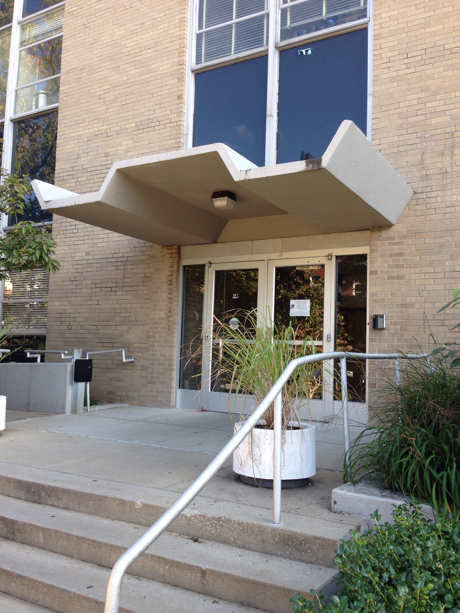
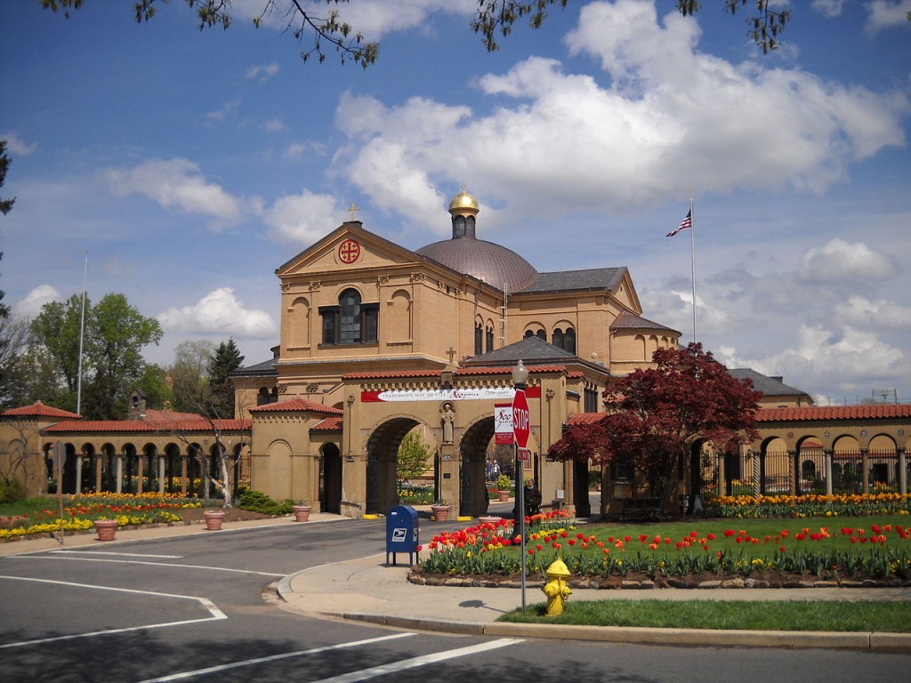
The great weather this weekend motivated me to get out and finally see some architecturally relevant, but less known places around DC. One of the best sites I visited was the Franciscan Monastery tucked away in a residential neighborhood of Northeast DC. The church and cloister are situated on a hill and the cloister opens to the south revealing a small well designed park. This park had everything, including hidden grottos, all being replicas of historical biblical spaces. I found this better than the church itself. This is worth a visit for someone who finds themselves in the area.

Location: 1400 Quincy St NE, Washington, DC 20017

Good Design Moment - Ohio Historical Society

Working on my portfolio last night, I was in Google earth looking at a project site in Columbus, when I remembered the cool building I always thought was great and meant to stop by. After a little research, it turns out my instincts were correct. A Columbus Firm, W. Byron Ireland & Associates, designed this Brutalist masterpiece that won praise in 1970 from the National AIA.

There is a great write up about the building, including a well written argument for architecture that seems "ugly" to the public, by Jeff Regensburger and some great photos (including the one I used above) from the photo blog histOHry.

Location: 800 E. 17th Avenue, Columbus, OH

Good Design Moment - Police Station Tower

Near Georgia Ave and Peabody St is a great radio tower for a police station. With a little bit of effort and design someone turned what typically is ugly into elegance.  You can tell they added another tower that reflects the what we expect from government design these days (tried my best to get it out of the photo). We should think of this strategy for cell towers. Maybe towers that look like palm trees aren't the best solution. The police station below the tower is a Miesian like building similar to the Martin Luther King Jr. Library.  I'm sure the neighborhood and political  forces are filing the paperwork necessary for its destruction.