Link Light Rail Signage Options

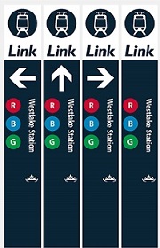
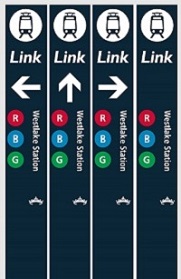
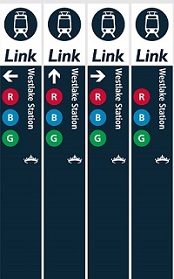
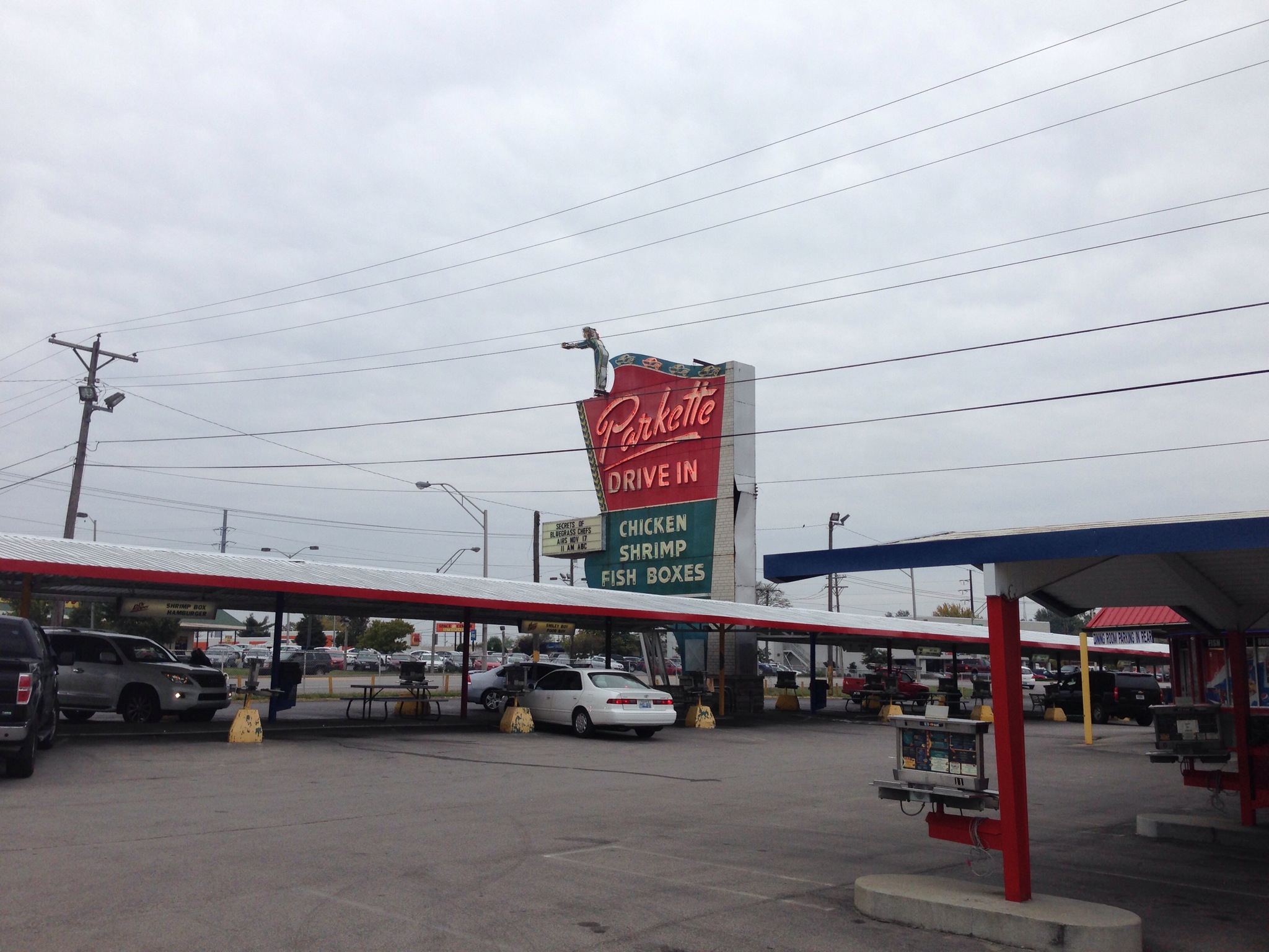
Sound Transit is reconsidering their current signage for the light rail stations and has recently issued a survey asking people what they think. They have three pretty similar options, but I want to advocate for the best option which includes a white bar across the top with a big arrow indicating the entrance to the station. 

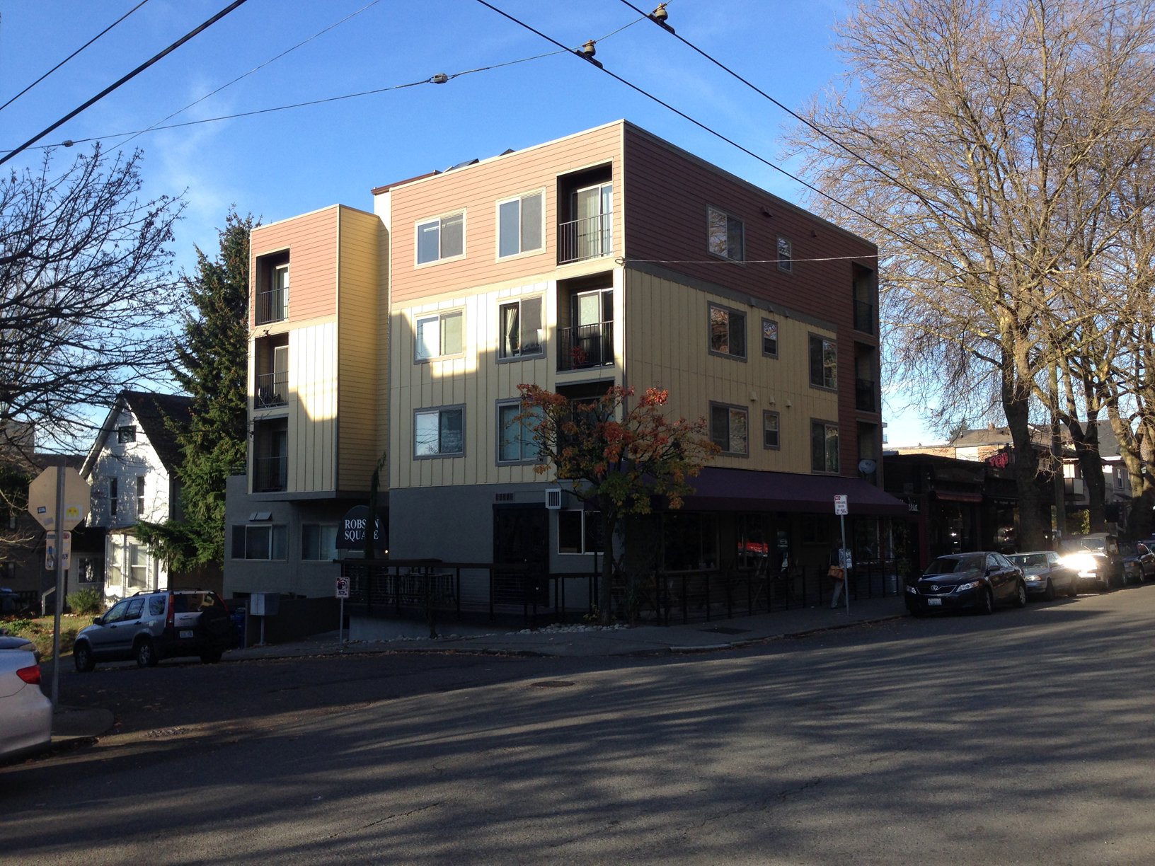
As a transplant to Seattle, I found the signage woefully inadequate and non existent in my first year. I didn't actually realize there was any signage of the current system until this survey... So anything that grabs your attention and lets you know where to go is of the most importance. 

There are some fundamental issues that will still be baked into the system, like the naming the train system Link when everyone largely calls it light rail. I hope that over time the Link takes on a brand identity like the T in Boston or the L in Chicago (who clearly wins the clever points). With that being said, below are the options proposed and the survey for you to take.  

Link to the actual survey (not good on mobile devices) - http://ow.ly/8Ajy30iaRUM

Good Design Moment - Anhalt Building Addition

In a city draped with Hardie Panel details, it's nice to see a building where the owners chose to go with something longer lasting and easier to look at. Public47 did a great job restoring historic apartment building in addition to building a more modern portion. The dark brick is a particular nice element. 

IMG_0575.jpg

Read more on Public47's website.


Location Address: 201 16th Ave E, Seattle, WA 98112 (Technically 1600 E John Street)

Drivin' West - Off to Los Angeles and the Rest

So I'd like to interrupt this blog stream three years later and pick up where I left off. A lot has happened since then, but it's only appropriate to pick up where I left off and add what I can remember. 

map of the final portion of the trip
View of Highway 95

So anyone who took note of my last post and knows a little about Las Vegas might note that I did not take the most popular route to California, the 15 (as in I-15). I instead took a route to Palm Springs that kept me on two lane highways most of the route. One reason for this was Brent saying his preferred method of travel was staying off the interstate and stopping at motels near cool looking bars and the biggest reason, Michelle warning me of the hellish road work taking place on the California side of the interstate. I got to see Searchlight (Where Harry Reid grew up) and drive an odd road that used to be part of Route 66. The road had no shoulder, but was lined in beautiful creosote bushes. I eventually arrived to Palm Springs. 

Corbusier Bank of America


The architecture of palm springs is exciting. I was particularly interested in this Bank of America that was heavily influenced by Le Corbusier. 

After Palm Springs I spent a few nights in Los Angeles which is riddled with great buildings. I particularly liked the lean towards more modern. Here's a few highlights. 

Garden Grove Church Los Angeles

Garden Grove - the mid-century buildings are particularly interesting.  Writing about this later I can't believe how crazy those stairs are. 


Los Angeles Performing Arts Center

The Los Angeles Performing Arts Center was fantastic. I had so much fun just walking around the outside and enjoying the space.


Cinerama Los Angeles

The Cinerama looks fantastic. Can you tell I'm a Welton Becket Fan?


Capitol Records Los Angeles

Capitol Records tower by Welton Becket. So Good.

I then decided to take the 1 and 101 up to San Francisco. This was a great drive that didn't contain much traffic and good views throughout. Along the way was Hearst Castle which is an interesting building of old California and movie stars.

I then found myself in beautiful San Francisco. This city has quite a bit of charm and while I love the way the city looks, I know it comes at a price of making the city less affordable and livable. I did notice the city has lost some of it's edge which is unfortunate and something that Seattle also is finding itself trying to tackle with sky rocketing housing costs.

Cathedral Of Saint Mary Of The Assumption San Francisco

Some of my favorite discoveries on this visit was the Cathedral Of Saint Mary Of The Assumption. I couldn't go inside due to the obvious funeral occurring in the photo, but a quick image search suggests it's a good one.
 

Hyatt Regency San Francisco

I finally set foot in my first John Portman Hotel which featured a vertigo inspiring lobby and a desire to not miss another Portman hotel ever again. 

I then booked it to Portland to finalize my trip. 

Portland Building

An architect can't go to Portland and not manage to grab a photo of Micheal Graves's masterpiece, The Portland Building. While dated, the building is considered high Post Modern architecture and I am glad that Portland decided to keep and restore it. 
 

Keller Fountain Park, Portland - Lawrence Halprin

I really like Lawrence Halprin's work and was happy to see the fountains were on at Keller Fountain Park. I wish we could do public spaces like this today. 

That concludes this trip. I hope to fire up this blog and keep posts coming into the future. Stay Tuned.

Drivin' West - Reno? No, Let's Keep Driving.

So the first, and most important, item on the agenda was a safe and timely arrival in Las Vegas. A drive to Reno was about 11.5 hours from Seattle. I was going to make the first leg of the trip a serious no-frills driving day, but shortly after the plans got into the works, I was offered a generous opportunity to stay at the temporary Adanalian mansion on Lake Tahoe. The Adanalians are the family of my coworker, Ryan, and also happen to be clients at the office. We're designing their permanent mansion. Part of the agenda, if I made it to the Adanalians, would include the chance to throw some dice with Pete Adanalian at the Lakeside Inn. This tempting offer added and hour to the total drive, and one doesn't want to arrive too late in case the craps tables are closed, so I decided to hit the road after work, instead of starting the morning after.

Seattle-Glenbrook-Map

Before I continue, I have to say I drove a 2013 Chevy Cruz rent-a-car instead of my own vehicle. Anyone who has gotten to know me in the past 10 years, should know Bertha, a 1999 Oldsmobile, Silhouette minivan that has been moving me around since 2004. Unfortunately, the last road trip proved it may be best for her to remain in the greater Seattle area, you know, where cell phone reception is close by. She has many fans that will be sorry to read that. She can't party like it's 1999 anymore...

IMG_6686
IMG_6686

Now that the car item has been explained, lets get moving. The initial drive down I-5 was relatively uneventful. I made steady progress and could have made more but decided at 10:45pm that I may need to put together a plan for the night. I decided to pull off into the Oaks Grove Rest Stop, get on Priceline, and arrange a place to stay about an hour ahead (a tactic developed during my longer cross country travels). The search indicated my route left dense civilization (with hotels) after Eugene, Oregon, so I settled for the Broadway Inn about 30 minutes out.

The next day, I work up early and hit the road. This leg of the trip would take me off the interstate for most of the day. The drive was therapeutic with a mix of rural farmland and forests scattered about and virtually no traffic. I made it a point to ensure my gas tank was near full most of the day per the advice of my coworker, Anne, although the mandatory full service stations feel weird. After driving through the mountains of Oregon, the terrain flattens a bit. Before the California state line lies the small town of Merrill, Oregon which has an enticing CMU drive-thu buiding called the Polar Bear. Signage indicated they have burgers, fries, and, milkshakes and it was about lunch time. The establishment had the potential to serve some mean food, but the end result was average for the the bacon burger and fries. I did find it odd that the fries weren't a little limpy. I wonder if the potato farmers nearby prefer a more raw potatoey texture.

View from Gas Station in Adin, California

I was due to get into Lake Tahoe, technically Glenbrook, at 5:30pm but I wanted to make a small detour to check out the Peppermill. I appreciate how the casino treats the interior with a lot of mirrors and neon. The interior remains good, but portions are slowly being converted into a cheap Caesars Palace theme. In the Caesar Palace wing, the gold was rubbing off the bathroom fixtures and the soap dispensers were silver, but this is Reno! At least they thought of soap dispensers even if they don't match (I have to knock Reno just a little bit). Fortunately, the Peppermill still features video screens throughout the casino floor with worldly landscapes, something all the Peppermill owned locations have, and the world famous Fireside Lounge.

At the end of the day, I made it to Glenbrook safely, met up with Pete, visited the site of their new mansion, got a little history of the area, ate a steak dinner, and threw some dice. I did pretty well but, unfortunately, Pete wasn't fairing as well. He's more adventurous which paid well in the beginning, but later took advantage of his winnings. We later tried to gamble for a "good story," but unfortunately the story didn't pan out.

Special thanks to Pete and all the Adanalians for being so hospitable.

Pete, dressed appropriately for his boat on Lake Tahoe.
Lake Tahoe at Sunset

Stay tuned for the next post featuring the drive to the great city of Las Vegas.

Drivin' West - A Road Trip to Los Angeles via Las Vegas

(sound of intense blowing... long pause... footsteps fade away... footsteps approaching... canned air sound...) The blog has lacked some attention lately, mostly due to taking some of the Architecture Registration Exams and the intensity of the profession these days. Both don't look to be resolving in the near future (guess I'll keep the canned air handy).

In case you missed the photos posted on Instagram (some on the right sidebar) and Facebook a few weeks ago, I recently went on a two week 3,400 mile road trip that included keys stops in Las Vegas, Los Angeles, and San Francisco. I will be taking the next few weeks to highlight segments of the trip under the category and title of Drivin' West.

Route Map


Since I moved to Seattle, I had been meaning to take a trip down the west coast to refresh myself on the cities and built environment. When I received a save-the-date for a wedding in Las Vegas from good undergraduate friends, Tommy and Lindsey, I quickly realized this was my chance. I think some thought I was nuts for wanting to drive the whole way, but this is my preferred way of travel. Only driving car does one have the chance to see landscapes and towns that would otherwise be skipped over. Also, driving a car 65mph on the open road with the windows down and music blasting is way better than being crammed onto an airplane with no food.

Preparation of the trip included a prefect mix of logistical planning and improvisation. For important stops, I organized days and reserved places to stay. For less significant stops or legs of the journey I made on-the-fly decisions. The tools used for achieving this was a simple spreadsheet with important sites, places to stay, and people to see integrated with a map. I could easily prioritize and adjust my schedule depending on real-time conditions or preferences.

Trip Spreadsheet and Map


To summarize, this trip was one of the the best I've had in awhile. I was very satisfied with the mix of entertainment, socializing, and alone time. While I expected to see some great sites and architecture, I didn't realize how much fun it would be to meet old friends and family along the way. There are a lot of great people in my life and even if they are a billion miles away, they still know how to have a great a time and are kind enough to spend some time with me (sometimes with a moments notice).

Stay tuned for the first leg of the trip, Seattle to The Great State of Nevada.

ARE's Programming, Planning, and Practice

ppppass
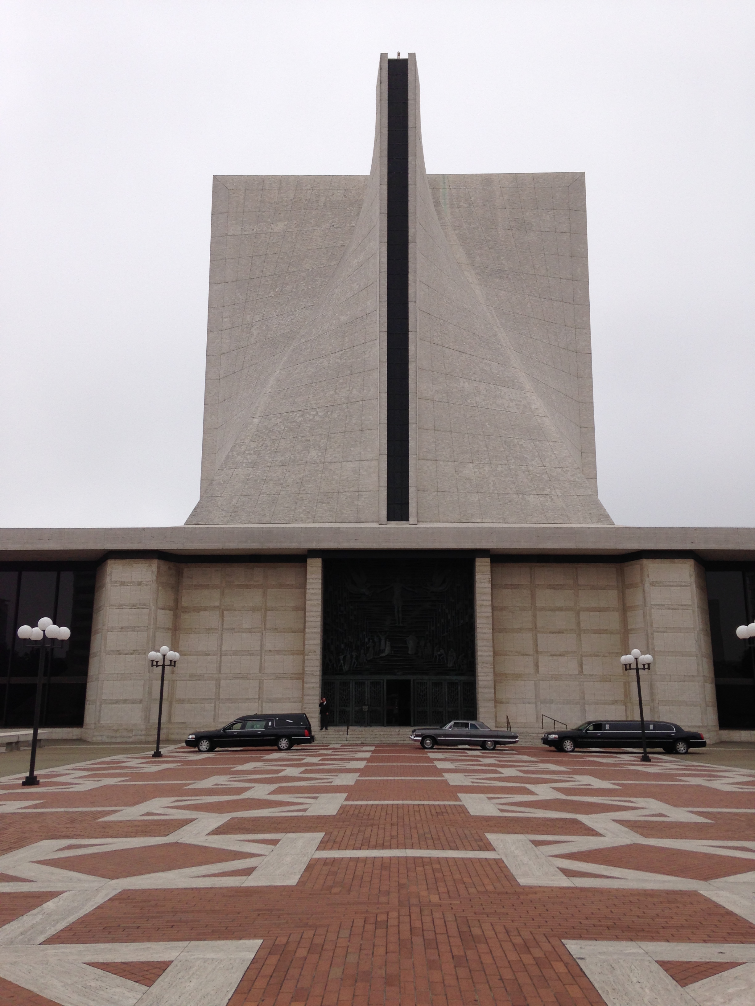
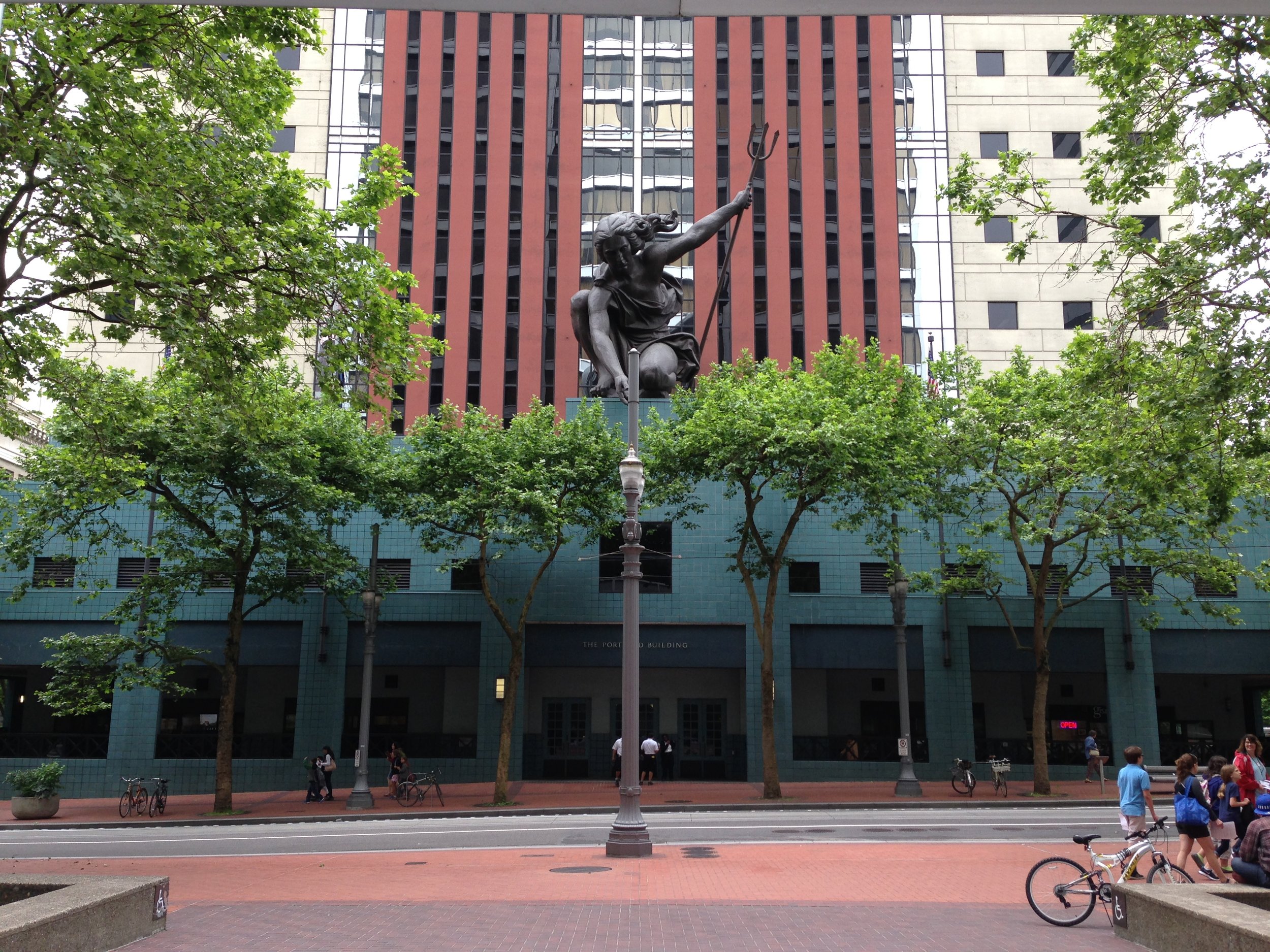
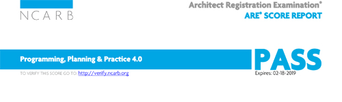
You may say, "boy, I haven't seen many updates on Matt's blog lately." If not, humor me. I have lacked in the writing department in an effort to cram information into my head and later dispelling it to pass the Architecture Registration Exams. Studying for the test reminds me of the college days where I would sit in the library reading every possible thing a day before a test, only for this test it's every night for weeks and the material is comparable to the old encyclopedia book sets we had back in the day. I recently passed the exam entitled Programming, Planning, and Practice (PPP) and thought I would share with fellow ARE takers some items I found helpful for the test. Jenny's Notes - Jenny's Notes summarize every possible item for the test with useful and relevant information. We also learn some fun facts about Portland.

Schiff Hardin Lectures - I found the lectures on the A201 and B101 to be very helpful in understanding the basic legal framework of the AIA contracts. The concepts of the A201 and B101 can be applied to many of the other contracts. No Sandbagging!

Ben Rudgers' Vignette Guide - Widely recommended on the forums, this guide established good vignette techniques that I adapted slightly to ace the PPP. The guide also includes hilarious asides.

I read both Kaplan and Ballast for this test. I took the advice of youngarchitect.org to read the following chapters in Ballast, that turned out to be helpful: 5 Site Analysis 15 Soil and Foundations 29 Energy Efficiency 30 Sustainable Design 35 Site work.

(Local) Songs for the Day - Wimps "KEXP Live Porformance"

A music-buff friend of mine visited Seattle this past week and we attended a lot of live concerts. I quickly realized I have no idea of how much good stuff is within a quick local bus ride. My favorite from this past week was Wimps, who feature an upbeat tempo with some great / funny vocals. This is definitely worth a listen while you avoid talking to your coworkers this morning. Enjoy.

A Brief Tour of Seattle's Facades, a Lack of Commitment

About two months ago, maybe three at this point, I was debating the architectural excellence of a building my coworker picked out while we drove to a job site in Ballard. Per the usual, I argued that I didn't find anything particularly good about the building while my coworker (who loves everything) praised the buildings supposed architectural excellence. As I mustered up the reasons the building wasn't good, I finally realized the leading cause of mediocrity plaguing much of Seattle's bad architecture- an unnecessary use of many material and color variations. Since this realization, I slowly documented mediocre buildings that demonstrate a non-committed facade. Through the documentation, it's apparent there are a variety of strategies, which I've started to decipher below. Before heading into the tour, here are some basics to look out for. The material choices come in composite woods (hardie), metal, vinyl, and the oh-so-hot real wood. The configurations of the materials come in vertical, horizontal, squares, and shingle. The colors lean towards multiple dominant colors, with a slightly dull or dated tint.

Disclaimer: some of these can be difficult to look at. Please open another tab in your browser of good architecture in case you find yourself feeling weak.

An Initial Assessment of Seattle's Non-committed Facades:

Horizontally - Perhaps this building is a new theoretical argument for top, middle, and base. The "rusticated" green base, a wide vertical middle, and a thin horizontal top. In case the materials were not making the argument clear, 3 dominant paint colors are used to emphasize the facade strategy.

Vertically - We can see a similar strategy as mentioned above, except vertically. The material and color treatment suggests at one point the three different colored parts were separate massing elements. As the photo now demonstrates, the massing has been flattened, leaving the remnants of three different colors and two different material treatments (at least the colors aren't too terrible).

1/3, 2/3 - Outside the horrendous gluing of mass for what looks to be a wall vented fireplace, this building uses the 1/3 - 2/3 color strategy with white trim separating the vertical and shingle materials. Note how the adjacent property is the same configuration but the design uses a different color palette (so clever! I never suspected they were the same floor plans...).

Color 4 - The massing of this building indicates a love for saw blades as indicated with the roof line. Each additional massing strategy glued onto this building is further emphasized with a different color/material. The designer wanted to celebrate the saw blade idea by painting this a separate color (green) with a thin piece of trim (We wouldn't want to confuse it with the blue plane).

Color 5 - As massing grows, designers feel compelled to select more colors. The building on the left contains a more conservative massing strategy (not so much gluing to maximize profits) so the largely flat facade pops with 5 colors and 4 or 5 materials. Who needs a better massing strategy with a non-committed facade? (note the green and wood building on the right is still part of the same complex- color 7?).

Color 6ish - At some point it's hard to keep track of the colors, but this developer special building has a true uncommitted style to it's color palette.

Colors + Wood - What seems like a crappy developer copy of Silodam, the hot trend is to incorporate wood into the facade for a real pop. This building uses two colors of wood and inserts more wood randomly between windows on the left side. The randomness is topped off with the irrational play of blue on the wood side. It's like the designers can't figure out whats going wrong, so they impulsively add more materials and make the organization less rational.

Historically - While the lack of commitment is a more current occurrence, this house couldn't miss the opportunity to partake through the only power an older committed house can- paint. A separation of beige and brown is articulated horizontally on a board that meets the lower eave. No trim separation needed!

I could keep going, but I'll save you the torture. There are more in my ever growing album of Seattle's Non-committed Facades. The strategies are evolving and it would be interesting to follow up with this post in the future. The newest trend appears to be the random wood panel or color panel inserted into a monolithic portion as demonstrated with the color + wood project.

The non-committed facade is a poor design strategy that has dated these buildings, in addition to our city. I could see a good designer falling victim to this trend, but it's important to stray from complexity and use committed facade strategies. I would also like to encourage better massing, but this is a more difficult task.

---

On a closing note, either Gehry has fallen victim for Seattle's non-commitment or he studied up on his Seattle vernacular. I'll let you decide.

Henderson's Downtown Development - Desertion

Henderson is where I grew up. I think it's fair to say, compared to the current city boundaries, I knew the town in it's infancy. I spent a lot of time, as a kid, in the original neighborhood (housing for the original Magnesium factory workers). It wasn't the highfalutin areas of Green Valley, Anthem, and whatever the next developer wants to call their fortified complex of stucco homes. Growing up in the southwest in the 1990s-2000s exposed me to tremendous growth including Henderson becoming the second largest city in the state (Sorry Reno... well not really). It's safe to say the development leading to the size was not good. The entire valley fell, and still falls, victim to the fast and loose development that leads to sprawl. In Henderson, it's clear the city wants to improve some of the deserted areas largely focusing on downtown, but unfortunately it's not based on any urban design logic or even a skimming of The Death and Life of Great American Cities Wikipedia article. The latest version suggest is the same old idea ten fold.

The strategy calls for the leveling all the current fabric (buildings) and persuading developers to make a new great place (because new has to be better, right?). A stroll down Water street makes one wonder if the city was bombed out. Most of the buildings I knew as a kid are non existent  and largely empty lots with and chain link fences.

IMG_4483sm

Anyone who has escaped the development standard of sprawl can tell you a great downtown street will have a lot of commercial buildings. Slightly more research suggests buildings have to be continuous along the street front, a gap for a parking lot or bad proportioned building can throw everything off for pedestrians. Unfortunately the city is implementing the opposite and, well, the results show little progress on the hopes for a nice downtown.

Downtown Henderson could be a great place and I hope one day it can turn around, but using the same formula won't work.

The specifics on the city's plan can be found here.

A photo album featuring empty lots of downtown can be found here.

General Photos of the Las Vegas Valley

Greetings 2014! The holidays delayed new posts for a bit, but don't fret, I am brewing a few good posts that should satisfy your need for grumpy design banter. To get us warmed up, I'm sharing some general photos of the Las Vegas Valley taken over a span of three visits. Note these photos don't reflect the entire collection, I had to seperate some into different albums for the brewing blog posts. Enjoy.

Album: Las Vegas [General]

IMG_5326

Lexington Modern - Honorable Mentions

So to wrap up the Lexington Modern series for now, I wanted to mention a few remaining gems of the Lexington area that deserved a honorable mention. The Parkette Drive In Parkette Drive In

The Parkette drive in is a good example of a 50s drive in diner, when signs were a fantastic piece of art built for automobile viewing. If Robert Venturi and Denise Scott Brown wrote Learning from Lexington, this sign would surely be indexed. The food also features some interesting items, one is the hot brown burger, a cheese burger with a slice of turkey and alfredo sauce, that I enjoyed on my visit.

Location: 1230 E New Circle Rd, Lexington, KY

The Spaceship House The Spaceship House

My friend, Jonathan, dubbed this the spaceship house. It's not something that I immediately warm to, but it's nice to see someone was thinking outside the box through some simple formal gestures. I feel this could have been the top of and small air traffic tower. I'd be interesting to see this adapted into a new structure, which could be a cool theory heavy building. The neighborhood also features some great mid century tract housing worth checking out.

Location: Mt Tabor Rd and Kasey Court, Lexington, KY

Southland Christian Church - Richmond Road Campus Southland Christian Church - Richmond Road Campus

This Lexington mega church is mega modern. The Richmond Road campus for the Southland Christian Church is in a re-purposed mall building that features some super contemporary design worth noting. The use of contemporary architecture for the church reminds me of the Catholic church reformation back in 16th and 17th century. The Catholic church would use extreme Baroque architecture to lure in more followers and separate itself from it's counter reformation foes who practiced a simple architectural style. It's odd how the counter reformation is still living on in church architecture. At any rate, the church was locked when we stopped by so I didn't get past a peering into the main hall foyer.

Location: 2349 Richmond Road, Lexington, KY

Living Arts and Science Center Addition

Front-View-900x390

Jonathan (the friend mentioned above) sent me an article in the Chevy Chase stating the Living Arts and Science Center is planning the ground breaking for a new contemporary addition. It's exciting to see a Lexington institution wanting to use modern architecture.


You can view more photos of these and other buildings from my recent trip to Lexington in this photo album.

Song(s) for the Day - Röyksopp "Remind Me" + "Happy Up Here"

Recently, I was listening to the classic top 50 most played songs on my phone this past weekend and ran across a Röyksopp song. Listening to song reminded me of what a great music video "Remind Me" was. The video is a bit old now, 2002, but still remains interesting in how it uses infographics to explain a woman's work day in London. The video was put together by H5, which is a pretty good french design firm from what I can tell. This video won Best Music Video in 2002 at the MTV Europe Music Awards.

Another great music video that is worthy of sharing and making this a double song packed post is "Happy Up There" by the same artist, which features robot light bulb objects flying above a city mimicking space invaders.