Link Light Rail Signage Options

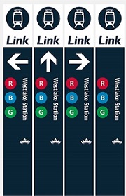
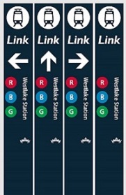
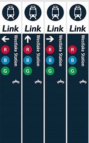
Sound Transit is reconsidering their current signage for the light rail stations and has recently issued a survey asking people what they think. They have three pretty similar options, but I want to advocate for the best option which includes a white bar across the top with a big arrow indicating the entrance to the station. 

As a transplant to Seattle, I found the signage woefully inadequate and non existent in my first year. I didn't actually realize there was any signage of the current system until this survey... So anything that grabs your attention and lets you know where to go is of the most importance. 

There are some fundamental issues that will still be baked into the system, like the naming the train system Link when everyone largely calls it light rail. I hope that over time the Link takes on a brand identity like the T in Boston or the L in Chicago (who clearly wins the clever points). With that being said, below are the options proposed and the survey for you to take.  

Link to the actual survey (not good on mobile devices) - http://ow.ly/8Ajy30iaRUM

(Local) Songs for the Day - Wimps "KEXP Live Porformance"

A music-buff friend of mine visited Seattle this past week and we attended a lot of live concerts. I quickly realized I have no idea of how much good stuff is within a quick local bus ride. My favorite from this past week was Wimps, who feature an upbeat tempo with some great / funny vocals. This is definitely worth a listen while you avoid talking to your coworkers this morning. Enjoy.

A Brief Tour of Seattle's Facades, a Lack of Commitment

About two months ago, maybe three at this point, I was debating the architectural excellence of a building my coworker picked out while we drove to a job site in Ballard. Per the usual, I argued that I didn't find anything particularly good about the building while my coworker (who loves everything) praised the buildings supposed architectural excellence. As I mustered up the reasons the building wasn't good, I finally realized the leading cause of mediocrity plaguing much of Seattle's bad architecture- an unnecessary use of many material and color variations. Since this realization, I slowly documented mediocre buildings that demonstrate a non-committed facade. Through the documentation, it's apparent there are a variety of strategies, which I've started to decipher below. Before heading into the tour, here are some basics to look out for. The material choices come in composite woods (hardie), metal, vinyl, and the oh-so-hot real wood. The configurations of the materials come in vertical, horizontal, squares, and shingle. The colors lean towards multiple dominant colors, with a slightly dull or dated tint.

Disclaimer: some of these can be difficult to look at. Please open another tab in your browser of good architecture in case you find yourself feeling weak.

An Initial Assessment of Seattle's Non-committed Facades:

Horizontally - Perhaps this building is a new theoretical argument for top, middle, and base. The "rusticated" green base, a wide vertical middle, and a thin horizontal top. In case the materials were not making the argument clear, 3 dominant paint colors are used to emphasize the facade strategy.

Vertically - We can see a similar strategy as mentioned above, except vertically. The material and color treatment suggests at one point the three different colored parts were separate massing elements. As the photo now demonstrates, the massing has been flattened, leaving the remnants of three different colors and two different material treatments (at least the colors aren't too terrible).

1/3, 2/3 - Outside the horrendous gluing of mass for what looks to be a wall vented fireplace, this building uses the 1/3 - 2/3 color strategy with white trim separating the vertical and shingle materials. Note how the adjacent property is the same configuration but the design uses a different color palette (so clever! I never suspected they were the same floor plans...).

Color 4 - The massing of this building indicates a love for saw blades as indicated with the roof line. Each additional massing strategy glued onto this building is further emphasized with a different color/material. The designer wanted to celebrate the saw blade idea by painting this a separate color (green) with a thin piece of trim (We wouldn't want to confuse it with the blue plane).

Color 5 - As massing grows, designers feel compelled to select more colors. The building on the left contains a more conservative massing strategy (not so much gluing to maximize profits) so the largely flat facade pops with 5 colors and 4 or 5 materials. Who needs a better massing strategy with a non-committed facade? (note the green and wood building on the right is still part of the same complex- color 7?).

Color 6ish - At some point it's hard to keep track of the colors, but this developer special building has a true uncommitted style to it's color palette.

Colors + Wood - What seems like a crappy developer copy of Silodam, the hot trend is to incorporate wood into the facade for a real pop. This building uses two colors of wood and inserts more wood randomly between windows on the left side. The randomness is topped off with the irrational play of blue on the wood side. It's like the designers can't figure out whats going wrong, so they impulsively add more materials and make the organization less rational.

Historically - While the lack of commitment is a more current occurrence, this house couldn't miss the opportunity to partake through the only power an older committed house can- paint. A separation of beige and brown is articulated horizontally on a board that meets the lower eave. No trim separation needed!

I could keep going, but I'll save you the torture. There are more in my ever growing album of Seattle's Non-committed Facades. The strategies are evolving and it would be interesting to follow up with this post in the future. The newest trend appears to be the random wood panel or color panel inserted into a monolithic portion as demonstrated with the color + wood project.

The non-committed facade is a poor design strategy that has dated these buildings, in addition to our city. I could see a good designer falling victim to this trend, but it's important to stray from complexity and use committed facade strategies. I would also like to encourage better massing, but this is a more difficult task.

---

On a closing note, either Gehry has fallen victim for Seattle's non-commitment or he studied up on his Seattle vernacular. I'll let you decide.

Good Design Moment - Dakar Apartments

A gem of Seattle's Summit Avenue is the fantastic Dakar Apartment Building. Built in 1963, this mid century modern building has a great detail of diamond like forms layered on the facade. These forms break up the modern facade into an interesting mid century feel. One would assume the diamond material would be some form of concrete, typical of this style, but a closer inspection demonstrates the shapes are actually wood. darkarfacade

dakardetail

IMG_4925 One could loosely compare this facade to the theory that Alvar Aalto designed in a regional variation of modernism. As Aalto didn't follow the rigid rules of modernism for a more regional design, the Dakar Apartment Building doesn't use typical materials of mid century modern for a more regional material, wood.

Picturesque Seattle

I have been putting together a series of general Seattle photos going back to my visit in April of this year. Seattle offers great views due to it's numerous hills. One can't really resist grabbing a shot when a good view is presented (as you can tell from the "view from Capitol Hill" shots of pretty much the same thing near my apartment). I organized the collection starting from Seattle Center (with many photos of the space needle) spiraling out to different parts of town. Take a look, there are some great shots. General Seattle [2013]

Browse the Seattle Album

I've also added some new photos to the University of Washington photo album, including the reading room of the Suzzallo Library and the Odegaard Undergraduate Library with the recent interior renovation.

Good Design Moment - Sieg Hall

So I wrote earlier that I would post another project relating to the King County Administrative Building in Seattle. I was interested in the architect Roland G. Pray to see what other work he may have done and found the only website with anything besides an obituary on the guy. I took a moment to Google a few buildings in the list and found Sieg Hall, a building I photographed a month earlier on the University of Washington Campus. It's a pretty good one on a Beautiful Campus. We can see a geometric compositions similar to the King County Administration Building. Good Job Roland G. Pray.

Seig Hall - University of Washington


Source: University of Washington Digital Collections


Source: University of Washington Digital Collections


While I think the building is great, the general public and users finds it dated and bad. Which may be partially true of its construction and maintenance as visually described on the sarcastically entitled webpage Beautiful Sieg Hall -- "The Pride of UW"

Seattle!

seattleSo the lapse in posts were due to a recent move to Washington... State. I now live in Seattle and the two weeks I've been here indicates I will be here for quite awhile. Seattle has a lot of things I've desired in a place to live that Washington (DC) couldn't provide. The first is a general population that is invested in a livable city and has a general happiness about a lot of things. The biggest improvement is housing. I now live in one of the most desirable neighborhoods of Seattle for what I was paying in a rapidly gentrifying neighborhood where my former roommate was mugged at gunpoint just this week in DC. The best part is I landed a job at a great firm only 3 blocks from my apartment. The firm is Board and Vellum, which is a young firm that I already feel at home working at. Everyone welcomes my harsh criticism and aren't afraid to do the same to me.

A fun fact is I now live in the same city as my arch enemy, Matt Hagen of matthagen.COM... He's not really an enemy, but this guy has owned matthagen.com since I was a freshman in high school (2001) trying to register the domain. It would be interesting to see how much of my email he's received.

I will get this blog rolling again. I have some good design moments lined up and plenty to post about.