Drivin' West - Off to Los Angeles and the Rest

So I'd like to interrupt this blog stream three years later and pick up where I left off. A lot has happened since then, but it's only appropriate to pick up where I left off and add what I can remember. 

map of the final portion of the trip
View of Highway 95

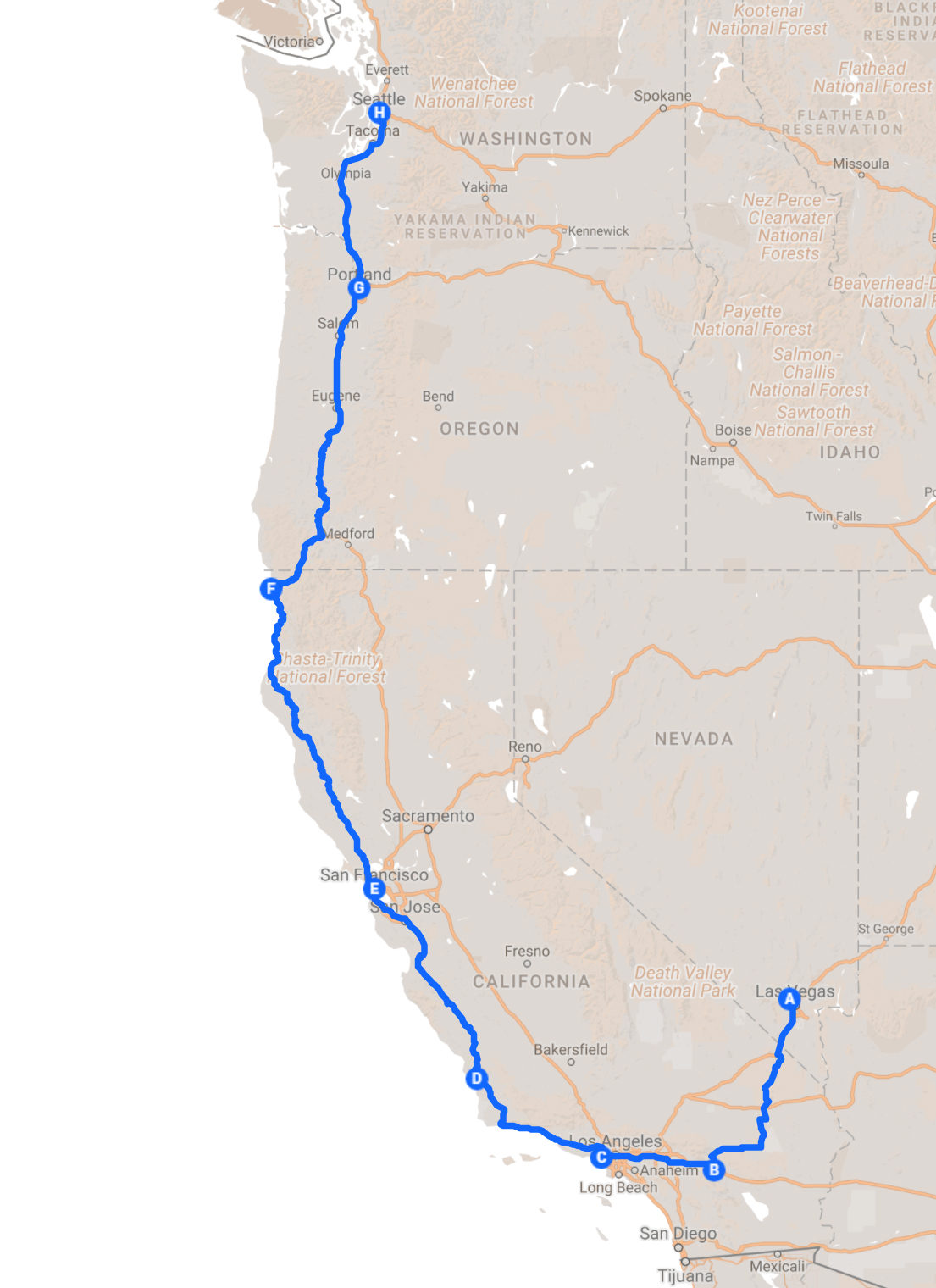
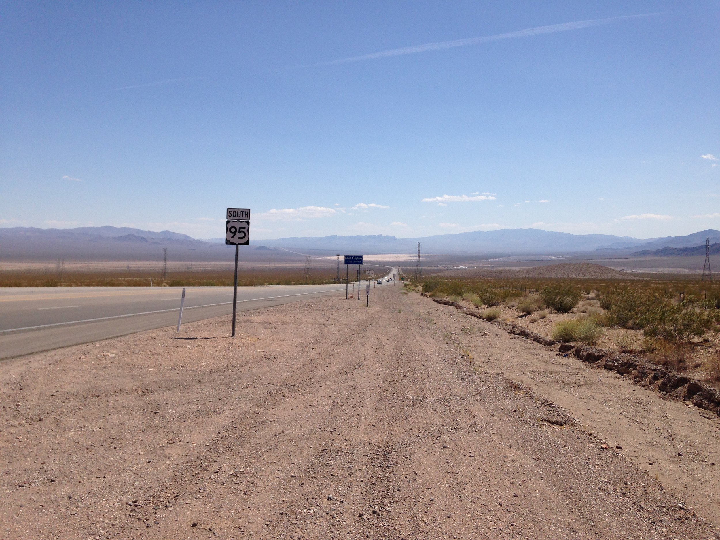
So anyone who took note of my last post and knows a little about Las Vegas might note that I did not take the most popular route to California, the 15 (as in I-15). I instead took a route to Palm Springs that kept me on two lane highways most of the route. One reason for this was Brent saying his preferred method of travel was staying off the interstate and stopping at motels near cool looking bars and the biggest reason, Michelle warning me of the hellish road work taking place on the California side of the interstate. I got to see Searchlight (Where Harry Reid grew up) and drive an odd road that used to be part of Route 66. The road had no shoulder, but was lined in beautiful creosote bushes. I eventually arrived to Palm Springs. 

Corbusier Bank of America


The architecture of palm springs is exciting. I was particularly interested in this Bank of America that was heavily influenced by Le Corbusier. 

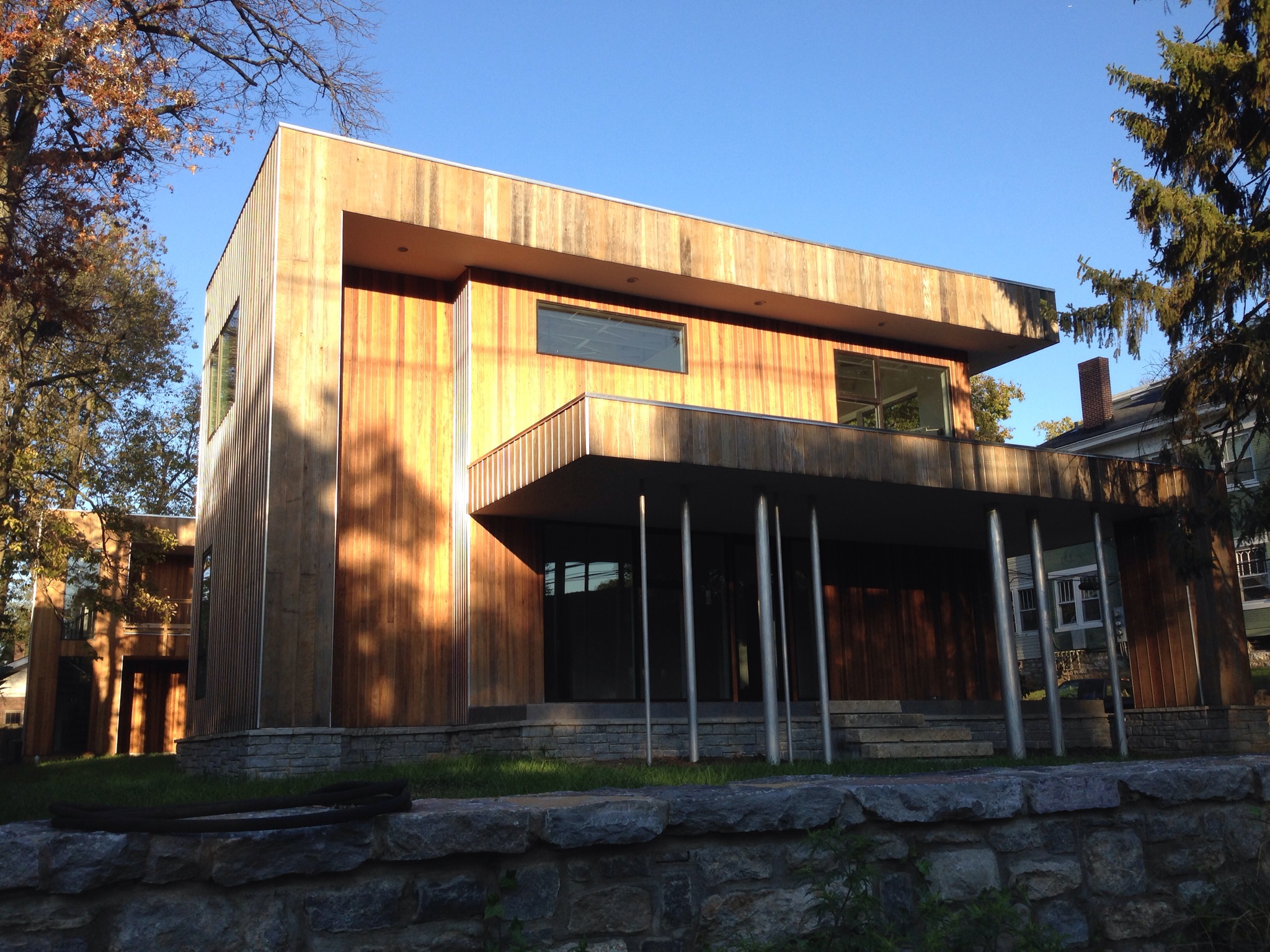
After Palm Springs I spent a few nights in Los Angeles which is riddled with great buildings. I particularly liked the lean towards more modern. Here's a few highlights. 

Garden Grove Church Los Angeles

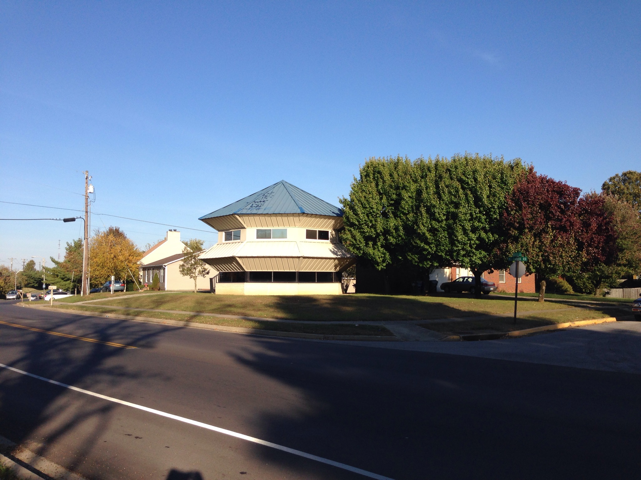
Garden Grove - the mid-century buildings are particularly interesting.  Writing about this later I can't believe how crazy those stairs are. 


Los Angeles Performing Arts Center

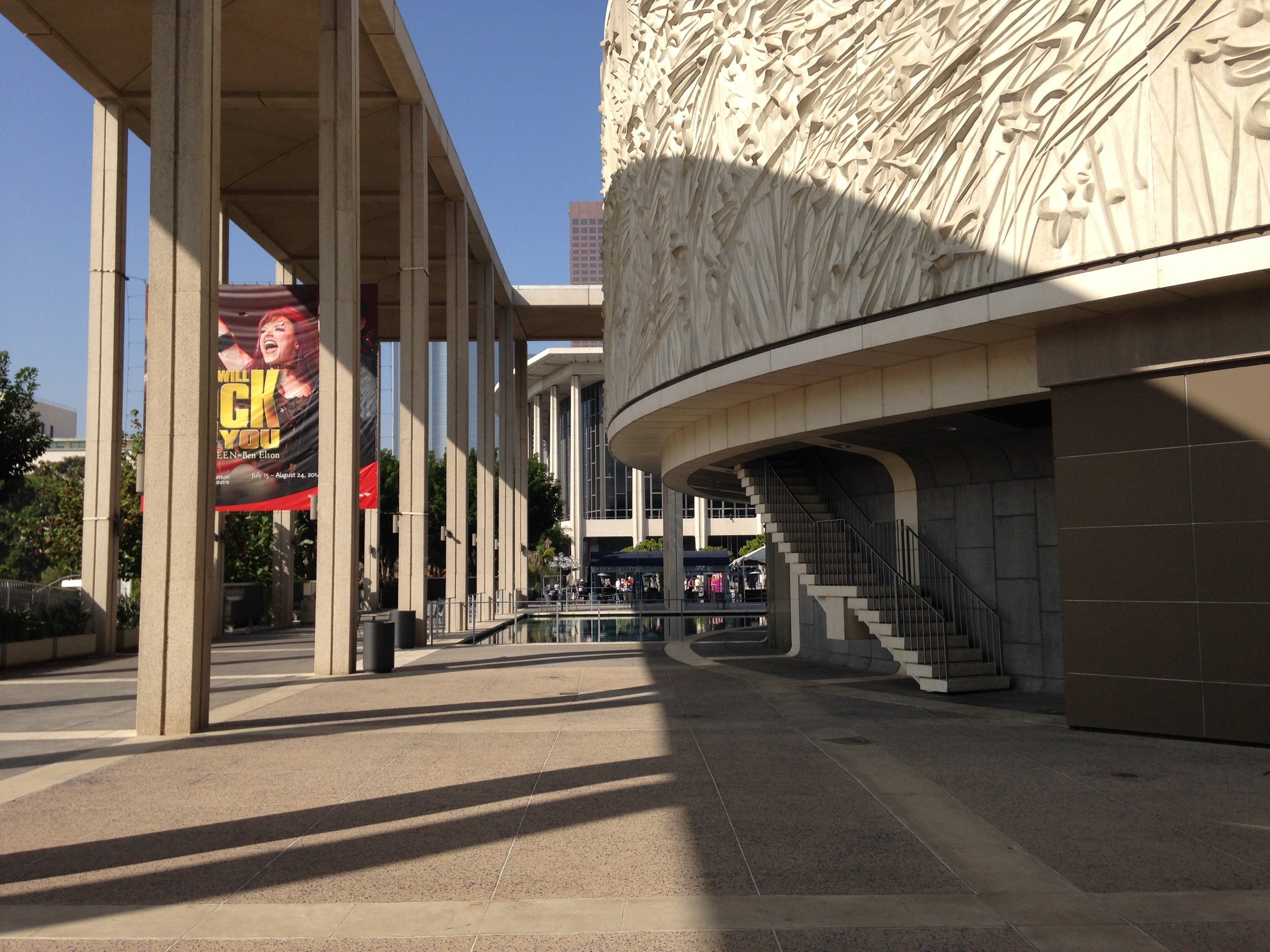
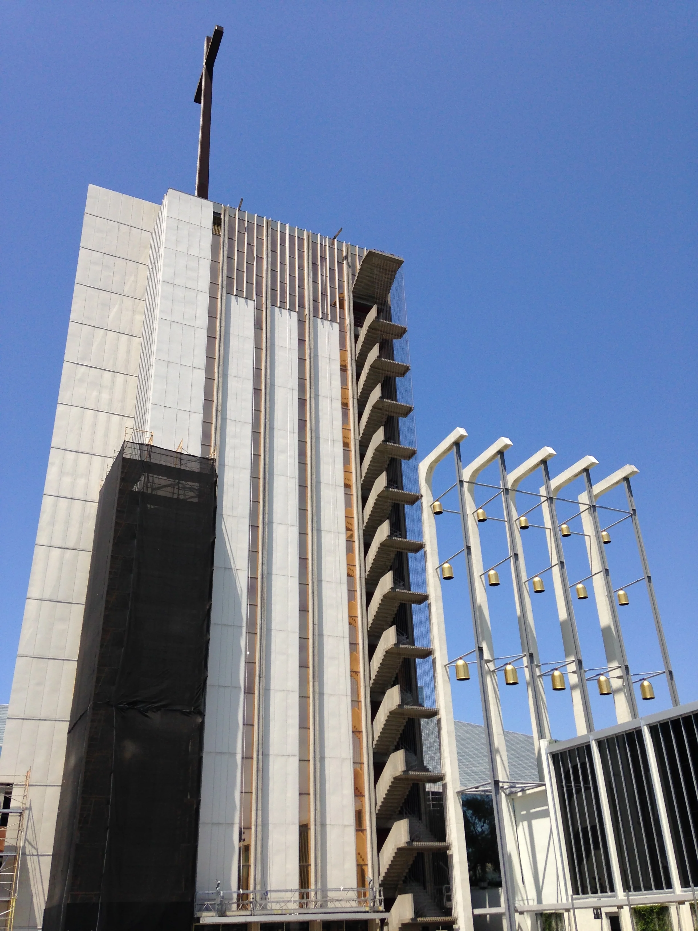
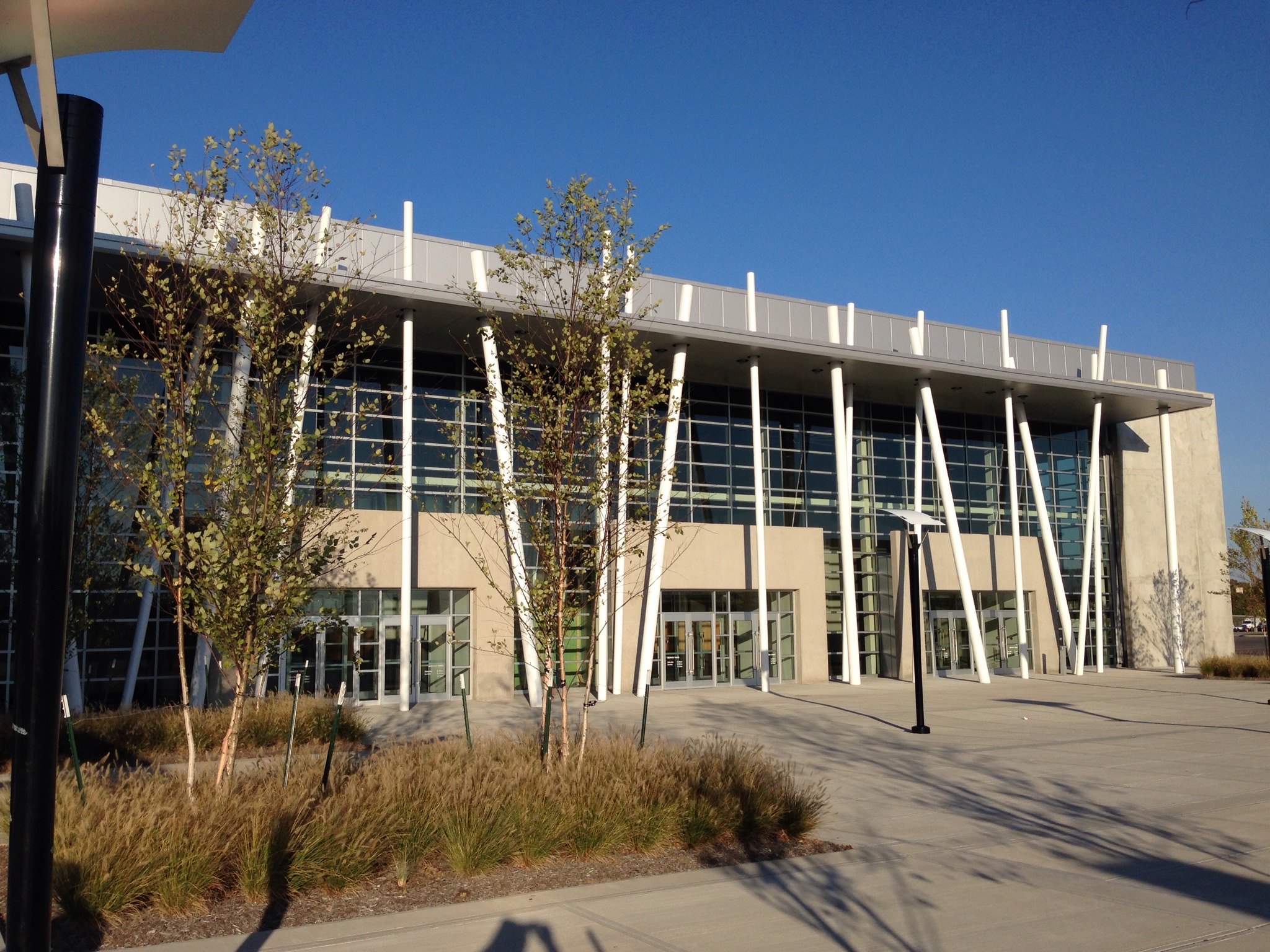
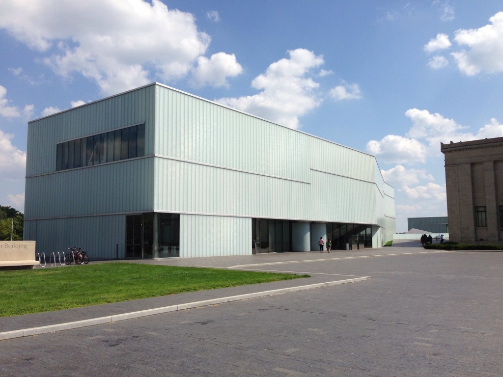
The Los Angeles Performing Arts Center was fantastic. I had so much fun just walking around the outside and enjoying the space.


Cinerama Los Angeles

The Cinerama looks fantastic. Can you tell I'm a Welton Becket Fan?


Capitol Records Los Angeles

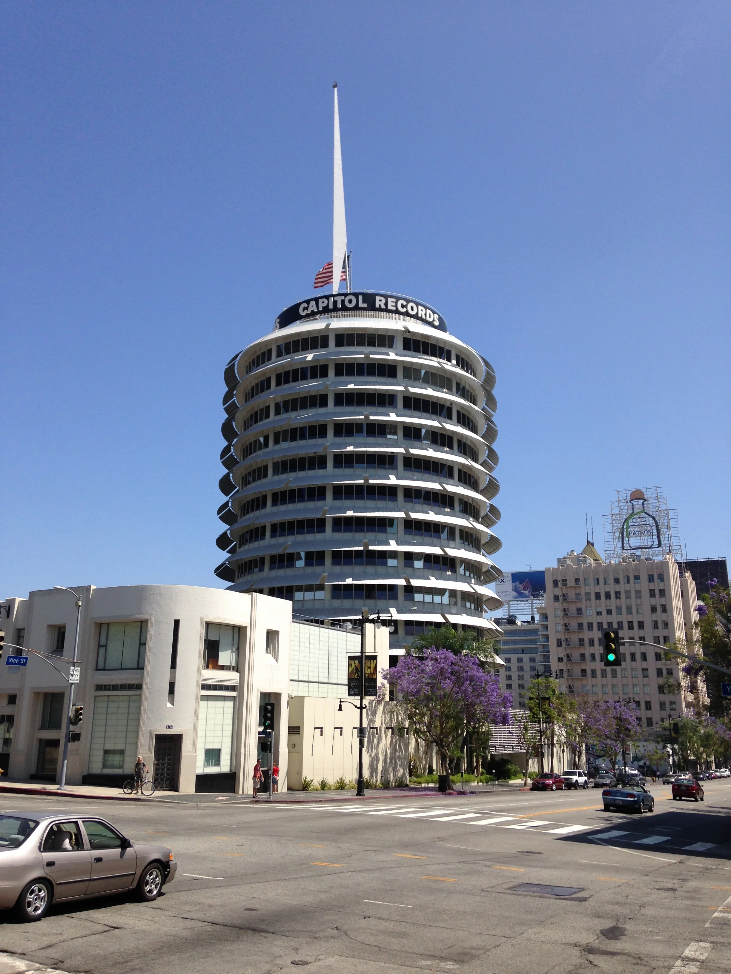
Capitol Records tower by Welton Becket. So Good.

I then decided to take the 1 and 101 up to San Francisco. This was a great drive that didn't contain much traffic and good views throughout. Along the way was Hearst Castle which is an interesting building of old California and movie stars.

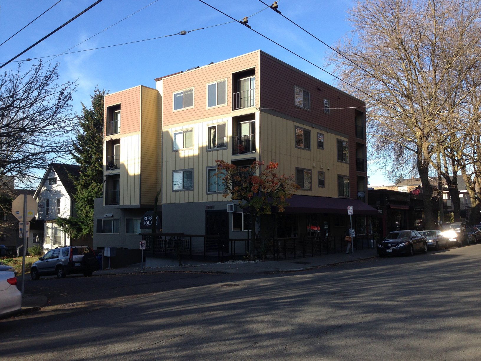
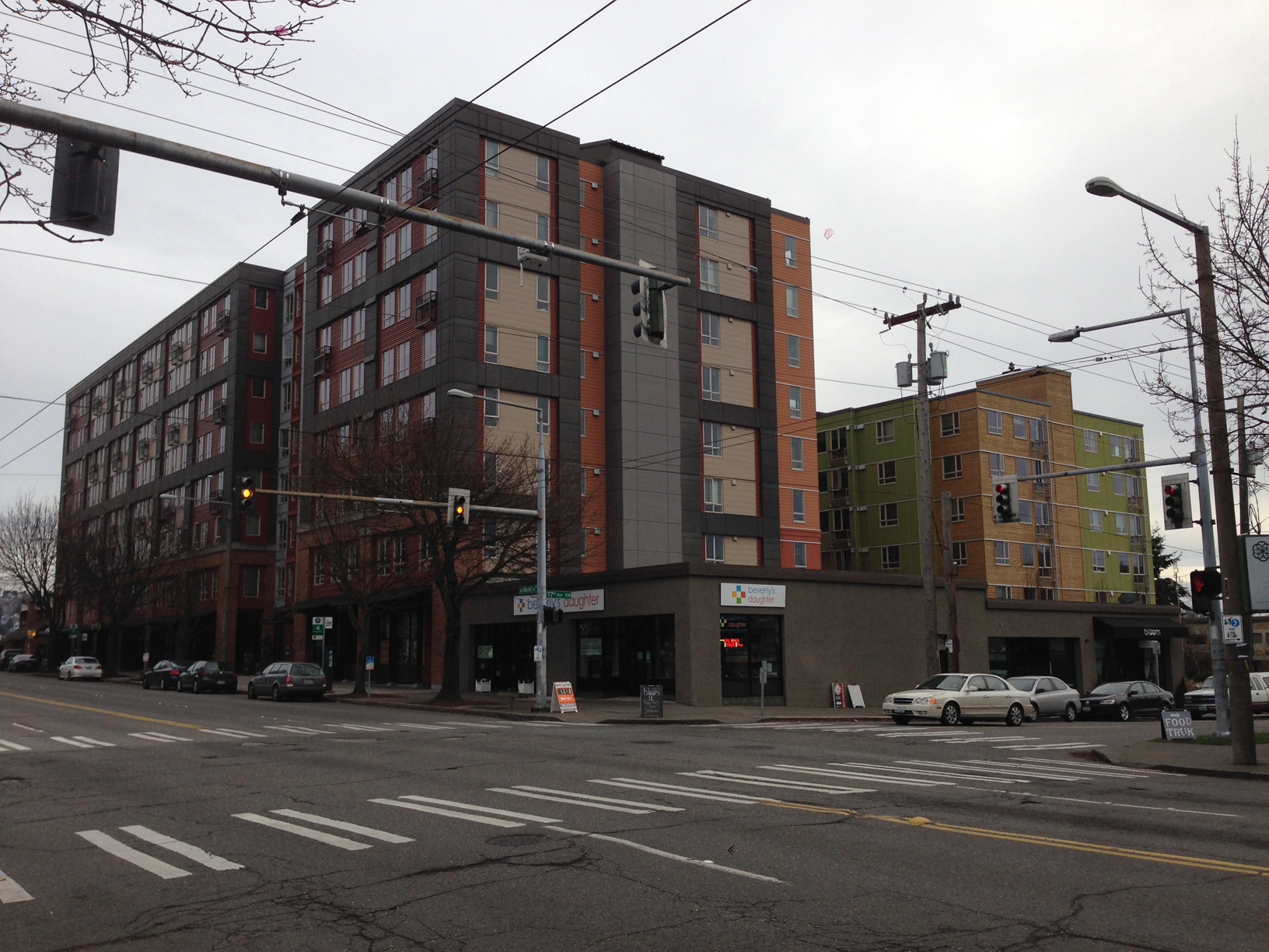
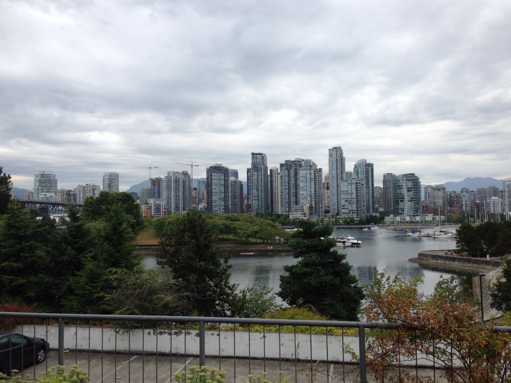
I then found myself in beautiful San Francisco. This city has quite a bit of charm and while I love the way the city looks, I know it comes at a price of making the city less affordable and livable. I did notice the city has lost some of it's edge which is unfortunate and something that Seattle also is finding itself trying to tackle with sky rocketing housing costs.

Cathedral Of Saint Mary Of The Assumption San Francisco

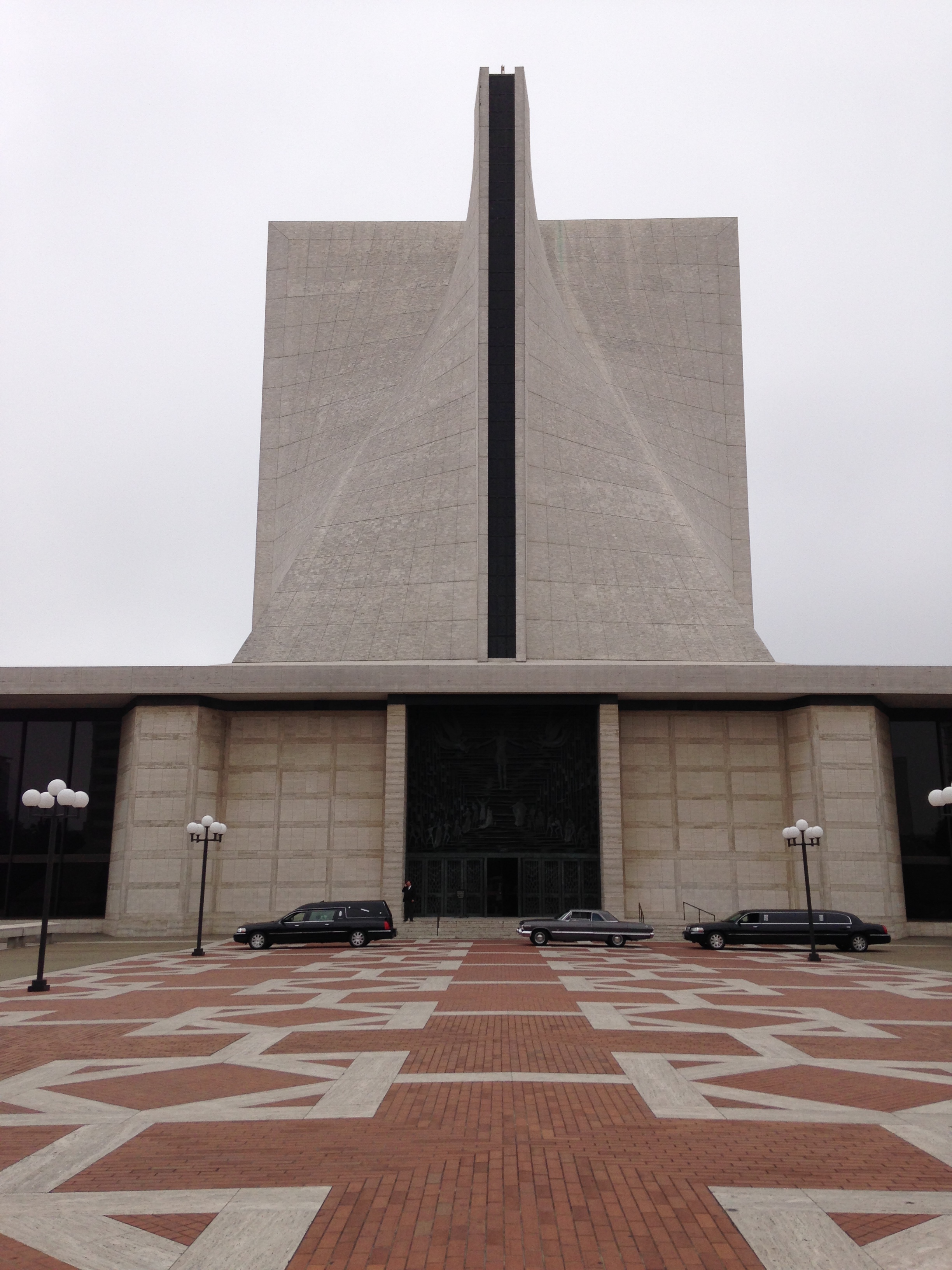
Some of my favorite discoveries on this visit was the Cathedral Of Saint Mary Of The Assumption. I couldn't go inside due to the obvious funeral occurring in the photo, but a quick image search suggests it's a good one.
 

Hyatt Regency San Francisco

I finally set foot in my first John Portman Hotel which featured a vertigo inspiring lobby and a desire to not miss another Portman hotel ever again. 

I then booked it to Portland to finalize my trip. 

Portland Building

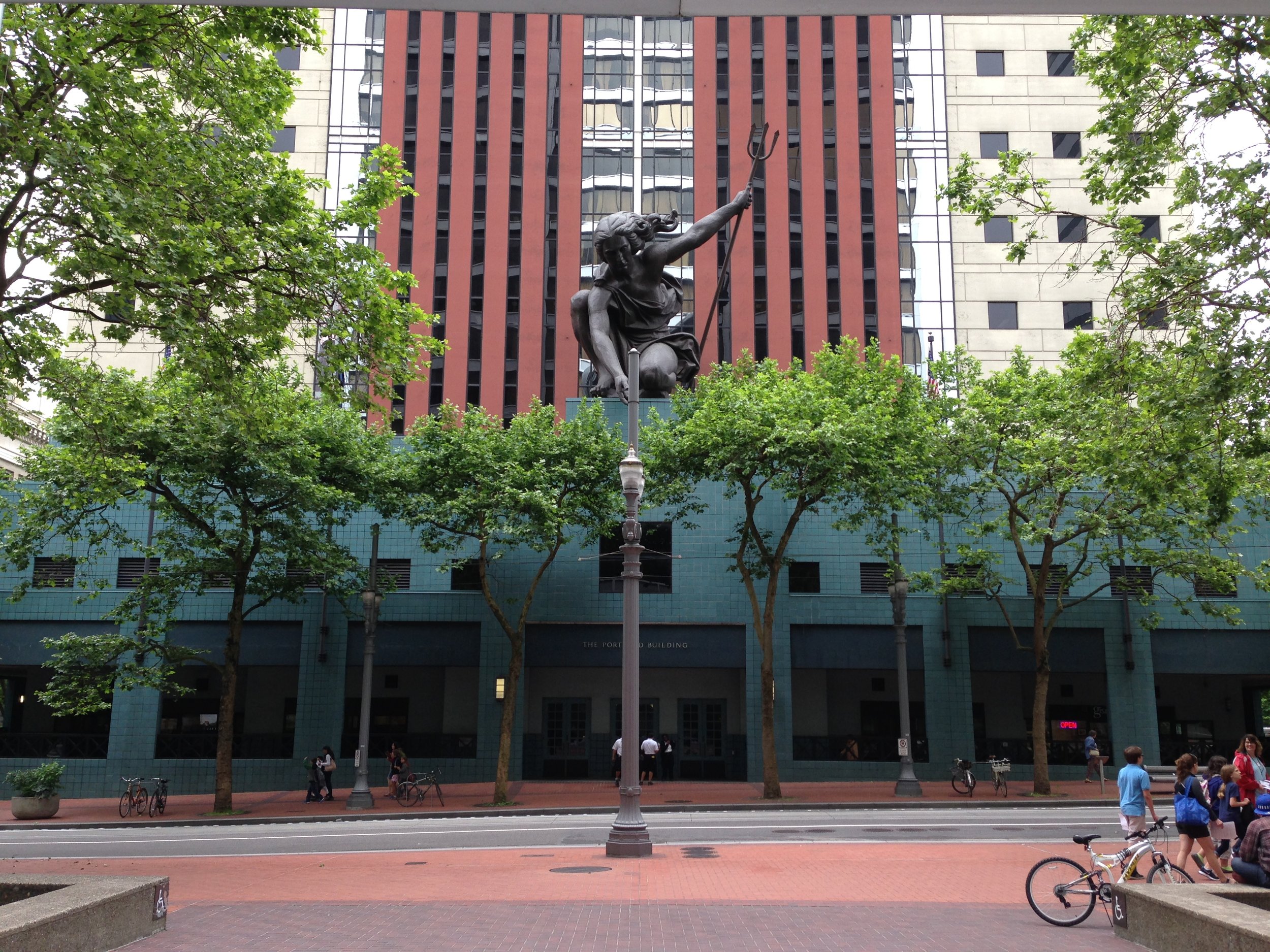
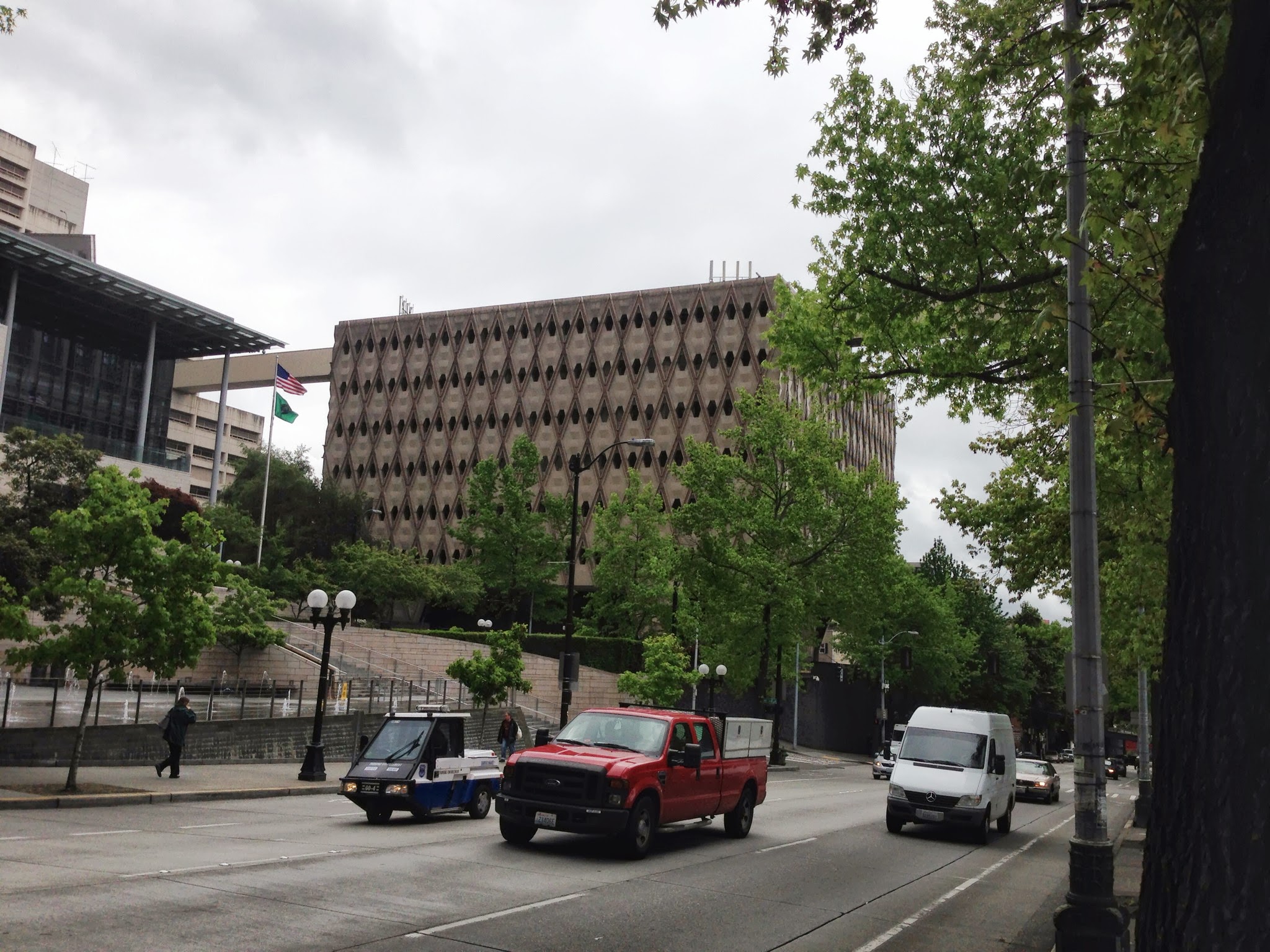
An architect can't go to Portland and not manage to grab a photo of Micheal Graves's masterpiece, The Portland Building. While dated, the building is considered high Post Modern architecture and I am glad that Portland decided to keep and restore it. 
 

Keller Fountain Park, Portland - Lawrence Halprin

I really like Lawrence Halprin's work and was happy to see the fountains were on at Keller Fountain Park. I wish we could do public spaces like this today. 

That concludes this trip. I hope to fire up this blog and keep posts coming into the future. Stay Tuned.

ARE's Programming, Planning, and Practice

ppppassYou may say, "boy, I haven't seen many updates on Matt's blog lately." If not, humor me. I have lacked in the writing department in an effort to cram information into my head and later dispelling it to pass the Architecture Registration Exams. Studying for the test reminds me of the college days where I would sit in the library reading every possible thing a day before a test, only for this test it's every night for weeks and the material is comparable to the old encyclopedia book sets we had back in the day. I recently passed the exam entitled Programming, Planning, and Practice (PPP) and thought I would share with fellow ARE takers some items I found helpful for the test. Jenny's Notes - Jenny's Notes summarize every possible item for the test with useful and relevant information. We also learn some fun facts about Portland.

Schiff Hardin Lectures - I found the lectures on the A201 and B101 to be very helpful in understanding the basic legal framework of the AIA contracts. The concepts of the A201 and B101 can be applied to many of the other contracts. No Sandbagging!

Ben Rudgers' Vignette Guide - Widely recommended on the forums, this guide established good vignette techniques that I adapted slightly to ace the PPP. The guide also includes hilarious asides.

I read both Kaplan and Ballast for this test. I took the advice of youngarchitect.org to read the following chapters in Ballast, that turned out to be helpful: 5 Site Analysis 15 Soil and Foundations 29 Energy Efficiency 30 Sustainable Design 35 Site work.

A Brief Tour of Seattle's Facades, a Lack of Commitment

About two months ago, maybe three at this point, I was debating the architectural excellence of a building my coworker picked out while we drove to a job site in Ballard. Per the usual, I argued that I didn't find anything particularly good about the building while my coworker (who loves everything) praised the buildings supposed architectural excellence. As I mustered up the reasons the building wasn't good, I finally realized the leading cause of mediocrity plaguing much of Seattle's bad architecture- an unnecessary use of many material and color variations. Since this realization, I slowly documented mediocre buildings that demonstrate a non-committed facade. Through the documentation, it's apparent there are a variety of strategies, which I've started to decipher below. Before heading into the tour, here are some basics to look out for. The material choices come in composite woods (hardie), metal, vinyl, and the oh-so-hot real wood. The configurations of the materials come in vertical, horizontal, squares, and shingle. The colors lean towards multiple dominant colors, with a slightly dull or dated tint.

Disclaimer: some of these can be difficult to look at. Please open another tab in your browser of good architecture in case you find yourself feeling weak.

An Initial Assessment of Seattle's Non-committed Facades:

Horizontally - Perhaps this building is a new theoretical argument for top, middle, and base. The "rusticated" green base, a wide vertical middle, and a thin horizontal top. In case the materials were not making the argument clear, 3 dominant paint colors are used to emphasize the facade strategy.

Vertically - We can see a similar strategy as mentioned above, except vertically. The material and color treatment suggests at one point the three different colored parts were separate massing elements. As the photo now demonstrates, the massing has been flattened, leaving the remnants of three different colors and two different material treatments (at least the colors aren't too terrible).

1/3, 2/3 - Outside the horrendous gluing of mass for what looks to be a wall vented fireplace, this building uses the 1/3 - 2/3 color strategy with white trim separating the vertical and shingle materials. Note how the adjacent property is the same configuration but the design uses a different color palette (so clever! I never suspected they were the same floor plans...).

Color 4 - The massing of this building indicates a love for saw blades as indicated with the roof line. Each additional massing strategy glued onto this building is further emphasized with a different color/material. The designer wanted to celebrate the saw blade idea by painting this a separate color (green) with a thin piece of trim (We wouldn't want to confuse it with the blue plane).

Color 5 - As massing grows, designers feel compelled to select more colors. The building on the left contains a more conservative massing strategy (not so much gluing to maximize profits) so the largely flat facade pops with 5 colors and 4 or 5 materials. Who needs a better massing strategy with a non-committed facade? (note the green and wood building on the right is still part of the same complex- color 7?).

Color 6ish - At some point it's hard to keep track of the colors, but this developer special building has a true uncommitted style to it's color palette.

Colors + Wood - What seems like a crappy developer copy of Silodam, the hot trend is to incorporate wood into the facade for a real pop. This building uses two colors of wood and inserts more wood randomly between windows on the left side. The randomness is topped off with the irrational play of blue on the wood side. It's like the designers can't figure out whats going wrong, so they impulsively add more materials and make the organization less rational.

Historically - While the lack of commitment is a more current occurrence, this house couldn't miss the opportunity to partake through the only power an older committed house can- paint. A separation of beige and brown is articulated horizontally on a board that meets the lower eave. No trim separation needed!

I could keep going, but I'll save you the torture. There are more in my ever growing album of Seattle's Non-committed Facades. The strategies are evolving and it would be interesting to follow up with this post in the future. The newest trend appears to be the random wood panel or color panel inserted into a monolithic portion as demonstrated with the color + wood project.

The non-committed facade is a poor design strategy that has dated these buildings, in addition to our city. I could see a good designer falling victim to this trend, but it's important to stray from complexity and use committed facade strategies. I would also like to encourage better massing, but this is a more difficult task.

---

On a closing note, either Gehry has fallen victim for Seattle's non-commitment or he studied up on his Seattle vernacular. I'll let you decide.

Lexington Modern - Honorable Mentions

So to wrap up the Lexington Modern series for now, I wanted to mention a few remaining gems of the Lexington area that deserved a honorable mention. The Parkette Drive In Parkette Drive In

The Parkette drive in is a good example of a 50s drive in diner, when signs were a fantastic piece of art built for automobile viewing. If Robert Venturi and Denise Scott Brown wrote Learning from Lexington, this sign would surely be indexed. The food also features some interesting items, one is the hot brown burger, a cheese burger with a slice of turkey and alfredo sauce, that I enjoyed on my visit.

Location: 1230 E New Circle Rd, Lexington, KY

The Spaceship House The Spaceship House

My friend, Jonathan, dubbed this the spaceship house. It's not something that I immediately warm to, but it's nice to see someone was thinking outside the box through some simple formal gestures. I feel this could have been the top of and small air traffic tower. I'd be interesting to see this adapted into a new structure, which could be a cool theory heavy building. The neighborhood also features some great mid century tract housing worth checking out.

Location: Mt Tabor Rd and Kasey Court, Lexington, KY

Southland Christian Church - Richmond Road Campus Southland Christian Church - Richmond Road Campus

This Lexington mega church is mega modern. The Richmond Road campus for the Southland Christian Church is in a re-purposed mall building that features some super contemporary design worth noting. The use of contemporary architecture for the church reminds me of the Catholic church reformation back in 16th and 17th century. The Catholic church would use extreme Baroque architecture to lure in more followers and separate itself from it's counter reformation foes who practiced a simple architectural style. It's odd how the counter reformation is still living on in church architecture. At any rate, the church was locked when we stopped by so I didn't get past a peering into the main hall foyer.

Location: 2349 Richmond Road, Lexington, KY

Living Arts and Science Center Addition

Front-View-900x390

Jonathan (the friend mentioned above) sent me an article in the Chevy Chase stating the Living Arts and Science Center is planning the ground breaking for a new contemporary addition. It's exciting to see a Lexington institution wanting to use modern architecture.


You can view more photos of these and other buildings from my recent trip to Lexington in this photo album.

Good Design Moment - Dakar Apartments

A gem of Seattle's Summit Avenue is the fantastic Dakar Apartment Building. Built in 1963, this mid century modern building has a great detail of diamond like forms layered on the facade. These forms break up the modern facade into an interesting mid century feel. One would assume the diamond material would be some form of concrete, typical of this style, but a closer inspection demonstrates the shapes are actually wood. darkarfacade

dakardetail

IMG_4925 One could loosely compare this facade to the theory that Alvar Aalto designed in a regional variation of modernism. As Aalto didn't follow the rigid rules of modernism for a more regional design, the Dakar Apartment Building doesn't use typical materials of mid century modern for a more regional material, wood.

Lexington Modern - Contemporary Stately Home

The most recent addition of Lexington's contemporary architecture is thoughtSPACE's "Indigenious Modern" house on the corner of Richmond Road and Richmond Avenue.  It's exciting to see something built that reflects today on a respectable street that reminds me of New Orleans in a lot of ways. IMG_4355

  The house's biggest exterior feature is a continuous cladding detail of vertical wood boards sandwiched between thin metal strips. The large formal gesture is reminiscent of the dutch modern style with large cantilevered lines articulating the massing. The front porch is a modern twist on the neighbors through its unsymmetrical appearance and random sized columns holding up the roof. The push and pull of massing creates an assorted understanding of the house, for example, the front facade looks different from the southeast than the northwest kind of blurring one's understanding of the facade.

IMG_4360

  The back yard features a really cool bridge that connects the master bedroom with a room above the garage.

IMG_4368

  The interior (from looking in the windows) features what appears to be reclaimed wood and with modern clean lines and finishes. The only item that has me questioning the textbook contemporary style is a large metal graphic of leaves/grass that serves as the guardrail for the stairs. Perhaps this was the indigenous part of the architect's term of "Indigenous Modern."

IMG_4365

  This house is a great addition of architecture in Lexington and deserves praise. Unfortunately, some people aren't warming to the building according to an interview in the Chevy Chase with the architect, John Steven Dehart. I would be surprised if modern architecture didn't face some level of opposition in any american community, but at some point we have to move from the architecture of the past and be true to the period of design that we live in today.

Check out more photos from my recent visit here.

Location: Richmond Road and Richmond Ave, Lexington, KY

Lexington Modern - The Miller House

Lexington's most famous piece of modern architecture is José Oubrerie's Miller House. It's impressive to see, even after 25 years, articles being published on the house. Some of these publications include an article by Dwell, a recent article by Evan Chakroff (also translated into Portuguese), and, as of last week, a whole book called In Suburbia Ego. This recent book will include the writings of many architects solely about the house. The Miller House I am relatively close to many of the people writing about the Miller House (including being José's student for a brief, but intense, quarter), but the thought that maybe my appreciation for the house is only a regional phenomenon is mute once we consider this house is an American Masterwork of the 20th and 21st century, according to Kenneth Frampton. He's clearly not from around Kentucky and seems to have a respectable take on these matters.

As stated above, architects in Kentucky and Ohio know a lot about this building, but I think it's fair to say people of Lexington know little outside the local arts scene. So here's a brief summary to get everyone on the same page. The building was a dream residence for a lawyer in Lexington by the name of Robert Miller. In 1988, Miller selected José Oubrerie to design it, who was the Dean of the University of Kentucky's College of Architecture. Outside academia, José Oubrerie was already an established world class architect who worked with Le Corbusier early in his career and had high profile works around the world. Two buildings that come to mind are Le Corbusier's church of Saint-Pierre in Firminy, which he completed at the request of Firminy's government, and his very own French Cultural Center in Damascus.

The Miller House has so much going on architecturally and theoretically. I've seen and read hours of it, but I'll save you from this, outside saying the red grid on the Wile Wolf Building that I compared to the Casa del Fascio should be in play again.

Image Showing the Original Site

The designed intent of the Miller House included its landscape, sitting on top of a hill, the natural features surrounding were intentional and complimented the structure. The highlight of the original site included a pond and a modest take on an English garden landscape with trees dotting the banks.  The site also included a tree lined pathway around the property line. This provided a great running track for the owner, in addition to blocking out the tract developments surrounding the site.

Image Showing the Pond from the 3rd Floor Balcony

I'm not completely sure about the whole history of the house, but apparently Robert Miller moved out. The house was vandalized and soon after a non-profit bought and improved the building for a brief time. During this time the Architecture School used it, local concerts took place there, and the house was even featured in a music video by, Neon Indian.

http://www.youtube.com/watch?v=lv8IsdbYR9g

After 2006, the non-profit sold the house leaving the future in limbo. Today Ball Homes owns the land surrounding the site and the owner of Ball Homes purchased the house this summer after the house sat on the market for some time. While I can't confirm this, word on the street is Mr. Ball bought the home for around 200-300 thousand, which seems laughable even in the housing market of central Kentucky.

The biggest shame of the house is the slow destruction taking place.  The Miller House's current state reminds me of a suffering hospital patient on life support. The current property has been voided of the pond and subdivided into 48 lots for tract homes.

Subdivided Lots of the former Miller House Property

When visiting the site recently, I took a copy of the lot map from the model home. It's clear there is no intention to keep any of the landscaping outside of the house and frankly, I wouldn't be surprised to see this house mysteriously drop of the map some night. There is an effort by Katie Halsey to get the building listed on a historical register, but the chances of that seem bleak, plus the aforementioned lots surrounding the house have been sold. The historical protection would limit development of the site, but what can one do once the surrounding houses are built?

To look at the future of this home, I can't help but think past comparing it to the fate of Villa Vaucresson (aka Besnus). The building may stay, but recognition of the original design won't exist through the slow distortion by people who don't know any better. It's just too late.

IMG_4335 More images from my recent visit of the Miller house can be found here.

Location: 832 Lochmere Pl, Lexington, KY 40509


Modern Lexington - Wolf Wile Building

As promised there are some really great architectural moments happening around Lexington. I was lucky to have my friend, Jonathan, drive me around and show me some buildings he's taken notice of, as well unexpected stops following my own verbal "ooo, what's that?" These moment's will be part of a mini series called Lexington Modern, which will focus on modern architectural places of the city. I will start with a building that is both, old and new.

Wolf Wile Building Front

Wolf Wile Building Front

In 1948, Lexington's Wolf Wile Department Store moved from a location near Union Station, at the time, to a brand new building on the corner of Quality and Main Streets. The building would be architecturally up-to-date and represent the newest in retail trends. The Architects behind the structure were Lexington's Frankel and Curtis (check out some of their other buildings!) and what appears to be a retail consultant, Amos Parrish and Co. The architectural design is a rare type in the region, but all the rage in the late 40s. The owners kept the building in good shape until 1992 when the store closed due to the competition of the ever-so-familiar suburban stores. Luckily, in 1996 the James N. Gray Construction company bought the former store and made it their corporate headquarters. Not too long following the purchase, the building was listed on the National Register of Historic Places.

Wolf Wile Entry

Wolf Wile Entry

The building is a great example of mid century modern. I find it very fortunate that both the original and current owners made an effort to preserve the building. Preservation of buildings this old, certainly ones of a modern style are hard to come by. The current owners, Gray, a design-build construction firm, not only took the time to preserve the existing building, Franklin Gray (an Architect) designed a new interior and a contemporary addition to the rear of the building (now used as the entry). This addition is excellent from the exterior and something that I appreciate in the context of Lexington's downtown. It shows how contemporary architecture can fit well within an old urban context.

Wolf Wile Building Rear

Wolf Wile Building Rear

The modern addition has familiar theoretical elements after my own quick analysis. The dominant element being the yellow platform that extends past the red steel grid. The platform reminds me of Le Corbusier's ship like element above the front door of Villa Vaucresson (aka Besnus), with the end angled piece similar to the protuding cooridors of La Tourette. The red steel grid could be compared to the facade of Terragni's Casa del Fascio making the argument of capitalism versus fascism. Capitalism, the platform, (with an american flag!) is superior and stable compared to fascism, the red steel grid, looking unorganized, slipping around the rear massing. This could then be compared to the former store itself, a capitalistic enterprise (oddly with Italian details inside) being protected by government regulations but, I digress...

This building is good and one that is luckily protected both by the owner and the government.

Check out Lexington Modern Photo Album for more recent photos and former images of the space used to list the building on the National Register of Historical Places.

Thanks to Peter Brackney for writing a informative piece about this building in 2011 that I used to find out so much about this building.

Location: Quality and Main Streets, Lexington, KY 40507

Lexington Modern - Wolf Wile Building

As promised there are some really great architectural moments happening around Lexington. I was lucky to have my friend, Jonathan, drive me around and show me some buildings he's taken notice of, as well unexpected stops following my own verbal "ooo, what's that?" These moment's will be part of a mini series called Lexington Modern, which will focus on modern architectural places of the city. I will start with a building that is both, old and new.

Wolf Wile Building Front In 1948, Lexington's Wolf Wile Department Store moved from a location near Union Station, at the time, to a brand new building on the corner of Quality and Main Streets. The building would be architecturally up-to-date and represent the newest in retail trends. The Architects behind the structure were Lexington's Frankel and Curtis (check out some of their other buildings!) and what appears to be a retail consultant, Amos Parrish and Co. The architectural design is a rare type in the region, but all the rage in the late 40s. The owners kept the building in good shape until 1992 when the store closed due to the competition of the ever-so-familiar suburban stores. Luckily, in 1996 the James N. Gray Construction company bought the former store and made it their corporate headquarters. Not too long following the purchase, the building was listed on the National Register of Historic Places.

Wolf Wile Entry The building is a great example of mid century modern. I find it very fortunate that both the original and current owners made an effort to preserve the building. Preservation of buildings this old, certainly ones of a modern style are hard to come by. The current owners, Gray, a design-build construction firm, not only took the time to preserve the existing building, Franklin Gray (an Architect) designed a new interior and a contemporary addition to the rear of the building (now used as the entry). This addition is excellent from the exterior and something that I appreciate in the context of Lexington's downtown. It shows how contemporary architecture can fit well within an old urban context.

Wolf Wile Building Rear The modern addition has familiar theoretical elements after my own quick analysis. The dominant element being the yellow platform that extends past the red steel grid. The platform reminds me of Le Corbusier's ship like element above the front door of Villa Vaucresson (aka Besnus), with the end angled piece similar to the protuding cooridors of La Tourette. The red steel grid could be compared to the facade of Terragni's Casa del Fascio making the argument of capitalism versus fascism. Capitalism, the platform, (with an american flag!) is superior and stable compared to fascism, the red steel grid, looking unorganized, slipping around the rear massing. This could then be compared to the former store itself, a capitalistic enterprise (oddly with Italian details inside) being protected by government regulations but, I digress...

This building is good and one that is luckily protected both by the owner and the government.

Check out Lexington Modern Photo Album for more recent photos and former images of the space used to list the building on the National Register of Historical Places.

Thanks to Peter Brackney for writing a informative piece about this building in 2011 that I used to find out so much about this building.

Location: Quality and Main Streets, Lexington, KY 40507

Pittsburgh is Great

Now I have been a Pittsburgh Steeler's fan since 1995 when the Cowboy's cheated their way into a Super Bowl victory. It was an odd alliance given I had never been to Pittsburgh and couldn't find it on a map easily in 1995, but one I've kept through the good and bad years of the Steelers' career (it's looking like it may be one of the bad years- Titans! really?) Outside of Football, Pittsburgh the city is great. I was lucky to be there for new years eve two years back and most recently for a wedding and I have to say Pittsburgh is a great city. My first memory of being in Pittsburgh was riding a greyhound bus to see friends in Allentown, Pennsylvania (I still owe Brent and Suzanne for the hospitality on that stay). I remember well entering the city which is best described as a blah blah blah of a long tunnel followed by a BAM! city all over the place. I managed to pull off a poor video of this moment. The video isn't as good as the real thing.

I would like to share a whole album of great buildings of the city, but unfortunately for the photo album, I was there to see great friends get married. I did manage to get a few shots of the University of Pittsburgh, which is one of the better campuses I've been to. The university is integrated well into the city and has densities that any college campus could use. I was intrigued by the Cathedral for Learning, the tallest building around, and managed to get a quick look. This building was fantastic! The Gothic style common space and classrooms resembling 29 difference countries was fascinating. We only managed to get into a handful of the rooms but this building was well designed and such an interesting concept. It was an entire university in one building, a vertical model instead of a horizontal. I highly recommend taking a look at this and all the many great building around Pittsburgh. I hope to get there soon and have a legit exploration of the city.

Take a look at the photos I managed to get (mostly photos of the Cathedral of Learning).

View Down Forbes Avenue

Bellevue and its Architecture

Seattle likes to make fun of Bellevue, but this shouldn't reflect on interesting architecture in the city. While looking at the Bellevue Arts Museum with Evan Chakroff, we took a moment to see what else the city had to offer. There were some interesting projects such as the Bellevue City Hall or the New Elements Tower, which featured a decent looking tower (diagrammatically interesting too). Take a look for yourself in the photo gallery. IMG_2452 (2) v

Bellevue Arts Museum - Steven Holl

I found myself at the The Bellevue Arts Museum this weekend to discover another Steven Holl work just a short drive from Seattle. This museum has some of the common found elements including a play with natural light throughout the space and a sculptural quality of the door levers and handrails. This is a successful building that fits the program (3 dimensional pieces) nicely and has some great design moments. I particularly enjoyed the rooftop courtyard and adjacent stairway wall of light. The red concrete was surprisingly pleasant with what a appeared to be the short side of a 2x4 creating the overall texture (I can see the contractor rolling his eyes and suggesting plywood molds to save costs).

Outside the architecture, there was a cool exhibit by Rick Araluce called The Minutes, the Hours, the Days

Take a look at the photos.

Bellevue Arts Museum

Good Design Moment - Sieg Hall

So I wrote earlier that I would post another project relating to the King County Administrative Building in Seattle. I was interested in the architect Roland G. Pray to see what other work he may have done and found the only website with anything besides an obituary on the guy. I took a moment to Google a few buildings in the list and found Sieg Hall, a building I photographed a month earlier on the University of Washington Campus. It's a pretty good one on a Beautiful Campus. We can see a geometric compositions similar to the King County Administration Building. Good Job Roland G. Pray.

Seig Hall - University of Washington


Source: University of Washington Digital Collections


Source: University of Washington Digital Collections


While I think the building is great, the general public and users finds it dated and bad. Which may be partially true of its construction and maintenance as visually described on the sarcastically entitled webpage Beautiful Sieg Hall -- "The Pride of UW"

Good Design Moment - Kansas City International Airport

The Kansas City airport designed by Kivett and Myers was a nice surprise a few weeks ago. Designed as an "Airport of the Future", it has many cool features that, much like TWA Terminal in New York, features an impractical design for modern air travel but is too good to demolish. Much like JFK it looks like the future prospects of this airport are limited with a new terminal being planned. Kansas City International Airport

It's great to see the road names around the airport terminal indicating the big ambitions that both TWA and Kansas City had for this airport.

Source: Google Maps

Vancouver and its Architecture

Two weekends ago I visited Vancouver, British Columbia with Evan Chakroff to see what's going on. Our goal was to see what we could with a rough outline of buildings on a spreadsheet and a handy book entitled Exploring Vancouver: The Architectural Guide by Harold Kalman & Robin Ward. Overall the city seemed more European than American and included a better tolerance to architecture of all decades. The city is littered with high points in many architectural styles and citizens try protect some of the best as the case of the Dal Grauer Substation (1954). As I reviewed photos for this post, I felt intrigued by many of the city's parking garages. The next time I head up there I'll have to document these better.

The city planning is something Vancouverites take great pride in coining the term "Vancouverism" and you can see the benefits of fighting the bad strategies most North American cities were implementing in the postwar area of freeways and superblock buildings. Vancouver's lack of freeway access to the city center (or centre) stands out as the largest element of Vancouverism. One has to drive through neighborhoods to get to the city center and the whole fabric of the city is full of street life.

Both The University of British Columbia, and Simon Fraser University had some of the best stuff around. The city also features some great Arthur Erickson.

Take a look at the photos. I have to convey that I am disappointing in the composition. Since I lost my camera in Tuscany 3 years ago I haven't been the best about taking photos and this album demonstrates this. I need to work on my photography skills and overall documentation of buildings.

Enjoy.

Vancouver Skyline

Check out the Vancouver Architecture Photos

Also check out the Simon Fraser University Photos

Nelson-Atkins Museum of Art - Steven Holl / Wight and Wight

I found myself in Kansas City this weekend and stopped by the Nelson-Atkins Museum of Art to check out Steven Holl's addition. The design was well composed playing with the landscape east of the original museum building. The light on the interior was fantastic and made for a great space. I was surprised by the museum's collection of art and the original building designed by Wight and Wight. Oh, and the museum is free. I was only in town for a few hours, but given this I'd like to go back and discover some more gems of the city. Nelson-Atkins Museum of Art (Bloch Addition)

Check out more photos here!

Read more about the Museum on Steven Holl's Website.

Good Design Moment - King County Administrative Building

On my first day of work in Seattle, I took note of the King County Administrative Building on my way to Pioneer Square. I snapped a shot of the building and dug it up today for this post. A quick Google search led me to a Wikipedia article describing the building as "ugly" and the architect Roland G Pray. I am not surprised by the lack of attraction to this building- it's likely the same people who think slapping a stucco pilaster on a tract home as a beautiful design. If we take a moment to actually look at the building it's very interesting. It was built in 1971 and represents this point in time well. It's tectonic exterior facade is fantastic with a simple layering of structural elements (that seem to have held up pretty well). I was surprised that the natural light was decent inside given the relatively small window openings. My only general critique is the entry and how the building does not address the street, which was likely impossible for the architect to with with past zoning regulations anyhow (I'm sure the "ugly" naysayers described above will blame the architect anyway).  Comparing this building with the Seattle Public Library seems easy with it's playful and geometric exterior and other obvious themes. Perhaps I should write about this in a future post.   King County Administration Building   King County Administration Building

  Stay tuned for more relating Good Design Moments relating to this project.

Interesting Art Project - Bad Zoning

700 Delaware Ave, SWI recently received an article from a friend who thought  this was an art project worth checking out. A former church has become a building sized mural in Southwest DC. This seems like an interesting idea, and one worth checking out, but this speaks more to the bad planning by Washington than the cultural shift of religion. The Southwest portion of DC was used as a grand experiment of city planning in the 50s through 70s. The area is plagued with awful zoning. much of the old existing street grid was tore up for large thoroughfares and freeways. Today the experiment is over and while many great architectural building still remain, there lacks the mixed use needed to bring this area back. If proper zoning took place, this former church/art project could make for a great bar, restaurant, or concert venue.

Las Vegas

So time has passed since my last post. I was putting in extra hours at the office and in early June I went to the homeland for a vacation. I had not been in the valley for almost one and a half years and I was very pleased to see the place was just as I remembered it. First, the weather was beautiful with dry heat and unseasonably cooler temperatures. I sat outside a Starbucks in 90 degrees and thought this is what 90 degrees should feel like. I was happy to see all my friends and family were doing well. When flying in, I realized I forgot about the city's true scale of sprawl. It's amazing from the perspective of someone now living on the east coast to see a world of such low density. I think the sprawl isn't as bad as I thought it was in the past. While there are still negative impacts, certainly on the environment, I think the city for the most part can adapt what they currently have to make the city better through increasing densities in older parts of the city. I'm glad to see a push towards moving into downtown Las Vegas. This part of town is a true gem and I'm sure rents will rise as more people realize this.

I found a few new development since I last lived in the city. I am happy to see the mass transportation system is still expanding and really meeting the needs of the high density routes. I am glad to see the new terminal and signage system for McCarran Airport, although the new airport doesn't seem to be nearly as attractive as the adjacent terminal 1. The pastel colors of the parking garage reminds me more of post modern architecture over something complimentary to the desert landscape and Terminal 1. Additionally, the designers of the parking garage convey a real slapdash placement of the building with the center spiraling ramps being about 20 feet off center of Maryland Parkway.  Every time I sat at the light of Maryland Parkway and Russell Road I cringed at the off centered spiral. It would have been a simple and easy gesture to have the spiral on axis with Maryland Parkway. I would comment on the airport itself, if I could have seen it over the parking garage.

The Lou Ruvo Center for Brain Health was less exciting that I thought it would be. I found the steel structure overwhelming. The main interior space seems like it could offer something good.

I also took a moment to look at Predock's Las Vegas Library also part of the Lied Discovery Children's Museum. I was really surprised at what the library had to offer. One of my favorite features were the outside reading rooms. The small rooms inserted around the exterior of the building offer patron the ability to take books outside without checking them out. A really good courtyard inserted in the center of the building reminded me of the courtyard next to the Cordoba Cathedral where small canals allow water to flow from one tree to the next. Unfortunately, this courtyard looked closed and not well maintained. I recommend a stop for the designers in the valley that haven't been inside since childhood.

I like the development around the center of the strip. My only complaint is the new pedestrian walkways around the Cosmopolitan and City Center are a pain to navigate. The design of the walkways don't address the need for pedestrian to pass by the two casinos, instead making you go into the mall or walking down to street level to only go back up shortly after. Also, could the county finally connect Harmon to a major street on the west side of I-15? This is a great thoroughfare that is underutilized.

All in all, the city is still great. Keep up the good work Las Vegas.