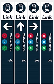
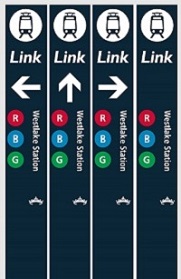
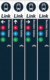
Link Light Rail Signage Options

Sound Transit is reconsidering their current signage for the light rail stations and has recently issued a survey asking people what they think. They have three pretty similar options, but I want to advocate for the best option which includes a white bar across the top with a big arrow indicating the entrance to the station. 

As a transplant to Seattle, I found the signage woefully inadequate and non existent in my first year. I didn't actually realize there was any signage of the current system until this survey... So anything that grabs your attention and lets you know where to go is of the most importance. 

There are some fundamental issues that will still be baked into the system, like the naming the train system Link when everyone largely calls it light rail. I hope that over time the Link takes on a brand identity like the T in Boston or the L in Chicago (who clearly wins the clever points). With that being said, below are the options proposed and the survey for you to take.  

Link to the actual survey (not good on mobile devices) - http://ow.ly/8Ajy30iaRUM

Interesting Art Project - Bad Zoning

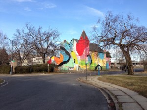
700 Delaware Ave, SWI recently received an article from a friend who thought  this was an art project worth checking out. A former church has become a building sized mural in Southwest DC. This seems like an interesting idea, and one worth checking out, but this speaks more to the bad planning by Washington than the cultural shift of religion. The Southwest portion of DC was used as a grand experiment of city planning in the 50s through 70s. The area is plagued with awful zoning. much of the old existing street grid was tore up for large thoroughfares and freeways. Today the experiment is over and while many great architectural building still remain, there lacks the mixed use needed to bring this area back. If proper zoning took place, this former church/art project could make for a great bar, restaurant, or concert venue.

Capitol PechaKucha Disappointment

I attended my second round of Capitol PechaKucha this past Thursday and, unfortunately, it was another disappointing night. Luckily it's not the speakers that are the problem, but the organizers of the event. They come off as the kind of people who don't pay attention to the details to an astronomical level. They also praised the fact that they have been around since 2007, which is more scary that the details haven't been worked out by this point. The first problem is they haven't managed the process of checking tickets. The fact that you have to pay $10 to attend seems odd, but it's Washington, so I digress? The ticket people seem like they were just handed a list and hadn't thought of a process to check off people and verify IDs. This may also be a simple problem on my part of showing up way too early. For some reason the time posted isn't the actual start time of the speakers, but an hour of listening to DJ cool play his jams while drinking overpriced (not so cold) beers. It's also sad that there are never enough chairs at the events. The latest event was so bad that there were only about 10 long benches/couches. Good work making everyone uncomfortable!

The last time I attended the event, I was surprised that the hosts pronounced Pecha Kucha incorrectly. I was laughed at in Columbus for not being able to get it right, but thought maybe Columbus and I had learned to pronounce it incorrectly. I was relieved when a speaker, who had been to the one in Japan, took a moment in her presentation last event to correct the hosts. The event on Thursday proved that nothing came of this public correction. They still pronounce it incorrectly.

After all that I wasn't surprised to realize that the projector had not been set up properly, cutting out 1/10 of the bottom of each slide, when compared to the laptop screen. I found this particularly bad with the fashion presentation, where the whole outfit wasn't being projected.

The one thing out of the control of the organizers, but worthy of noting was the audience talked through presentations to a point that presenters couldn't be heard. What is wrong with these people?

I know the PechaKucha system works on a kind of honor system, but I would recommend the PechaKucha committee revoke the current organization association. Washington DC deserves a organization that lives up to great standards that would make the event as fun as the ones I've attended in Columbus and Springfield, Ohio.

Useful Links: How to pronounce Pecha Kucha: http://www.youtube.com/watch?v=gdghID66kLs

I Like My Architecture Plaid

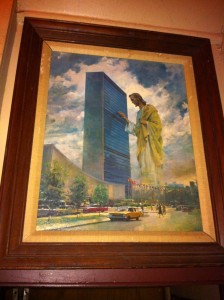
We were at a our local bar the other day, when someone noticed a picture in the dimly lit corner of Jesus blessings a building. I jumped up and examined the picture to recognize the building as the United Nations Headquarters. I say "great design," followed by a friend asking "whats so great about a box?" This question comes up often. I don't think Washington solely possesses this architectural pessimism, but Washingtonians have a way of becoming experts on anything with all the Master's Degrees. I know I can't change an international relation's expert on architecture, but I'll beg that one hear me out.

What instills confidence that the UN Headquarters a great building is the fact that Oscar Niemeyer and Le Corbusier designed it. I don't know the in and outs of the building, but I know that these two were/are (Oscar is 104! -[Update- Oscar passed away December 5, 2012]) very competent designers with a record surpassing most architects in the past and now. My confidence in these two architects' designs is similar to the confidence most people have in Apple. I don't know every Apple made device, but I can easily argue every product is good. Apple products are known to work well, be built well, and have an intuitive interface. No one can compare!

So what makes Oscar Niemeyer and Le Corbusier so good? In the word of my graduate studies professor, Robert Livesey, "What is it doing?". Everything Corbusier touched was full of symbolism, strategies, historical references, and arguments that would take hours of Doug Graf  diagrams to explain. Niemeyer even recognized the brilliance of  Corbusier calling him "the master"  and he would use these same devices in his own work.

I know this isn't going to convince anyone outside of architecture that the UN Headquarters is great. What makes any architectural argument weak to a laymen is their understanding of architecture as an aesthetic. Architecture is a language. I can't speak French to a German and expect him to understand much. In a similar way, an hour long presentation analyzing the UN headquarters won't make much sense if you don't understand Chandigarh or Brasilia. If one want to truly discuss the merits of the built environment,  it's imperative to know basic architectural language.

If architecture is only an aesthetic, there isn't much to discuss. I like plaid you like stripes.

Communities and Metro Stations

Washington Metro LogoSo I was looking the breakfast links on Greater Greater Washington this morning when I found a hilarious post (including a sarcastic map) by Matt Johnson and David Alpert regarding the new Silver line station names proposed by Fairfax county. Working Station names proposed by WMATA were cited as too boring. Fairfax County's effort churned out an even more boring list of names, all starting with a certain large region then hyphenated  into more specific area (table below). I don't know much about Virginia, so I can't speak to the superiority of the names, but I imagine everyone could do better. Maybe I should send Fairfax County the London Underground map hanging above my desk for inspiration? I pull two valuable lessons from this. a) The community may not be the best source for a station names largely because b) the community, in general America, doesn't value the rich resources of history. We should hand over new station names to regional experts and historians. I bet they could draft up meaningful station names fulfilling everyone requirements and maybe give everyone a new perspective of each neighborhoods. If we could start valuing knowledge again we could overcome this fiasco.

Working name Fairfax proposal
Tysons East Tysons-McLean
Tysons Central 123 Tysons I&II
Tysons Central 7 Tysons Central
Tysons West Tysons-Spring Hill Road
Wiehle Avenue Reston-Wiehle Avenue
Reston Parkway Reston Town Center
Herndon-Monroe Herndon-Reston West
Route 28 Herndon-Dulles East

I'm betting , in the end, the strongest power of corporate and developer interests will win this war. Prove me wrong Fairfax County!

Everyone's an Expert

I was reading a column by John Kelly entitled "Could D.C.’s Metro stations be prettier? Or do they reflect the city perfectly?" in the Washington Post. The article questioned how well Metro Stations resembled Washington the way that other cities (mostly the spectacular international ones) do. The person he used in the article was a  Mechanical Engineer named Dale to make the case that the stations needed improving.

This article largely reflects the dilemma of design. I don't know the ins and outs of the Metro quite yet, but I do know that the system well designed architecturally. The system is functional, but creates an unconfined and comfortable space. I can't think of many stations, and I have been to quite a few, that aren't cluttered by columns or strike fear in the claustrophobic. Luckily Kelly agrees with me on this point.

One can suggest many reasons for the same design of every station, but the most important is that it makes the system clearer. I bet there are two sets of escalators at each end of the station, and if there is another line running I bet I can visually find it through a perpendicular vault and the audio cues of the trains on that line.  Who knows how many signs and tunnels I would have to go through to do the same in London, or Berlin.

I think dolling up the stations would simply be that. A ficticious application to make the people of the time feel like their station is cool. This would largely follow the culture of now, being grossly outdated within 10 years, if not sooner. Then we would be hearing about how out dated the station is and how it needs to be improved. The Metro stations are classic, not to decorated, and functional. 30 years from now the people will still feel the stations are boring, but that sure beats the ugly that dated architecture cliche quickly becomes.

On a closing note I would just like to say, good design is always taken for granted. The Metro stations have so many brilliant details that people likely don't notice. My favorites are air conditioning that comes from the tall brown information signs and under the concrete benches- or that the majority of the light comes from reflections off the vaults- or that the audio system was originally hidden below the side walls to hide all the clutter of most train systems. I think we should celebrate and embrace maintaining the original design. It has proven successful since the 60s and people should recognize it for that.