
Here is a podcast I participated in with Charles Fadem and Rachel Scott from my office talking a little bit out the transit of the region and a comparison to other cities I've lived in.
A Brief Tour of Seattle's Facades, a Lack of Commitment
About two months ago, maybe three at this point, I was debating the architectural excellence of a building my coworker picked out while we drove to a job site in Ballard. Per the usual, I argued that I didn't find anything particularly good about the building while my coworker (who loves everything) praised the buildings supposed architectural excellence. As I mustered up the reasons the building wasn't good, I finally realized the leading cause of mediocrity plaguing much of Seattle's bad architecture- an unnecessary use of many material and color variations. Since this realization, I slowly documented mediocre buildings that demonstrate a non-committed facade. Through the documentation, it's apparent there are a variety of strategies, which I've started to decipher below. Before heading into the tour, here are some basics to look out for. The material choices come in composite woods (hardie), metal, vinyl, and the oh-so-hot real wood. The configurations of the materials come in vertical, horizontal, squares, and shingle. The colors lean towards multiple dominant colors, with a slightly dull or dated tint.
Disclaimer: some of these can be difficult to look at. Please open another tab in your browser of good architecture in case you find yourself feeling weak.
An Initial Assessment of Seattle's Non-committed Facades:
Horizontally - Perhaps this building is a new theoretical argument for top, middle, and base. The "rusticated" green base, a wide vertical middle, and a thin horizontal top. In case the materials were not making the argument clear, 3 dominant paint colors are used to emphasize the facade strategy.
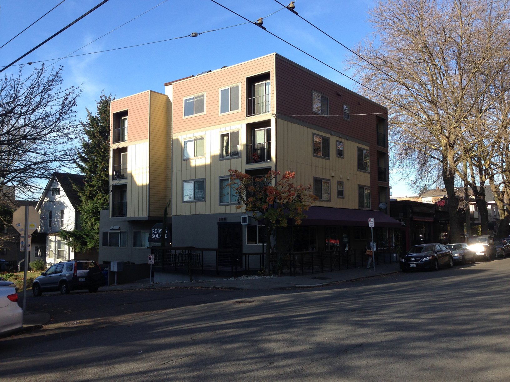
Vertically - We can see a similar strategy as mentioned above, except vertically. The material and color treatment suggests at one point the three different colored parts were separate massing elements. As the photo now demonstrates, the massing has been flattened, leaving the remnants of three different colors and two different material treatments (at least the colors aren't too terrible).

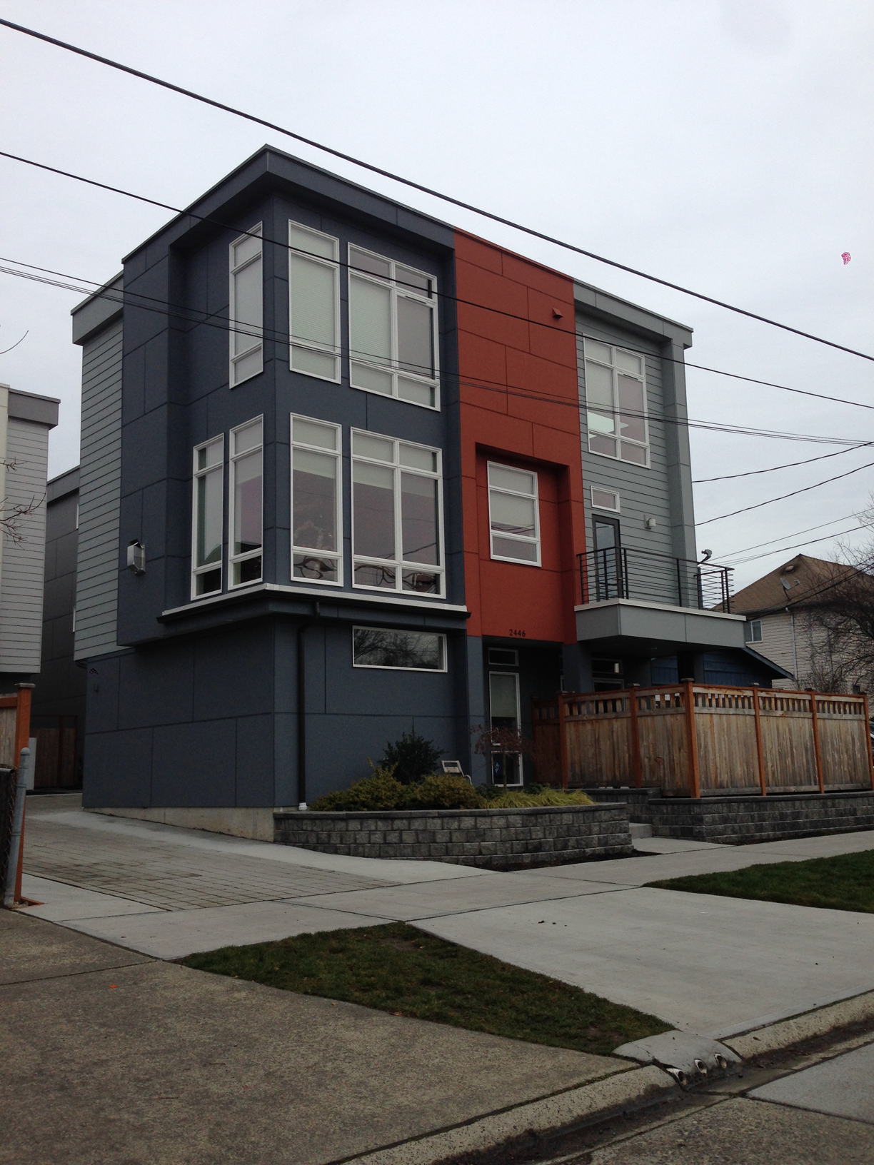
1/3, 2/3 - Outside the horrendous gluing of mass for what looks to be a wall vented fireplace, this building uses the 1/3 - 2/3 color strategy with white trim separating the vertical and shingle materials. Note how the adjacent property is the same configuration but the design uses a different color palette (so clever! I never suspected they were the same floor plans...).

Color 4 - The massing of this building indicates a love for saw blades as indicated with the roof line. Each additional massing strategy glued onto this building is further emphasized with a different color/material. The designer wanted to celebrate the saw blade idea by painting this a separate color (green) with a thin piece of trim (We wouldn't want to confuse it with the blue plane).
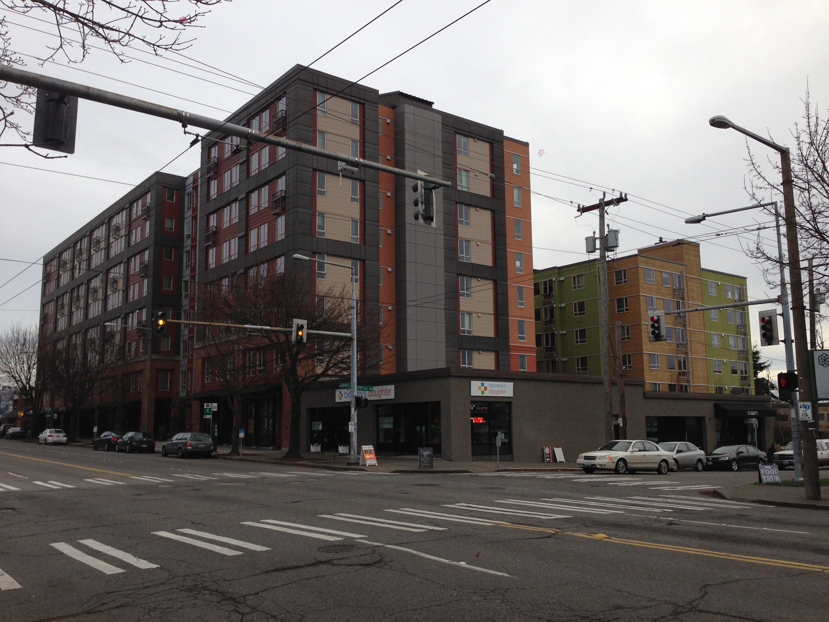
Color 5 - As massing grows, designers feel compelled to select more colors. The building on the left contains a more conservative massing strategy (not so much gluing to maximize profits) so the largely flat facade pops with 5 colors and 4 or 5 materials. Who needs a better massing strategy with a non-committed facade? (note the green and wood building on the right is still part of the same complex- color 7?).

Color 6ish - At some point it's hard to keep track of the colors, but this developer special building has a true uncommitted style to it's color palette.

Colors + Wood - What seems like a crappy developer copy of Silodam, the hot trend is to incorporate wood into the facade for a real pop. This building uses two colors of wood and inserts more wood randomly between windows on the left side. The randomness is topped off with the irrational play of blue on the wood side. It's like the designers can't figure out whats going wrong, so they impulsively add more materials and make the organization less rational.

Historically - While the lack of commitment is a more current occurrence, this house couldn't miss the opportunity to partake through the only power an older committed house can- paint. A separation of beige and brown is articulated horizontally on a board that meets the lower eave. No trim separation needed!
I could keep going, but I'll save you the torture. There are more in my ever growing album of Seattle's Non-committed Facades. The strategies are evolving and it would be interesting to follow up with this post in the future. The newest trend appears to be the random wood panel or color panel inserted into a monolithic portion as demonstrated with the color + wood project.
The non-committed facade is a poor design strategy that has dated these buildings, in addition to our city. I could see a good designer falling victim to this trend, but it's important to stray from complexity and use committed facade strategies. I would also like to encourage better massing, but this is a more difficult task.
---
On a closing note, either Gehry has fallen victim for Seattle's non-commitment or he studied up on his Seattle vernacular. I'll let you decide.


Source: Wikipedia
Virgin America and its Safety Video
Everyone raves about Virgin America, which I had flown once in the past and had the bad luck of boarding the plane that was having technology issues. The entire computer system for the seats were down, so it was pretty much any other airline. Last month, I wanted to stop by San Francisco on my way to Seattle from Las Vegas, and Virgin America was the best option. This time the computers were working and the experience was great.
What makes this airline superior is their desire to make flying a more pleasant experience. A better way of flying is demonstrated in every detail from the interior finishes to the interactive computer system for each seat. Some airlines feature the touch screen computers with entertainment, but Virgin America took this to the next level allowing one to order food/drinks (alcohol is called "the good stuff" on the menu), play games (multiplayer support with other people on the plane), play music, watch music videos, live tv, and other on demand content.
The most memorable part of the experience is the safety video. While other airlines make this a boring video about buckling a safety belt, Virgin America features an interesting music video with dancing and singing on a set modeled on an airplane interior. Take a look for yourself.
Virgin America Safety Video
What a breath of fresh air. I actually wanted to see the video on my second flight from San Francisco to Seattle. This is the opposite feeling I had boarding my sixth United flight this year (I have a similar distaste for United's newish logo). United's captive customers have to watch a safety video with the bare minimum of creativity, in addition to a corporate greenwashing video BEFORE. Be warned, this is a painful experience.
United Airlines Greenwashing Video (1/2)
United Airlines Safety Video (2/2)
It's funny how some simple and creative ideas improving experience can carry the reputation of an airline over destinations and price . I would really like to see this airline grow as it's clearly a different company in the mediocre/bad world of American domestic airlines.
Henderson's Downtown Development - Desertion
Henderson is where I grew up. I think it's fair to say, compared to the current city boundaries, I knew the town in it's infancy. I spent a lot of time, as a kid, in the original neighborhood (housing for the original Magnesium factory workers). It wasn't the highfalutin areas of Green Valley, Anthem, and whatever the next developer wants to call their fortified complex of stucco homes. Growing up in the southwest in the 1990s-2000s exposed me to tremendous growth including Henderson becoming the second largest city in the state (Sorry Reno... well not really). It's safe to say the development leading to the size was not good. The entire valley fell, and still falls, victim to the fast and loose development that leads to sprawl. In Henderson, it's clear the city wants to improve some of the deserted areas largely focusing on downtown, but unfortunately it's not based on any urban design logic or even a skimming of The Death and Life of Great American Cities Wikipedia article. The latest version suggest is the same old idea ten fold.
The strategy calls for the leveling all the current fabric (buildings) and persuading developers to make a new great place (because new has to be better, right?). A stroll down Water street makes one wonder if the city was bombed out. Most of the buildings I knew as a kid are non existent and largely empty lots with and chain link fences.
Anyone who has escaped the development standard of sprawl can tell you a great downtown street will have a lot of commercial buildings. Slightly more research suggests buildings have to be continuous along the street front, a gap for a parking lot or bad proportioned building can throw everything off for pedestrians. Unfortunately the city is implementing the opposite and, well, the results show little progress on the hopes for a nice downtown.
Downtown Henderson could be a great place and I hope one day it can turn around, but using the same formula won't work.
The specifics on the city's plan can be found here.
A photo album featuring empty lots of downtown can be found here.
Bad Design Moment - McCarran's Terminal 3 Parking Garage
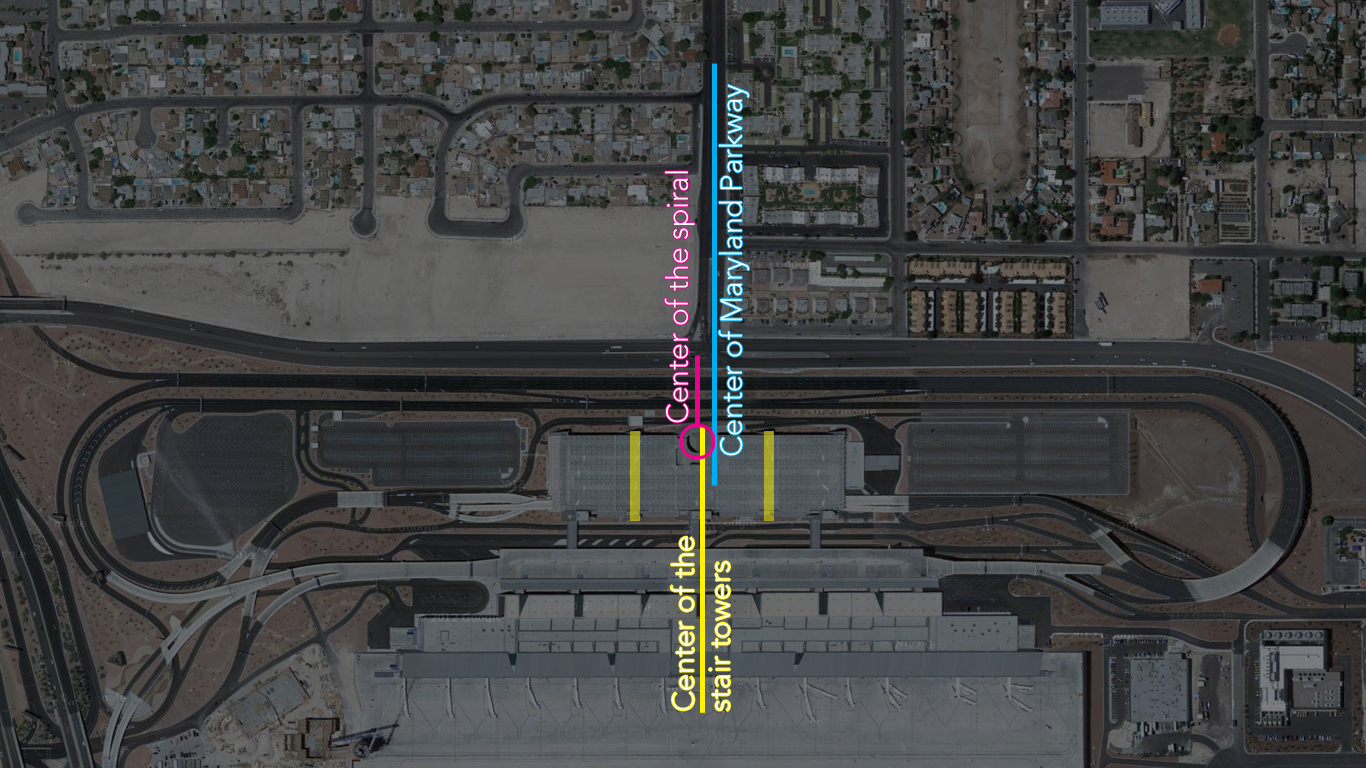
I have written about this in a previous post, but I think Terminal 3's parking garage deserves an official Bad Design Moment post. This is largely due to my sadness regarding the design reoccurring on a recent, unexpected, trip there. McCarran Airport's new terminal 3 is efficient, but the overall design is mediocre, certainly compared to the original terminal 1 building. The worst part of the new terminal building is the location of the parking garage's spiral ramp that is unsymmetrical within itself as well as missing a perfect opportunity to align with Maryland Parkway. It would have been an easy gesture to simply move the spiral, or the whole structure, to make the spiral align with Maryland Parkway or at the very least center it between the two stair towers. The parking garage s is a real beast and sad considering Vegas has some really well designed parking garages (including the one very near at terminal 1).

Below is a simple diagram illustrating the parking garage's many centers.
Lexington Modern - The Miller House
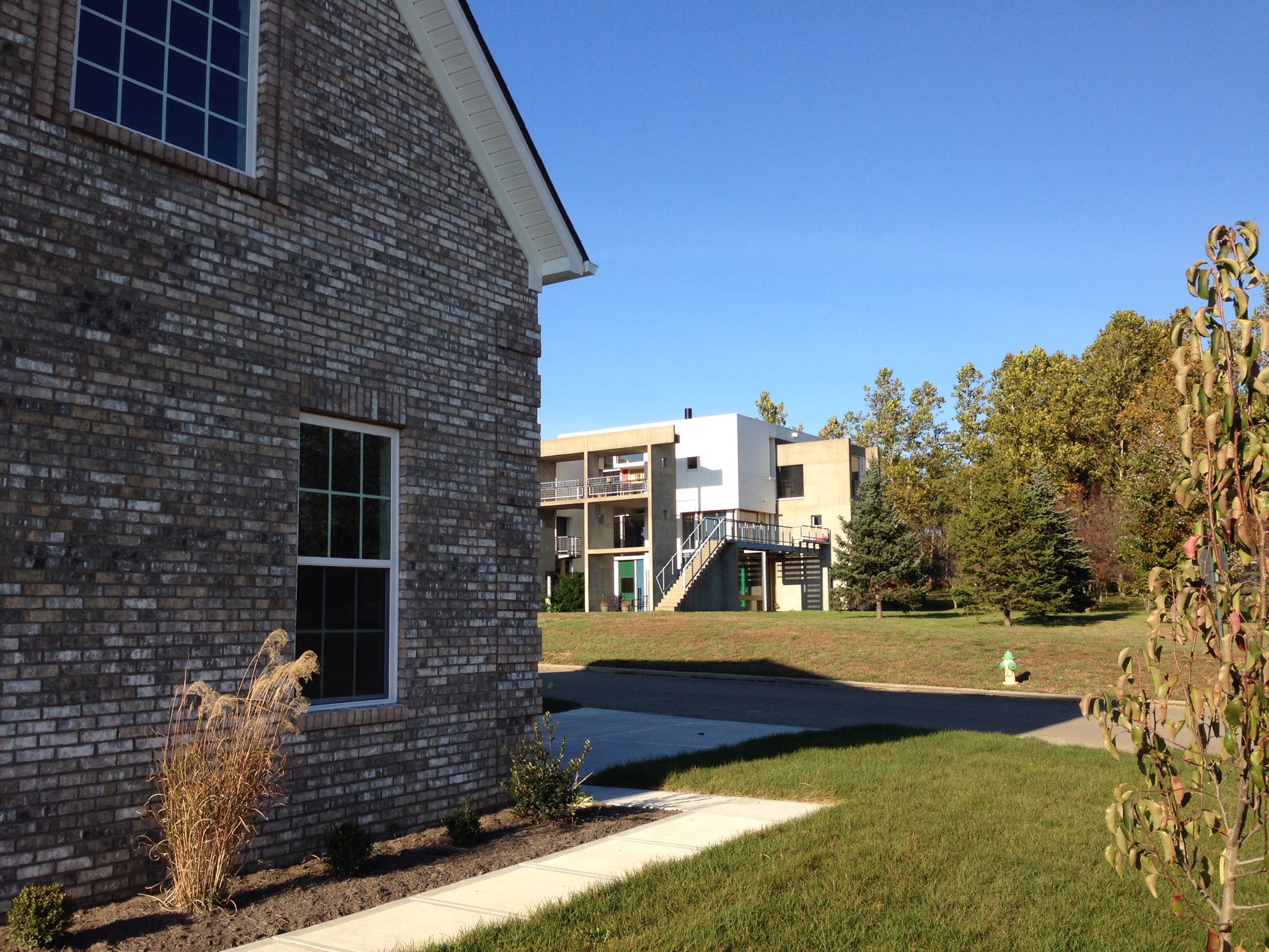
Lexington's most famous piece of modern architecture is José Oubrerie's Miller House. It's impressive to see, even after 25 years, articles being published on the house. Some of these publications include an article by Dwell, a recent article by Evan Chakroff (also translated into Portuguese), and, as of last week, a whole book called In Suburbia Ego. This recent book will include the writings of many architects solely about the house.
 I am relatively close to many of the people writing about the Miller House (including being José's student for a brief, but intense, quarter), but the thought that maybe my appreciation for the house is only a regional phenomenon is mute once we consider this house is an American Masterwork of the 20th and 21st century, according to Kenneth Frampton. He's clearly not from around Kentucky and seems to have a respectable take on these matters.
As stated above, architects in Kentucky and Ohio know a lot about this building, but I think it's fair to say people of Lexington know little outside the local arts scene. So here's a brief summary to get everyone on the same page. The building was a dream residence for a lawyer in Lexington by the name of Robert Miller. In 1988, Miller selected José Oubrerie to design it, who was the Dean of the University of Kentucky's College of Architecture. Outside academia, José Oubrerie was already an established world class architect who worked with Le Corbusier early in his career and had high profile works around the world. Two buildings that come to mind are Le Corbusier's church of Saint-Pierre in Firminy, which he completed at the request of Firminy's government, and his very own French Cultural Center in Damascus.
The Miller House has so much going on architecturally and theoretically. I've seen and read hours of it, but I'll save you from this, outside saying the red grid on the Wile Wolf Building that I compared to the Casa del Fascio should be in play again.
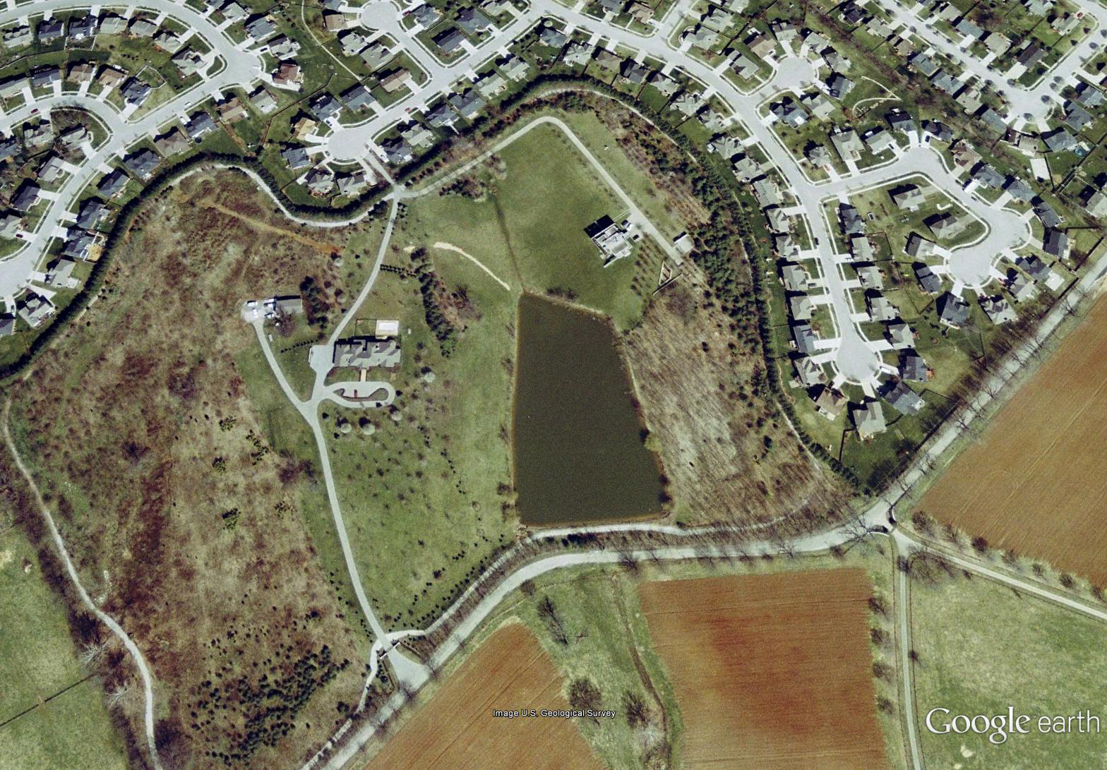
The designed intent of the Miller House included its landscape, sitting on top of a hill, the natural features surrounding were intentional and complimented the structure. The highlight of the original site included a pond and a modest take on an English garden landscape with trees dotting the banks. The site also included a tree lined pathway around the property line. This provided a great running track for the owner, in addition to blocking out the tract developments surrounding the site.

I'm not completely sure about the whole history of the house, but apparently Robert Miller moved out. The house was vandalized and soon after a non-profit bought and improved the building for a brief time. During this time the Architecture School used it, local concerts took place there, and the house was even featured in a music video by, Neon Indian.
http://www.youtube.com/watch?v=lv8IsdbYR9g
After 2006, the non-profit sold the house leaving the future in limbo. Today Ball Homes owns the land surrounding the site and the owner of Ball Homes purchased the house this summer after the house sat on the market for some time. While I can't confirm this, word on the street is Mr. Ball bought the home for around 200-300 thousand, which seems laughable even in the housing market of central Kentucky.
The biggest shame of the house is the slow destruction taking place. The Miller House's current state reminds me of a suffering hospital patient on life support. The current property has been voided of the pond and subdivided into 48 lots for tract homes.

When visiting the site recently, I took a copy of the lot map from the model home. It's clear there is no intention to keep any of the landscaping outside of the house and frankly, I wouldn't be surprised to see this house mysteriously drop of the map some night. There is an effort by Katie Halsey to get the building listed on a historical register, but the chances of that seem bleak, plus the aforementioned lots surrounding the house have been sold. The historical protection would limit development of the site, but what can one do once the surrounding houses are built?
To look at the future of this home, I can't help but think past comparing it to the fate of Villa Vaucresson (aka Besnus). The building may stay, but recognition of the original design won't exist through the slow distortion by people who don't know any better. It's just too late.
 More images from my recent visit of the Miller house can be found here.
Location: 832 Lochmere Pl, Lexington, KY 40509
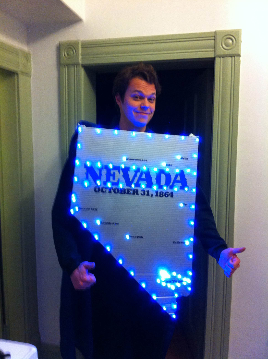
Nevada Day 2012
Happy (Real) Nevada Day
Today is October 31st and any true Nevadan will gladly spurt out "Happy Nevada Day!" To show off both their pride for Nevada and the that there is something more than Halloween to be observed.
The day is the anniversary of the Nevada territory being admitted as a state in the war ravaged union of 1864. The 31st of October has meaning to the holiday which had both the benefit of giving kids a day off on Halloween (which our teachers beat into our heads that the day off was for Nevada, not getting free candy), and providing social capitol for citizen to come together and celebrate a state we all love. Since then it's been a little odd for me when people tell me Happy Nevada Day not on the 31st after Nevada decided to change the day of celebration.
In 1997 a state assemblyman thought it would be a great idea to adjust Nevada Day to the nearest Friday before to create a three day weekend. In 1998 the people approved this idea cheapening the celebration of statehood to something on par with Black Friday. After doing some reading, I think this passed with mildly good intentions, but the day has lost it's only meaning- the date. If we put this idea in a larger context, such as Independence Day, would we be ok to move our July 4th celebrations to accommodate a three day weekend? Probably not. While I think most people enjoy three day weekends, I also think it's reasonable to say a random midweek day off is fun too and when you really think about it, roughly half of the time Nevada Day will fall appropriately to create a three weekend anyhow. So on this Nevada Day, I ask that someone go up to Carson City and fix this. Don't cheapen the holiday of our favorite state the way outsiders cheapen Nevadan culture.
Now that's off my chest, lets celebrate the Great State of Nevada with my yearly favorite "Home Means Nevada" sung by Nevada's very own the Killers.
Bad Design Moment - The Holiday on John Street
I am surprised at what is passed off for exterior siding these days. There is what looks like an apartment (perhaps the micro living kind) on John Street in Seattle that has a bad facade of blue painted metal panels. The uncoordinated mix of metal panel textures and narrow windows only makes the facade more insulting than painted it all blue. A decent window detail, a few continuous lines, or leaving the metal gray could improve this facade ten fold.

Shipping containers or trailers stacked on top of each other would be more interesting and true to what this building is.
For the record, the clock on the side is ok.
Located at 1001 East John Street, Seattle, WA
Interesting Art Project - Bad Zoning
 I recently received an article from a friend who thought this was an art project worth checking out. A former church has become a building sized mural in Southwest DC. This seems like an interesting idea, and one worth checking out, but this speaks more to the bad planning by Washington than the cultural shift of religion. The Southwest portion of DC was used as a grand experiment of city planning in the 50s through 70s. The area is plagued with awful zoning. much of the old existing street grid was tore up for large thoroughfares and freeways. Today the experiment is over and while many great architectural building still remain, there lacks the mixed use needed to bring this area back. If proper zoning took place, this former church/art project could make for a great bar, restaurant, or concert venue.
Las Vegas
 So time has passed since my last post. I was putting in extra hours at the office and in early June I went to the homeland for a vacation. I had not been in the valley for almost one and a half years and I was very pleased to see the place was just as I remembered it. First, the weather was beautiful with dry heat and unseasonably cooler temperatures. I sat outside a Starbucks in 90 degrees and thought this is what 90 degrees should feel like. I was happy to see all my friends and family were doing well.
When flying in, I realized I forgot about the city's true scale of sprawl. It's amazing from the perspective of someone now living on the east coast to see a world of such low density. I think the sprawl isn't as bad as I thought it was in the past. While there are still negative impacts, certainly on the environment, I think the city for the most part can adapt what they currently have to make the city better through increasing densities in older parts of the city. I'm glad to see a push towards moving into downtown Las Vegas. This part of town is a true gem and I'm sure rents will rise as more people realize this.
So time has passed since my last post. I was putting in extra hours at the office and in early June I went to the homeland for a vacation. I had not been in the valley for almost one and a half years and I was very pleased to see the place was just as I remembered it. First, the weather was beautiful with dry heat and unseasonably cooler temperatures. I sat outside a Starbucks in 90 degrees and thought this is what 90 degrees should feel like. I was happy to see all my friends and family were doing well.
When flying in, I realized I forgot about the city's true scale of sprawl. It's amazing from the perspective of someone now living on the east coast to see a world of such low density. I think the sprawl isn't as bad as I thought it was in the past. While there are still negative impacts, certainly on the environment, I think the city for the most part can adapt what they currently have to make the city better through increasing densities in older parts of the city. I'm glad to see a push towards moving into downtown Las Vegas. This part of town is a true gem and I'm sure rents will rise as more people realize this.
I found a few new development since I last lived in the city. I am happy to see the mass transportation system is still expanding and really meeting the needs of the high density routes. I am glad to see the new terminal and signage system for McCarran Airport, although the new airport doesn't seem to be nearly as attractive as the adjacent terminal 1. The pastel colors of the parking garage reminds me more of post modern architecture over something complimentary to the desert landscape and Terminal 1. Additionally, the designers of the parking garage convey a real slapdash placement of the building with the center spiraling ramps being about 20 feet off center of Maryland Parkway. Every time I sat at the light of Maryland Parkway and Russell Road I cringed at the off centered spiral. It would have been a simple and easy gesture to have the spiral on axis with Maryland Parkway. I would comment on the airport itself, if I could have seen it over the parking garage.
The Lou Ruvo Center for Brain Health was less exciting that I thought it would be. I found the steel structure overwhelming. The main interior space seems like it could offer something good.
I also took a moment to look at Predock's Las Vegas Library also part of the Lied Discovery Children's Museum. I was really surprised at what the library had to offer. One of my favorite features were the outside reading rooms. The small rooms inserted around the exterior of the building offer patron the ability to take books outside without checking them out. A really good courtyard inserted in the center of the building reminded me of the courtyard next to the Cordoba Cathedral where small canals allow water to flow from one tree to the next. Unfortunately, this courtyard looked closed and not well maintained. I recommend a stop for the designers in the valley that haven't been inside since childhood.
I like the development around the center of the strip. My only complaint is the new pedestrian walkways around the Cosmopolitan and City Center are a pain to navigate. The design of the walkways don't address the need for pedestrian to pass by the two casinos, instead making you go into the mall or walking down to street level to only go back up shortly after. Also, could the county finally connect Harmon to a major street on the west side of I-15? This is a great thoroughfare that is underutilized.
All in all, the city is still great. Keep up the good work Las Vegas.
Capitol PechaKucha Disappointment
I attended my second round of Capitol PechaKucha this past Thursday and, unfortunately, it was another disappointing night. Luckily it's not the speakers that are the problem, but the organizers of the event. They come off as the kind of people who don't pay attention to the details to an astronomical level. They also praised the fact that they have been around since 2007, which is more scary that the details haven't been worked out by this point. The first problem is they haven't managed the process of checking tickets. The fact that you have to pay $10 to attend seems odd, but it's Washington, so I digress? The ticket people seem like they were just handed a list and hadn't thought of a process to check off people and verify IDs. This may also be a simple problem on my part of showing up way too early. For some reason the time posted isn't the actual start time of the speakers, but an hour of listening to DJ cool play his jams while drinking overpriced (not so cold) beers. It's also sad that there are never enough chairs at the events. The latest event was so bad that there were only about 10 long benches/couches. Good work making everyone uncomfortable!
The last time I attended the event, I was surprised that the hosts pronounced Pecha Kucha incorrectly. I was laughed at in Columbus for not being able to get it right, but thought maybe Columbus and I had learned to pronounce it incorrectly. I was relieved when a speaker, who had been to the one in Japan, took a moment in her presentation last event to correct the hosts. The event on Thursday proved that nothing came of this public correction. They still pronounce it incorrectly.
After all that I wasn't surprised to realize that the projector had not been set up properly, cutting out 1/10 of the bottom of each slide, when compared to the laptop screen. I found this particularly bad with the fashion presentation, where the whole outfit wasn't being projected.
The one thing out of the control of the organizers, but worthy of noting was the audience talked through presentations to a point that presenters couldn't be heard. What is wrong with these people?
I know the PechaKucha system works on a kind of honor system, but I would recommend the PechaKucha committee revoke the current organization association. Washington DC deserves a organization that lives up to great standards that would make the event as fun as the ones I've attended in Columbus and Springfield, Ohio.
Useful Links: How to pronounce Pecha Kucha: http://www.youtube.com/watch?v=gdghID66kLs
The Angry Bicyclist
I have always felt a little odd as a bicyclist regarding traffic laws. I've always thought I should follow the same laws as automobiles because I am using the same road as automobiles. Unfortunately this requires stopping, which is quite different on a bike, so I have some exception to a stop sign treating it as a yield. On my daily commute I'm usually the only bicyclist waiting at a light with other bicyclist proceeding through the light. For some reason most bicyclist don't feel the need to stop at a red light. A new article published in Cycling discovered that bicyclist breaking the law is becoming more of a concern among communities. The negative perception is making expansion and adoption of bicycle networks harder to approve. I think it's time bicyclist suck it up and follow the law. NPR's Talk of the Nation recently had a segment regarding this issue. Also, I feel Portlandia describe the public perception quite well in this bike clip.
I Like My Architecture Plaid
 We were at a our local bar the other day, when someone noticed a picture in the dimly lit corner of Jesus blessings a building. I jumped up and examined the picture to recognize the building as the United Nations Headquarters. I say "great design," followed by a friend asking "whats so great about a box?"
This question comes up often. I don't think Washington solely possesses this architectural pessimism, but Washingtonians have a way of becoming experts on anything with all the Master's Degrees. I know I can't change an international relation's expert on architecture, but I'll beg that one hear me out.
We were at a our local bar the other day, when someone noticed a picture in the dimly lit corner of Jesus blessings a building. I jumped up and examined the picture to recognize the building as the United Nations Headquarters. I say "great design," followed by a friend asking "whats so great about a box?"
This question comes up often. I don't think Washington solely possesses this architectural pessimism, but Washingtonians have a way of becoming experts on anything with all the Master's Degrees. I know I can't change an international relation's expert on architecture, but I'll beg that one hear me out.
What instills confidence that the UN Headquarters a great building is the fact that Oscar Niemeyer and Le Corbusier designed it. I don't know the in and outs of the building, but I know that these two were/are (Oscar is 104! -[Update- Oscar passed away December 5, 2012]) very competent designers with a record surpassing most architects in the past and now. My confidence in these two architects' designs is similar to the confidence most people have in Apple. I don't know every Apple made device, but I can easily argue every product is good. Apple products are known to work well, be built well, and have an intuitive interface. No one can compare!
So what makes Oscar Niemeyer and Le Corbusier so good? In the word of my graduate studies professor, Robert Livesey, "What is it doing?". Everything Corbusier touched was full of symbolism, strategies, historical references, and arguments that would take hours of Doug Graf diagrams to explain. Niemeyer even recognized the brilliance of Corbusier calling him "the master" and he would use these same devices in his own work.
I know this isn't going to convince anyone outside of architecture that the UN Headquarters is great. What makes any architectural argument weak to a laymen is their understanding of architecture as an aesthetic. Architecture is a language. I can't speak French to a German and expect him to understand much. In a similar way, an hour long presentation analyzing the UN headquarters won't make much sense if you don't understand Chandigarh or Brasilia. If one want to truly discuss the merits of the built environment, it's imperative to know basic architectural language.
If architecture is only an aesthetic, there isn't much to discuss. I like plaid you like stripes.
Communities and Metro Stations
![]() So I was looking the breakfast links on Greater Greater Washington this morning when I found a hilarious post (including a sarcastic map) by Matt Johnson and David Alpert regarding the new Silver line station names proposed by Fairfax county. Working Station names proposed by WMATA were cited as too boring. Fairfax County's effort churned out an even more boring list of names, all starting with a certain large region then hyphenated into more specific area (table below). I don't know much about Virginia, so I can't speak to the superiority of the names, but I imagine everyone could do better. Maybe I should send Fairfax County the London Underground map hanging above my desk for inspiration? I pull two valuable lessons from this. a) The community may not be the best source for a station names largely because b) the community, in general America, doesn't value the rich resources of history. We should hand over new station names to regional experts and historians. I bet they could draft up meaningful station names fulfilling everyone requirements and maybe give everyone a new perspective of each neighborhoods. If we could start valuing knowledge again we could overcome this fiasco.
So I was looking the breakfast links on Greater Greater Washington this morning when I found a hilarious post (including a sarcastic map) by Matt Johnson and David Alpert regarding the new Silver line station names proposed by Fairfax county. Working Station names proposed by WMATA were cited as too boring. Fairfax County's effort churned out an even more boring list of names, all starting with a certain large region then hyphenated into more specific area (table below). I don't know much about Virginia, so I can't speak to the superiority of the names, but I imagine everyone could do better. Maybe I should send Fairfax County the London Underground map hanging above my desk for inspiration? I pull two valuable lessons from this. a) The community may not be the best source for a station names largely because b) the community, in general America, doesn't value the rich resources of history. We should hand over new station names to regional experts and historians. I bet they could draft up meaningful station names fulfilling everyone requirements and maybe give everyone a new perspective of each neighborhoods. If we could start valuing knowledge again we could overcome this fiasco.
| Working name | Fairfax proposal |
| Tysons East | Tysons-McLean |
| Tysons Central 123 | Tysons I&II |
| Tysons Central 7 | Tysons Central |
| Tysons West | Tysons-Spring Hill Road |
| Wiehle Avenue | Reston-Wiehle Avenue |
| Reston Parkway | Reston Town Center |
| Herndon-Monroe | Herndon-Reston West |
| Route 28 | Herndon-Dulles East |
I'm betting , in the end, the strongest power of corporate and developer interests will win this war. Prove me wrong Fairfax County!
BS BCS
 So I am going to join the other 85% of America in saying the BCS Bowl series is stupid. Most know the system isn't fair and should be taken to court for anti-trust practices. I could go on and on about it but we've heard most of the points before. I think the worst part, perhaps unforeseen years ago, was the destruction of collegiate conferences. The final nail it seem comes with the news that my Alma mater's conference the Mountain West will soon merge with Conference USA to become a new conference in 2013-14
The idea behind the Mountain West that I valued was being a small regional conference. The members that split from from the WAC back when the MWC formed, did so to be part of a manageable sized regional conference. As the past can describe, this is the point of conferences. I think it is a shame that universities now have to battle like a game of musical chairs to be in the power conferences (as decided by the BCS). I hope that one day a District Attorney, or the Department of Justice gets the ball rolling on an anti-trust lawsuit, so hopefully one day we can return to a more regional conference alignment.
Andy Schwarz letter questioning the legality of the BCS
"I'm not a nerd"...
What PIPA and SOPA have taught us, in case we didn't think this already, is that Congress doesn't understand technology. They even admit it by saying they aren't "nerds" as documented in Jon Stewart's The Daily Show (I think the use of the term "nerd" over "geek" to sound hip continues the point). Call me a rocket scientist, but shouldn't people who understand how stuff works make regulations about that stuff. A good rule of thumb in 2012- anyone who still uses a Blackberry should not be allowed to discuss technology. While we know it's just lobbyist telling congress what to do, let's pretend they are actually concerned about copyrighted material being stolen off the internet. Were these same people worried about tapes in the 70s and 80s? Were they pushing the 95th congress to ban tape decks? Probably not, so let's take back seat to technology laws for awhile so we can have Wikipedia in peace.
NCARB or DMV?
This past month NCARB (National Council of Architectural Registration Boards) decided it was time to ask their record holders for a little feedback. The feeling to voice my opinion about NCARB strikes a desire similar to say, congress asking me how they could better serve the  American people. I started the survey one day to find the process to take longer expected. I'm sad to say I did not complete the survey. At least I can happily know the perserverant managed to fill the result banks with dissatisfaction. So why is NCARB so bad?
I know very little about NCARB, except they enforce the rules and take my money for record keeping, so I decided I should take a look at potential issues. Naturally, my mind questions the current leadership and organization structure. I decided to read through the bylaws and looked at the leadership and discovered it's politics as usual. Members of the board have worked their way up a through the system and only serve a short and mostly unpaid terms. The terms are so short, when one reaches the executive board they are only allowed to serve for a year (two years for Presidents). For the powers that NCARB holds I would think the board would have a more influential tenure, after all, a typical collegiate student council has a longer allowed term.
American people. I started the survey one day to find the process to take longer expected. I'm sad to say I did not complete the survey. At least I can happily know the perserverant managed to fill the result banks with dissatisfaction. So why is NCARB so bad?
I know very little about NCARB, except they enforce the rules and take my money for record keeping, so I decided I should take a look at potential issues. Naturally, my mind questions the current leadership and organization structure. I decided to read through the bylaws and looked at the leadership and discovered it's politics as usual. Members of the board have worked their way up a through the system and only serve a short and mostly unpaid terms. The terms are so short, when one reaches the executive board they are only allowed to serve for a year (two years for Presidents). For the powers that NCARB holds I would think the board would have a more influential tenure, after all, a typical collegiate student council has a longer allowed term.
Another drawback to the current board is age. The board is served by a wise old crowd of tested architects. Unfortunately, the generation of architects that lead our professional field are far from understanding the current wave of technology. This is a much larger issue of our field, but relates to how NCARB has implemented technology. Fortunately they have made advances in technology, but still don't have the refined feel that a tested architect would practice in detailing a building.
Two points of contention seem to come up in my circle of soon-to-be architects that might be the result of the generation gap. One is the Intern Development Program (IDP). While getting the process online deserves applause, it still largely reflects the old paper model. Why should one have to keep track of hours with a spreadsheet on their computer, to transpose the same numbers to an online sheet to send to the boss and NCARB? IDP should skip a step and allow one to save unapproved hours online like an email draft . Then when the user is ready, they could send the logged hours to the boss and NCARB. (one can save unsent hours now)
Another point that is popularly irritating is the ARE (Architecture Registration Exam) drafting program. NCARB doesn't want to endorse one of the many popular drafting software. This seems logical as some people might not be familiar with AutoCAD. NCARB's solution was to developed their own poorly made drafting program that requires test takers to learn a software they will never use again. NCARB should allow all the software companies to load their drafting software and allow users to chose what they want. As long as the requirements are met in the drawings, who cares what program was used? Why not allow hand drafting (this seems more universal than a NCARB only program)?
These are not rocket science solutions, but ones that my generation might have a better insight on that could help the old guard and the profession. As designers and frequent users of the computer, young architects could make NCARB better than dealing with the DMV.
Why Apple?
 I was looking around for CES news this evening and noticed the live stream of the keynote and decided to watch. Steve Ballmer from Microsoft was the speaker, or was it Ryan Seacrest?
I believe I live in a world where it is 100% clear to know how to make a great product. I also believe it is 100% clear to know how to market a product. Apple has spelled out, in every way, what people want in products, how products should work, and marketing. I am dumbfounded while watching Microsoft, a company that has made 90% of the world's operating systems, struggle to sell products.
I was looking around for CES news this evening and noticed the live stream of the keynote and decided to watch. Steve Ballmer from Microsoft was the speaker, or was it Ryan Seacrest?
I believe I live in a world where it is 100% clear to know how to make a great product. I also believe it is 100% clear to know how to market a product. Apple has spelled out, in every way, what people want in products, how products should work, and marketing. I am dumbfounded while watching Microsoft, a company that has made 90% of the world's operating systems, struggle to sell products.
I am reminded of Tom Smykowski in the movie Office Space where he declares he is a people person. Maybe Microsoft needs to understand people a little better. I think the problem may lie with the executive boards and engineers that make up most companies. From my experience they view the world from a perspective of their own. They are achievers by generic formula and intelligence. Engineers are needed thinkers, they love to solve technical problems. To them, if it works- problem solved. Business people are motivated, they figure out financial success, usually through tried and tested means. To them, if they are making money- problem solved. What Microsoft and many other companies need is a third perspective. This perspective is one that isn't motivated by money or effectiveness, but by quality and attention to detail. Apple designs beautiful products that work and makes a lot of money. Apple's desire is to control and refine every detail (They also don't bother talking about it until it's time for product release). With these three qualities a product can be desired and admired. To me, this is simple (especially after Steve Job's Memoir), but I am astonished everyday that only a handful of companies in my life get it, and the rest tumble down the road hoping soon, it will pop into gear.
Until Microsoft lets someone with the third perspective make decisions, I think the company will continue to lose market share. This is unfortunate because Windows is something I prefer.
Dupont Circle - CVS - PNC - Baja Fresh Station
So David Alpert reminds us that Metro may be changing some station names to include more stuff around, such as Smithsonian - National Mall in his article from Greater Greater Washington. The idea clearly puts more words in the title of a station. This is ridiculous, the name needs to be short and descriptive. The purpose of the station name is not to inform one of everything within walking distance of the station, but to let one decipher the difference between stations. It's nice if the station name reflects a geographical location like Dupont Circle, but it's not always necessary as Foggy Bottom means little to me, but I know where the stop is in relation to the rest.
So here is my proposal - all station names should be a maximum of 5 syllables or 3 words.