Bad Design Moment - McCarran's Terminal 3 Parking Garage

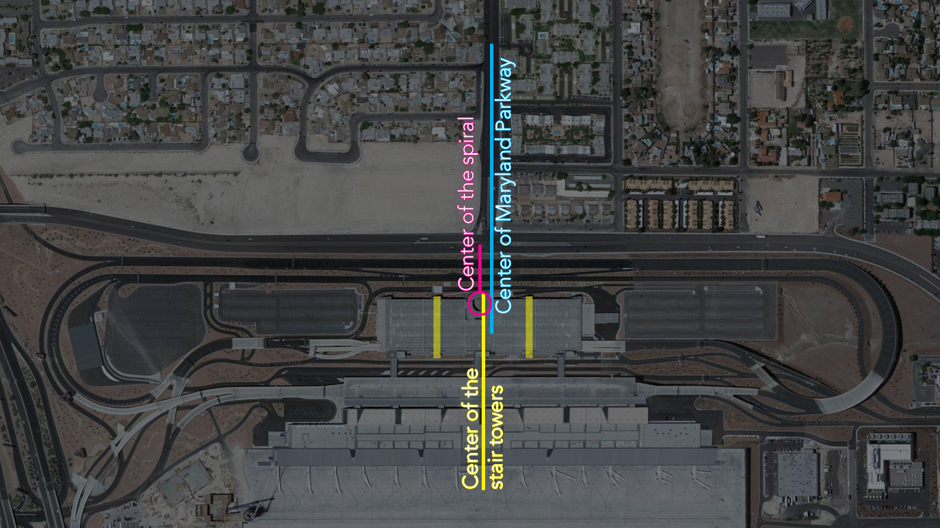
I have written about this in a previous post, but I think Terminal 3's parking garage deserves an official Bad Design Moment post. This is largely due to my sadness regarding the design reoccurring on a recent, unexpected, trip there. McCarran Airport's new terminal 3 is efficient, but the overall design is mediocre, certainly compared to the original terminal 1 building. The worst part of the new terminal building is the location of the parking garage's spiral ramp that is unsymmetrical within itself as well as missing a perfect opportunity to align with Maryland Parkway. It would have been an easy gesture to simply move the spiral, or the whole structure, to make the spiral align with Maryland Parkway or at the very least center it between the two stair towers. The parking garage s is a real beast and sad considering Vegas has some really well designed parking garages (including the one very near at terminal 1).

McCarran's Terminal 3 Parking Garage

  Below is a simple diagram illustrating the parking garage's many centers.

Terminal 3 Centers

  Location: Russell Rd and Maryland Pkwy, Las Vegas, NV

Bad Design Moment - Ballard Hotel

Hotel Ballard 
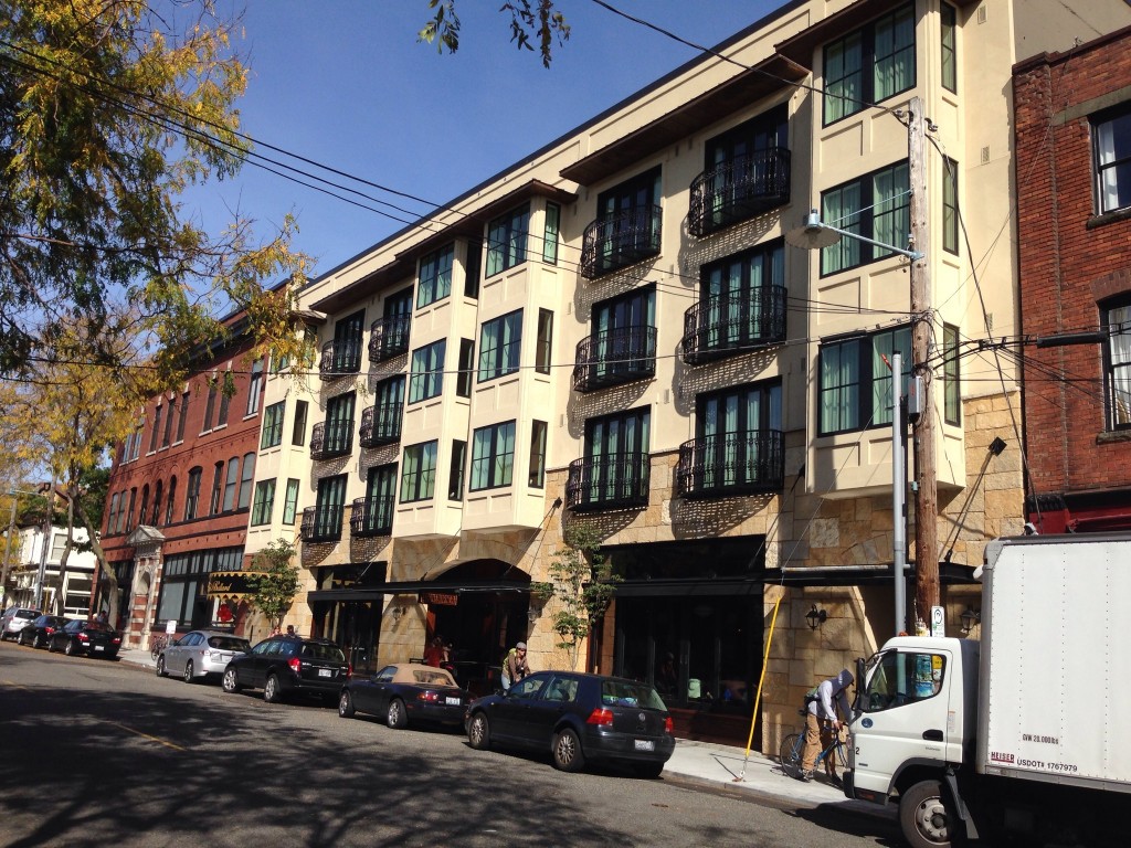
Ballard Avenue's row of old brick and stone buildings have been one upped by the beautifully designed facade of the Ballard Hotel. The designers pulled out all the stops to shows Seattlites the finest detailed faux Tuscan stucco that easily rivals the finest tract developments of Las Vegas, (maybe even surpasses the Lake Las Vegas Hotel- a fine stealing of Florence's own Ponte Vecchio). This building will live on as a testament to true architecture.

Location: 5216 Ballard Avenue Northwest, Seattle, WA 98107

Bad Design Moment - The Holiday on John Street

I am surprised at what is passed off for exterior siding these days. There is what looks like an apartment (perhaps the micro living kind) on John Street in Seattle that has a bad facade of blue painted metal panels. The uncoordinated mix of metal panel textures and narrow windows only makes the facade more insulting than painted it all blue. A decent window detail, a few continuous lines, or leaving the metal gray could improve this facade ten fold. IMG_2610

Shipping containers or trailers stacked on top of each other would be more interesting and true to what this building is.

For the record, the clock on the side is ok.

Located at 1001 East John Street, Seattle, WA

Bad Design Moment - New Drop Ceiling of Washington Metro Stations

A few months ago, a replacement drop ceiling was going in at Metro Center. I was surprised to see the new framework installed 2 inches lower than the previous ceiling and hoped this was a unique situation. Instead the lowered ceiling has become the new normal and makes for funny situations with existing elements. The ceiling now pops out from vents, escalators, and the curved bottom corners of the platforms above. The elegant curved concrete runs right into the new vertical frame! At Farragut North, I inspected the half completed ceiling for obstacles and could not find any obvious reason for a lower ceiling. I predict saving money was the root reason for this change, but it comes at the cost of aesthetics. It's unfortunate the Metro stations keep drifting away from Harry Weese's original design. New Dropped Ceiling - Installed at Gallery Place

New Dropped Ceiling - Framing at Farragut North