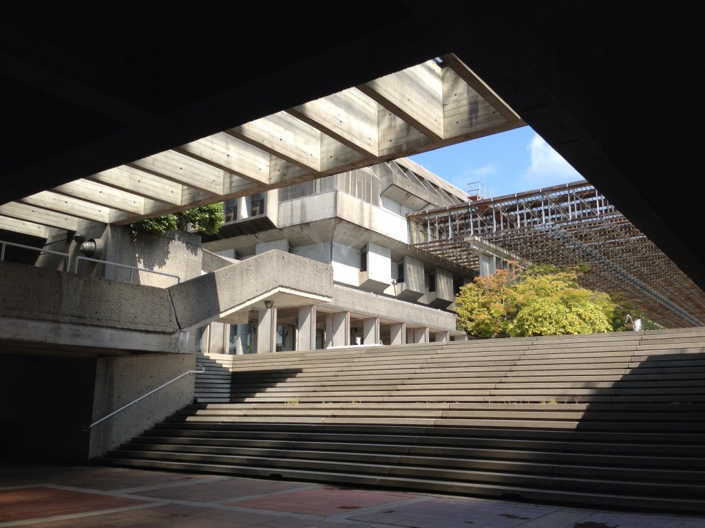
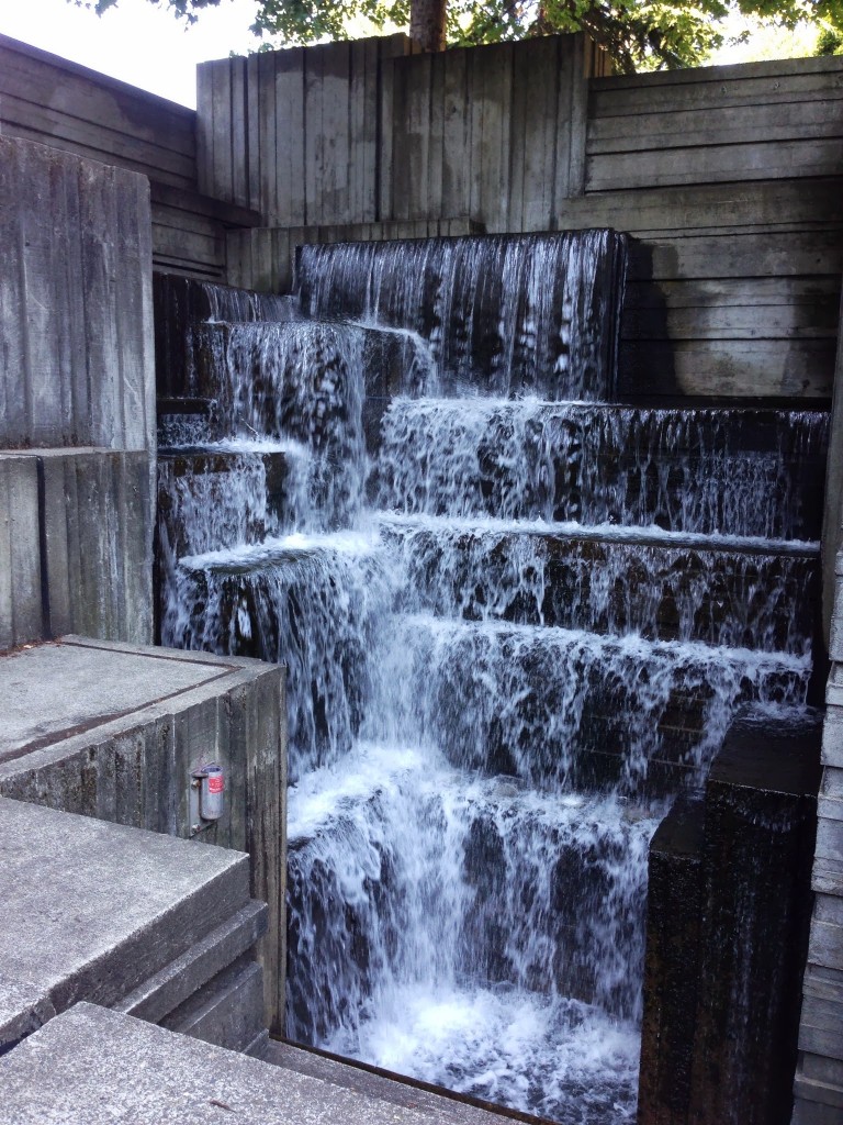
As promised, I will add photos now and then to my Seattle Photo Album. The most recent addition includes some shots from Downtown and one of my new favorite skyline photos (see below) from the water tower of volunteer park from a few weeks ago.
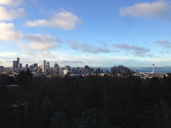 The whole album can be found here.
Picturesque Seattle
I have been putting together a series of general Seattle photos going back to my visit in April of this year. Seattle offers great views due to it's numerous hills. One can't really resist grabbing a shot when a good view is presented (as you can tell from the "view from Capitol Hill" shots of pretty much the same thing near my apartment). I organized the collection starting from Seattle Center (with many photos of the space needle) spiraling out to different parts of town. Take a look, there are some great shots.
![General Seattle [2013]](http://static1.squarespace.com/static/56d92f588259b560ad36971f/56d9349d12b65eeb1e3d7b3a/56d934cd12b65eeb1e3d81b5/1457075405384/IMG_3818-1024x768.jpg?format=original)
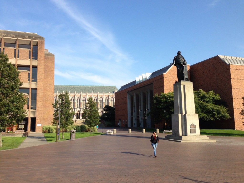
I've also added some new photos to the University of Washington photo album, including the reading room of the Suzzallo Library and the Odegaard Undergraduate Library with the recent interior renovation.
Photos - University of Washington
This photo album is the start of what will feed a series of future writings. University campuses are always full of "more" thoughtful designs that make them fun to explore. As I was assembling the architects and dates for this photo album, I was surprised by two items. First the Architects Kirk, Wallace, McKinley, & Associates did quite a bit of work for the University including Red Square back in the 1960s and early 1970s. I am interested to see their other works. Second, A building I always liked, although it seemed in disrepair and abandoned by the campus, in fact is important enough that in 2008, when the university proposed tearing down the building, an architecture student, Abby Martin, fought to keep the building through historic designation. The building housed an early nuclear reactor and was designed by TAAG,The Architect Artist Group, (Wendell Lovett, Daniel Streissguth, Gene Zema, Gerard Torrence, Spencer Moseley). Currently the album consists of two visits, one in April the other this past weekend. Classes have not started yet, so access to many of the buildings was limited. I plan to visit again once the campus is in full swing.
Bellevue and its Architecture
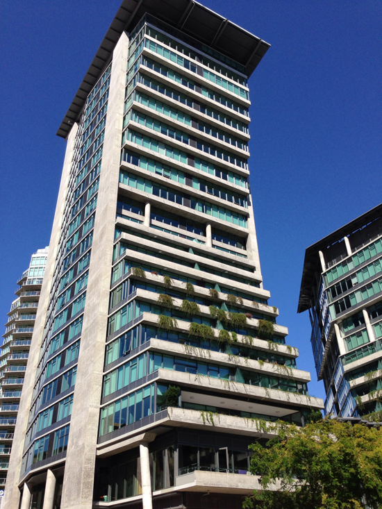
Seattle likes to make fun of Bellevue, but this shouldn't reflect on interesting architecture in the city. While looking at the Bellevue Arts Museum with Evan Chakroff, we took a moment to see what else the city had to offer. There were some interesting projects such as the Bellevue City Hall or the New Elements Tower, which featured a decent looking tower (diagrammatically interesting too). Take a look for yourself in the photo gallery.
Bellevue Arts Museum - Steven Holl
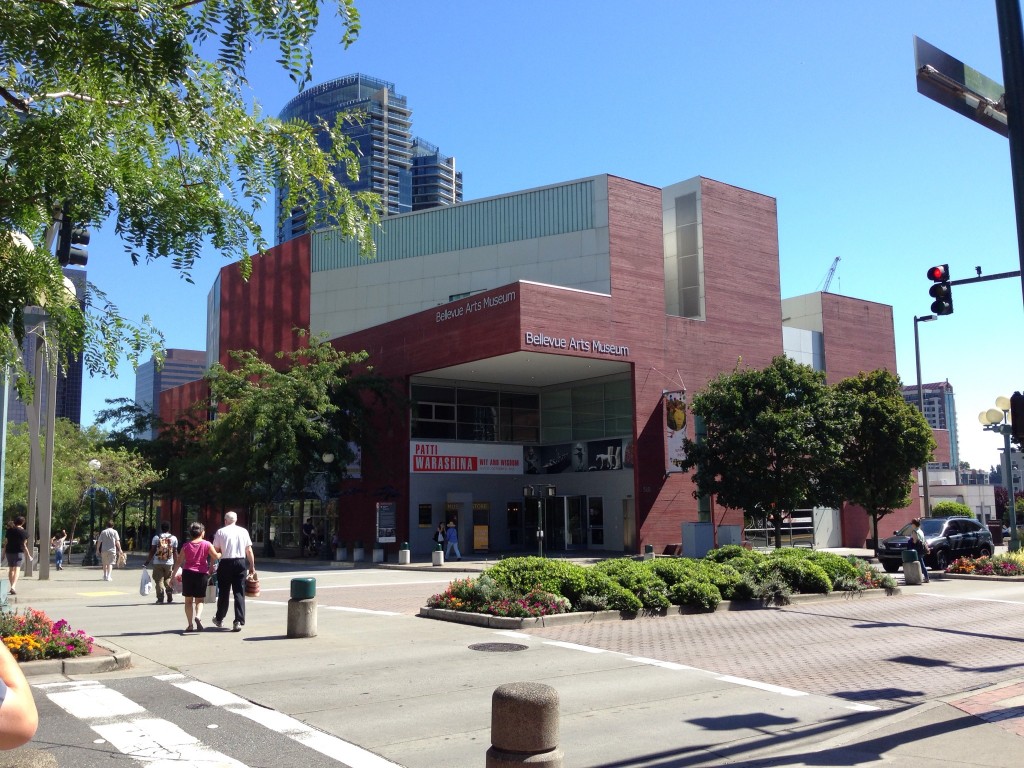
I found myself at the The Bellevue Arts Museum this weekend to discover another Steven Holl work just a short drive from Seattle. This museum has some of the common found elements including a play with natural light throughout the space and a sculptural quality of the door levers and handrails. This is a successful building that fits the program (3 dimensional pieces) nicely and has some great design moments. I particularly enjoyed the rooftop courtyard and adjacent stairway wall of light. The red concrete was surprisingly pleasant with what a appeared to be the short side of a 2x4 creating the overall texture (I can see the contractor rolling his eyes and suggesting plywood molds to save costs).
Outside the architecture, there was a cool exhibit by Rick Araluce called The Minutes, the Hours, the Days
Vancouver and its Architecture
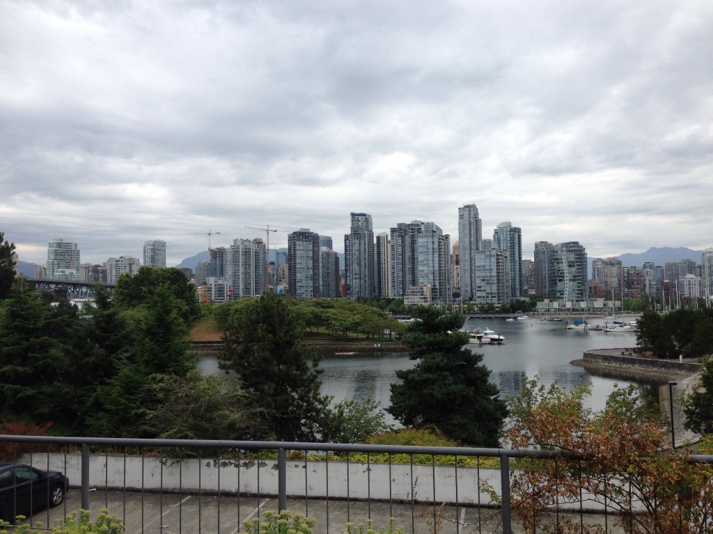
Two weekends ago I visited Vancouver, British Columbia with Evan Chakroff to see what's going on. Our goal was to see what we could with a rough outline of buildings on a spreadsheet and a handy book entitled Exploring Vancouver: The Architectural Guide by Harold Kalman & Robin Ward. Overall the city seemed more European than American and included a better tolerance to architecture of all decades. The city is littered with high points in many architectural styles and citizens try protect some of the best as the case of the Dal Grauer Substation (1954). As I reviewed photos for this post, I felt intrigued by many of the city's parking garages. The next time I head up there I'll have to document these better.
The city planning is something Vancouverites take great pride in coining the term "Vancouverism" and you can see the benefits of fighting the bad strategies most North American cities were implementing in the postwar area of freeways and superblock buildings. Vancouver's lack of freeway access to the city center (or centre) stands out as the largest element of Vancouverism. One has to drive through neighborhoods to get to the city center and the whole fabric of the city is full of street life.
Both The University of British Columbia, and Simon Fraser University had some of the best stuff around. The city also features some great Arthur Erickson.
Take a look at the photos. I have to convey that I am disappointing in the composition. Since I lost my camera in Tuscany 3 years ago I haven't been the best about taking photos and this album demonstrates this. I need to work on my photography skills and overall documentation of buildings.
Enjoy.
Check out the Vancouver Architecture Photos
Also check out the Simon Fraser University Photos
Nelson-Atkins Museum of Art - Steven Holl / Wight and Wight
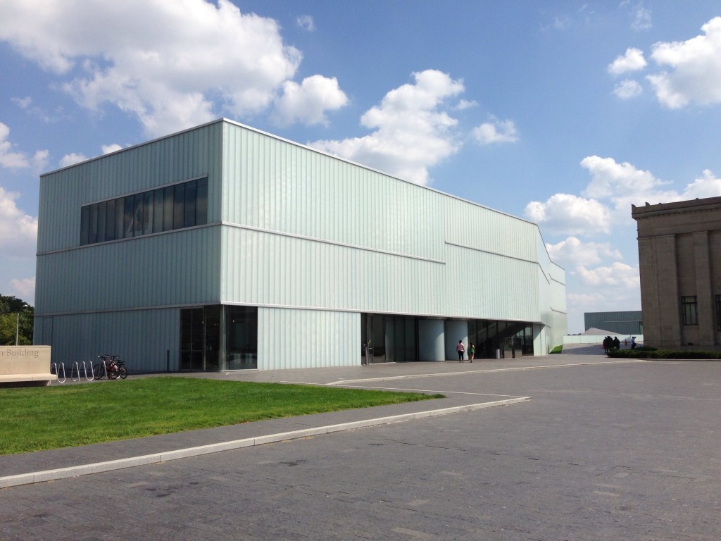
I found myself in Kansas City this weekend and stopped by the Nelson-Atkins Museum of Art to check out Steven Holl's addition. The design was well composed playing with the landscape east of the original museum building. The light on the interior was fantastic and made for a great space. I was surprised by the museum's collection of art and the original building designed by Wight and Wight. Oh, and the museum is free. I was only in town for a few hours, but given this I'd like to go back and discover some more gems of the city.
