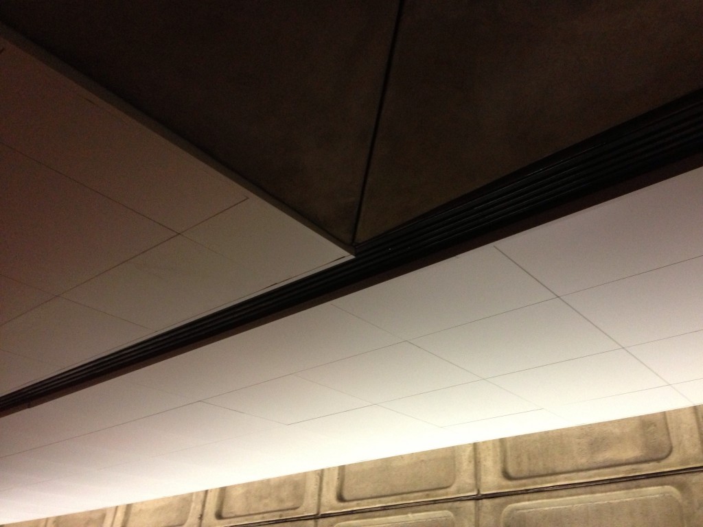
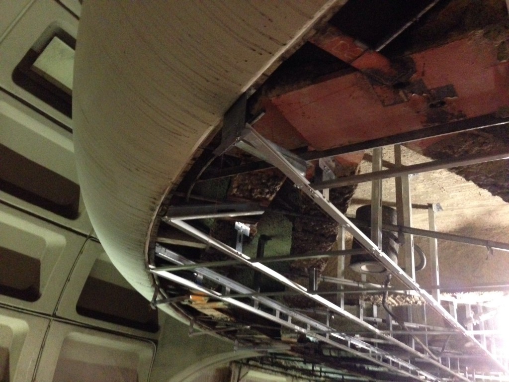
A few months ago, a replacement drop ceiling was going in at Metro Center. I was surprised to see the new framework installed 2 inches lower than the previous ceiling and hoped this was a unique situation. Instead the lowered ceiling has become the new normal and makes for funny situations with existing elements. The ceiling now pops out from vents, escalators, and the curved bottom corners of the platforms above. The elegant curved concrete runs right into the new vertical frame! At Farragut North, I inspected the half completed ceiling for obstacles and could not find any obvious reason for a lower ceiling. I predict saving money was the root reason for this change, but it comes at the cost of aesthetics. It's unfortunate the Metro stations keep drifting away from Harry Weese's original design.


